I'm starting this post to document defects with Confluence table visualization. This is coming from trying to use this tool using non numerical data for dashboarding purposes. This is an example data set that I have made up for testing purposes.
Emergency staffing table:
| Number | Department | Role |
| 1 | Fire | Firefighter |
| 2 | Fire | Firefighter |
| 3 | Fire | Chief |
| 4 | Police | Officer |
| 5 | Police | Officer |
| 6 | Police | Officer |
| 7 | Police | Officer |
| 8 | Police | Chief |
| 9 | Medical | EMT |
| 10 | Medical | EMT |
| 11 | Medical | EMT |
Initially I was not able to graph this data until I added a number column. Once I did that I had some success and am documenting the findings here.
- The department and role data is being aggregated and has correct labeling when shown on a page, but the behavior changes to a non aggregated legend when a graph is placed in a layout macro. The top image shows the chart in the page, and the bottom image shows the same chart pasted into an arrange.
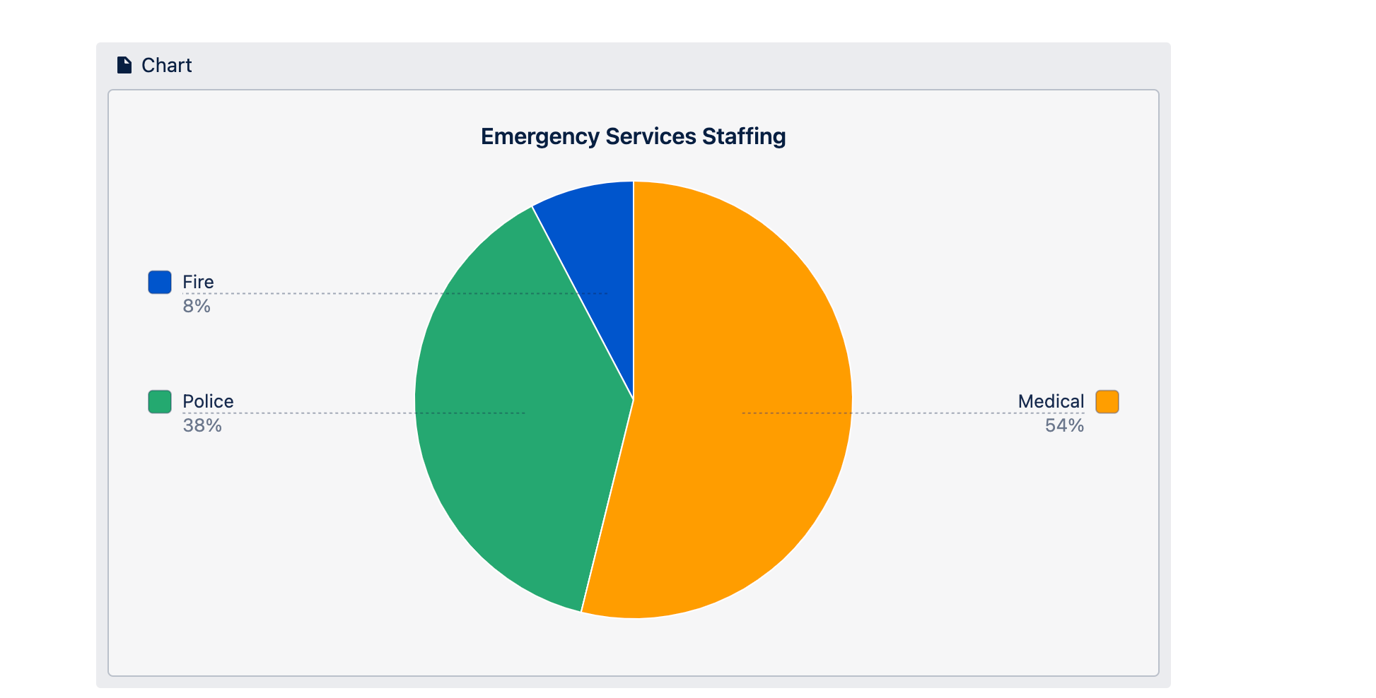
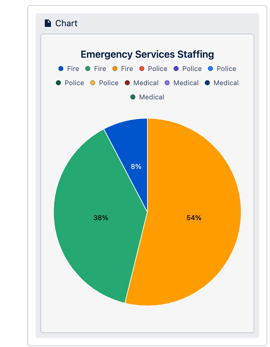
Partially answered: It looks like the non aggregated legend becomes visible based on screen size. When the minimum screen size threshold is not met the chart defaults to showing a non aggregated legend. Demonstration.
2. When placing this chart in an arrange macro the clickable show legend does not change the display of the legend. I believe that control should be able to affect the chart regardless of where the chart is placed.
3. I'd like to see pie charts show a count or percentage. A percentage with this data set is helpful, but may not be the best for this or other data types. In this case I'd like to see a count of individuals instead of their percentage of the population. I'd like to see a count, percentage, or both in the chart as an option.
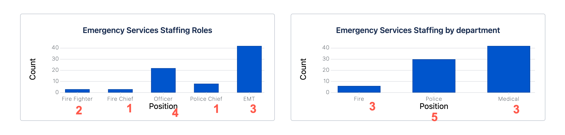
4. The bar chart data is not rendering appropriately. Using the data above as an example the medical data is being counted at 40. I have included a manual count with the data set above in red.
@Reni Carlson @Sam Ugulava Please have a look at the above, and let me know if there is a better or more helpful place for these items related to confluence chart visualization. I am excited about the ability for this tool to provide fast and accurate reporting.
Partialy Solved: I have partially solved the issue by adding a count column and appending a 1 for every row. Oddly if I used the Number column the chart compiled but the data shown was wrong.
No | Department | Role | Count |
|---|
1 | Fire | Fire Fighter | 1 |
2 | Fire | Fire Fighter | 1 |
3 | Fire | Fire Chief | 1 |
4 | Police | Officer | 1 |
5 | Police | Officer | 1 |
6 | Police | Officer | 1 |
7 | Police | Officer | 1 |
8 | Police | Police Chief | 1 |
9 | Medical | EMT | 1 |
10 | Medical | EMT | 1 |
11 | Medical | EMT | 1 |
12 | Medical | EMT | 1 |

