Hi,
Both team managed and company managed projects' burndown charts have only the burndown time (red line) line only. How to get the time spent (green line) as well to the same chart? I am referring to a chart similar to the below one.
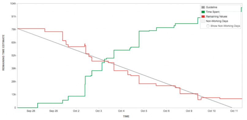
This is more effective and helpful in managing a project. Can someone help me here? Does this come via a different 3rd party app or Jira itself has this feature? If Jira has it, how to activate it? In all the current projects, only the red line appears both in team managed and company managed projects.
Thank you in advance,
Harshi


