I hope someone can help me understand why the Chart from Table macro summarizes year on the X-axis, instead of showing all dates.
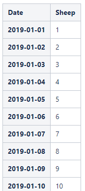
I have the following table. It goes from 2019-01-01 to 2019-12-31, and the "Sheep" value from 1 to 365. Obviously just test data to see if I can get a linear line graph showing. Here are the first 10 lines:
But my graph just looks like this, with a single point where all the days are summarized:
 How can I display a graph with all 365 data points? I don't get it...

