In the new Confluence Cloud editor, the spacing between a heading and the table of contents macro does not look right. Here it is in edit mode:
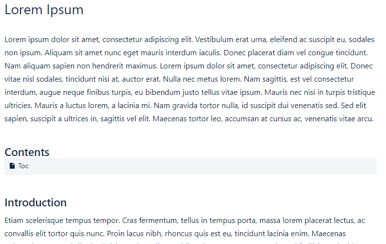
You can see already that the macro box touches right up against the heading, as opposed to a normal paragraph of text in the Introduction, which has a nice spacing from the heading.
The published page also doesn't look right:
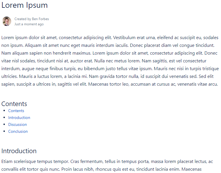
Is this a bug? It seems inconsistent with paragraph formatting elsewhere on Confluence, which I think is generally good. Is there any workaround to achieve a better paragraph spacing here?
It seems similar to this problem: https://community.atlassian.com/t5/Bitbucket-questions/Styling-inconsistency-in-markdown-between-header-and-Table-of/qaq-p/1140663
Which was acknowledged as needing to be fixed.

