Community resources
Community resources
Community resources


- Community
- Products
- Sourcetree
- Questions
- Did anyone really think that the new UI was an improvement?
Did anyone really think that the new UI was an improvement?
203 answers
1 accepted
Comments for this post are closed
Community moderators have prevented the ability to post new answers.
I'm not against change and usually deal with "upgrades" that take functions away or hide them (no idea why UI designers think that is useful). But honestly, the new sourcetree is 3 steps backwards.
Gitflow button is gone = very confusing. It's not even available in the customize menubar.
Branches under feature are not intended properly:
helpmonks__Git_.png
Cancel button in custom action doesn't work. One has to force quite the application.Custom_Actions.png

The new UI is terrible. I could handle the icons being flat and different. What bugs me is the loss of color and readability. It's really hard to tell where things are at a glance.
You must be a registered user to add a comment. If you've already registered, sign in. Otherwise, register and sign in.
+1
Reverted back to 1.7.0 after about 10 minutes of poking at the new UI.
- Quite confusing.
- Everything looks the same.
- Where's the color?
- Diff area looks weird (background should span to full-width, line numbers should have a bit of left/right padding)
- Font is way too big.
- Oh yeah - Git Flow? +1
Thank you SourceTree devs for the continuous effort you're putting into this project!
You must be a registered user to add a comment. If you've already registered, sign in. Otherwise, register and sign in.
Just updated.I hate it. It is awful!
And I was just starting to get used to the last downgrade of interface design; The design from two or three years ago is now VASTLY superior by comparison.
WHY do desktop application developers feel they need to follow Microsoft's interface design philosophy when it is painfully obvious that it is a train-wreck? This isn't a mobile app. Let them go do their phone thing - let us keep our visually appealing applications damn you!
You must be a registered user to add a comment. If you've already registered, sign in. Otherwise, register and sign in.
The new UI update removes a lot of buttons from the main toolbar which I used all the time. Specifically, the Add / Remove buttons. It was nice to be able to select multiple files and click the Add button. I'd sure like a way to at least customize the toolbar to bring them back. I'm going back to the old version.
As far as the theme, the old colors were great! You could easily feel your way around the interface without looking too closely to figure out what you're doing. This new flat colorless interface doesn't help usability, and in a tool like this usability should be king.
As far as the overall look and feel, it looks unfinished. The blue and gray looks very Windows 98ish and the spacing of tabs is way wider than it needs to be.
Hope our concerns are at least considered.
You must be a registered user to add a comment. If you've already registered, sign in. Otherwise, register and sign in.
UGLY, crashes and breaks.. Another quality Atlassian release? But hey this is what we get for going with free.
You must be a registered user to add a comment. If you've already registered, sign in. Otherwise, register and sign in.
It hurts to look at ![]()
You must be a registered user to add a comment. If you've already registered, sign in. Otherwise, register and sign in.
2.1 was good. 2.2 is too different/broken from previous version. Why is this listed as 2.2 when is feels like a 3.0?
What is a good alternative to source tree 2.2? 2.1 will work for a while, but this is the second time source tree has messed up their UI. It is getting old at this point.
You must be a registered user to add a comment. If you've already registered, sign in. Otherwise, register and sign in.
+1 as well. Had been using v1.7 and was quite happy. Switching to v1.8 greatly reduced readability and overall usability. A step backward in terms of intuitive UI.
I have switched back to v1.7 and will wait until 1.9 which hopefully will completely overhaul it back to something useful.
You must be a registered user to add a comment. If you've already registered, sign in. Otherwise, register and sign in.
the new ui is totally ugly and confusing. I will make a downgrade !!!!
You must be a registered user to add a comment. If you've already registered, sign in. Otherwise, register and sign in.
A partial answer, (this worked for me, I reverted to using the chocolately package)
> choco install sourcetree
That installs the 1.7 version.
You must be a registered user to add a comment. If you've already registered, sign in. Otherwise, register and sign in.
The new UI looks horrible, but it's downright fantastic compared to the broken functionality!
Where can I get v1.7???
ETA: Never mind, I found
https://downloads.atlassian.com/software/sourcetree/windows/SourceTreeSetup_1.6.25.0.exe
and
https://downloads.atlassian.com/software/sourcetree/windows/SourceTreeSetup_1.7.0.32509.exe
You must be a registered user to add a comment. If you've already registered, sign in. Otherwise, register and sign in.
Buggy, uninspired, absolutely terrible UI changes. Fire the designers now. Seriously WTF are Atlassian smoking?
Downgraded back to 2.1, thankfully that was as easy as download the dmg and install straight over the top of that "upgrade" abomination.
Auto-updates turned firmly off.
You must be a registered user to add a comment. If you've already registered, sign in. Otherwise, register and sign in.
Agreed - this UI is step backwards. It's worse not better.
You must be a registered user to add a comment. If you've already registered, sign in. Otherwise, register and sign in.
I don't think that flattening the UI is the complete explanation for this disaster. Okay, some People just don't like it, which is fine, but (apart from bugs) there are two much more important UI problems to me with SourceTree.
Especially after the Update there is absolutely no distinction between different areas of the program. Even Microsoft in its metro madness has understood that you need distinctive colors, several shades and borders (sic!) to express a clear structure, which is totally missing for me in SourceTree.
The UI controls are an inconsistent mess out of stuff that has been customized by Atlassian and controls that are left on their defaults, which makes them depend on the current OS and theme. I mean, SourceTree doesn’t look good on Windows 10 right now, but on Windows 7 it’s – because of all these unconsidered dependencies – even worse. The Program is obviously only tested on Windows versions 8, 8.1 or 10, because this extremely affects SourceTree on Windows 7
Nothing in SourceTree fits together, so please SourceTree Devs do yourself a favor: If you wish to restyle a WPF control, style all it's different states or just replace the whole control template for once, to keep the whole thing consistent.
The program looks like garbage, when:
- A customized "flat UI" button turns back to the system default 3D Aero style on mouse over.
- The menu bar uses the Aero button gradient as it's background brush that neither correctly fades into the background or separates itself from it with a border.
- Custom built dropdown buttons are completely missing their border while they otherwise are at least halfway looking like a native control.
- The Windows 7 gray window background is intermixed with custom backgrounds that do not match, especially without any border.
What I don’t understand is: SourceTree uses WPF for its UI. Why don’t they create their own global ResourceDictionary and store their own color palette with a bunch of Styles and Templates in it. They could pinpoint every aspect of the UI look and feel to the way they want it to be, instead of relying on a lot of OS theme dependent stuff that often do not match with the design (when it’s so different from the system theme). That would prevent them easily from displaying an inconsistent mess to us users.
You must be a registered user to add a comment. If you've already registered, sign in. Otherwise, register and sign in.
It feels like they only had one developer assigned to the project for a few weeks and tasked him with rebuilding half of the windows app and ui. Large parts of the (already outdated and highly inconsistent) ui have been removed and replaced with buttons and tabs that aren't really buttons or tabs, any contrast and spacing that was there has been removed and the icons, well... This is not flat design, this is just... flat.
Many of the big performance killers that have been reported time and time again for the past 2 years seem to have been tackled, it's just a shame this had to go paired with such a regression in existing functionality and usability. The amount of new issues we ran into after just a couple hours of using it was pretty staggering.
I don't know... I understand SourceTree not being a priority for Atlassian with it being a free product and all, but waiting 2 years for a stable, performant version to then get this is a bit of a bummer. Shame most Windows alternatives aren't really "up there" either.
Would opensourcing it be a possibility or solution?
You must be a registered user to add a comment. If you've already registered, sign in. Otherwise, register and sign in.
I don't hate the new interface per se... But I'm not in love with it either... And I am flustered that checking out a new branch now requires me to dig into a dropdown menu when it used to be a simple button click. I'm all for a new UI if said interface is in fact an improvement in user experience. But from where I sit this looks to be a step back and is gonna take some getting used to.
You must be a registered user to add a comment. If you've already registered, sign in. Otherwise, register and sign in.
+ 1.
The icons are too thin. This is not an issue about "flat design". Like others already said: It looks more like an wireframe, not an UI.
You must be a registered user to add a comment. If you've already registered, sign in. Otherwise, register and sign in.
A step in the right direction for sure. I think it is easier to tell where things are.
These things though, make the 1.8 version completely unusable for me: (I've reverted to 1.6 via chocolately package)
- submodules don't work, you cannot be in an attached head state, only detached, and fixing that screws up the submodule completely, as well as submodule bookmarks are screwed.
- gitflow button is gone
- the tabs (file history, search, file status) have lost concept of selection state, and it reverts back to selecting the left most tab when swapping repos using the container tabs.
Attlassian please add AT LEAST 1 and 3 stated above into some form of integration test or end to end test, so these features don't get broken in the future!!!!
![]()
You must be a registered user to add a comment. If you've already registered, sign in. Otherwise, register and sign in.
*Reverts update*
You must be a registered user to add a comment. If you've already registered, sign in. Otherwise, register and sign in.
You must be a registered user to add a comment. If you've already registered, sign in. Otherwise, register and sign in.
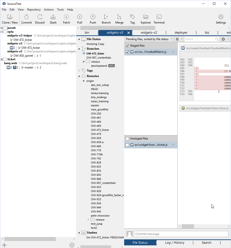
Modern UI = https://screen.jurosh.com/i15/2016_02_16_9702682820605655.png It makes me cry ![]() if it will be at least ugly responsive app I would deal with it but this ?!
if it will be at least ugly responsive app I would deal with it but this ?!
You must be a registered user to add a comment. If you've already registered, sign in. Otherwise, register and sign in.
No TreeView neither. When you are working with a bootstraped repo, and you don't want to gitignore it yet, having 300 files on the same tiny square box gets somewhat annoying to filter / push. Previously I could commit the desired folder with a single click.
You must be a registered user to add a comment. If you've already registered, sign in. Otherwise, register and sign in.
I like boldness and color. Even real flat things have better 3D hints than this interface.
You must be a registered user to add a comment. If you've already registered, sign in. Otherwise, register and sign in.
Absolutely NOT! SourceTree was (!WAS!) great!
You must be a registered user to add a comment. If you've already registered, sign in. Otherwise, register and sign in.
Comments for this post are closed
Community moderators have prevented the ability to post new answers.

Was this helpful?
Thanks!
- FAQ
- Community Guidelines
- About
- Privacy policy
- Notice at Collection
- Terms of use
- © 2025 Atlassian
You must be a registered user to add a comment. If you've already registered, sign in. Otherwise, register and sign in.