Community resources
Community resources
Community resources
- Community
- Products
- Confluence
- Questions
- Creating a Chart for a Table to show number of rows with given column value
Creating a Chart for a Table to show number of rows with given column value

I thought this would be pretty easy to accomplish, but I'm unable to figure this out. I'm thinking there should be an easy solution...
Say I have a table with rows that represent information on different cars. Each row represents a different car and columns for things like color, horse power, number of doors, etc.. Each car is categorized into a 'sub-class' of sorts, say "Sports car", "Luxury car", and "Standard car". The table has a column with this sub-class categorization data. I want to create a chart to show how many rows have each of the categories. So basically I want to see there are X amount of sports cars, Y amount of luxury cards, and Z amount of standard cars.
I tried creating a chart using the car category column as the labels column and the car name column as the values column, but I get the following error:
"Probably, there is no data in the Values column. Please, select the column with data values for chart generation."
It seems like there should be an easy solution, but I'm not seeing it...
1 answer
1 accepted

Hi @Jordan Govreau ,
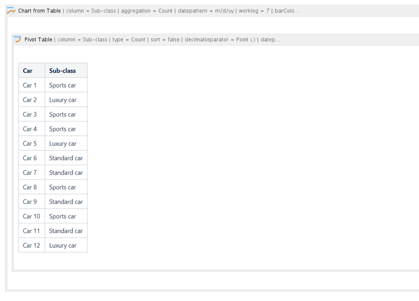
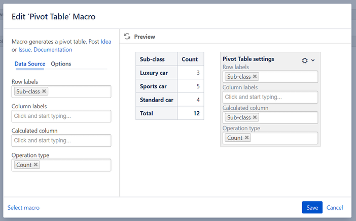
Please wrap your source table in the Pivot Table macro (Table Filter and Charts for Confluence app) to count the number of rows in each category because the Chart from Table macro requires numeric values when building a chart.
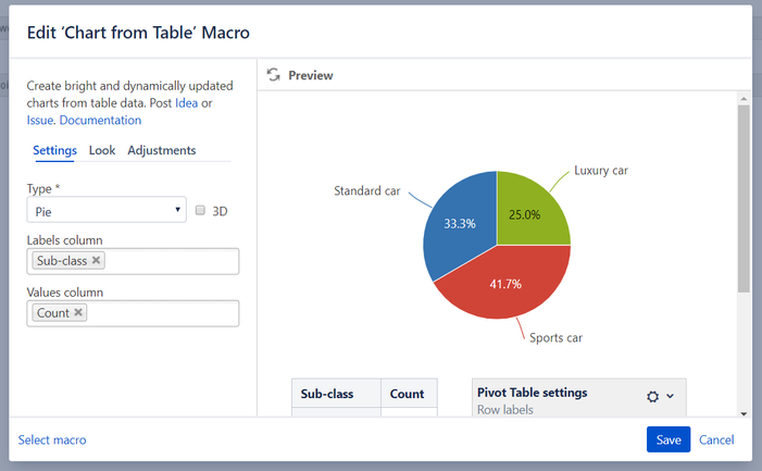
After that wrap the Pivot Table macro in the Chart from Table macro to build a chart based on the aggregated data:
The Pivot Table macro configuration:
The Chart from Table macro configuration:
Please let me know if it works for you.

Thanks Natalie, this is exactly what I'm looking for!
Is there any way I can not show the pivot table? I really only want to display the original table and the chart.
You must be a registered user to add a comment. If you've already registered, sign in. Otherwise, register and sign in.

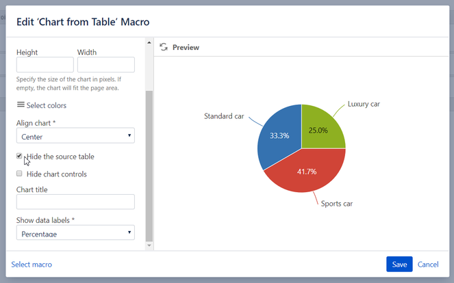
In case you hide the source table in the Chart from Table macro, you won't see both pivot and the source table.
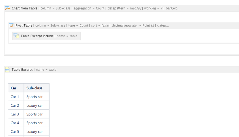
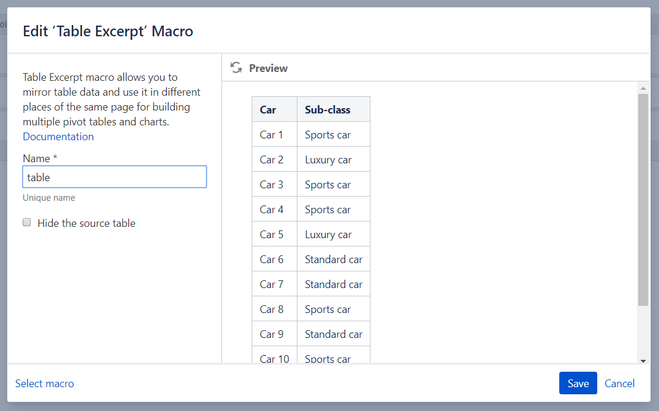
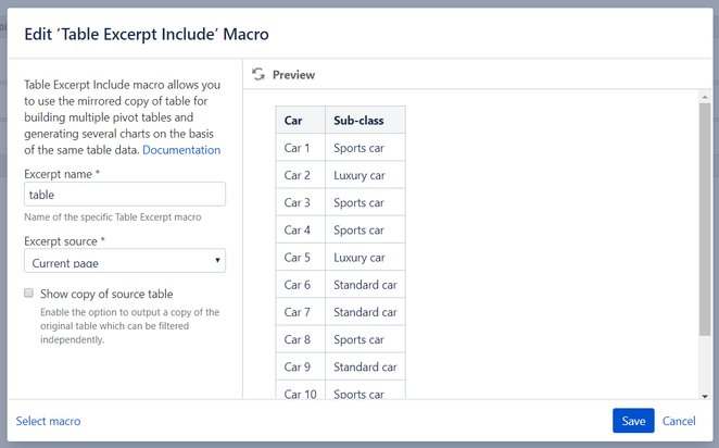
As a workaround, you can use the Table Excerpt and Table Excerpt Include macros.
Wrap your source table in the Table Excerpt macro and place the Table Excerpt Include macro in the Pivot Table macro body.
The Table Excerpt macro configuration:
The Table Excerpt Include macro configuration:
Set the Hide the source table option in the Chart from Table macro:
You must be a registered user to add a comment. If you've already registered, sign in. Otherwise, register and sign in.

Was this helpful?
Thanks!
- FAQ
- Community Guidelines
- About
- Privacy policy
- Notice at Collection
- Terms of use
- © 2025 Atlassian


You must be a registered user to add a comment. If you've already registered, sign in. Otherwise, register and sign in.