Community resources
Community resources
Community resources
- Community
- Products
- Atlassian Platform
- Questions
- Soliciting Feedback: Proposed changes to the navigation
Soliciting Feedback: Proposed changes to the navigation
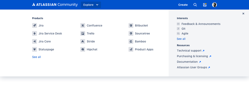
In my own experience with the community, it's sometimes a cumbersome process to get to various places in the community easily. When I am reading a discussion in the Jira collection, and want to see the latest in the "Feedback & Announcement" forums, I navigate to the homepage and then find the collection icon on the right rail and then go to that collection.
I'm sure you all have similar struggles akin to mine. That being said, I've been working on a solution that would put access to all collections into the global navigation. I'd love for you to see it and comment on it.
Does it make sense? What else would you like to see in the menu? Is it helpful? If you could shed some light on this I would be grateful.
Closed
Opened
4 answers

As a follow-up: what would be your hesitation to adding the Explore button at the top? If we added more elements in the header?
Yes, that's it exactly. I'm disabling the web-panel modules in JIRA plugins all the time because half the plugins want to add items to the menu.

With the resources, I will like to be able to include community resources as well -- like the FAQ!
You must be a registered user to add a comment. If you've already registered, sign in. Otherwise, register and sign in.
Thanks @Daniel Eads {unmonitored account} for quick and thoughtful response!
Yes, that support.atlassian.com loop can be troublesome. It's just difficult to determine which path to take at what time and in a smart way. My working assumption is that most customers will be able to self-service and find solutions to their issues (via community, support.atlassian.com or documentation). And for those customers who still get stuck, then they can go to support via the contact form. The issue of presenting the contact form prominently like this creates a lot of unnecessary tickets for our team to tackle, especially when a lot of those questions can be answered in the aforementioned places.
It's a tough nut to crack, and we're trying to work towards a better version, but thank you for recognizing it :)
Since the header is pretty bare-bones currently, I don't see any issues adding the Explore button to the top.
As a follow-up: what would be your hesitation to adding the Explore button at the top? If we added more elements in the header?
You must be a registered user to add a comment. If you've already registered, sign in. Otherwise, register and sign in.

Nice Kevan - I really like it!
The addition of the Resources section is a great improvement too. I like the "out" arrow (indicating that this will probably take you out of Community in a new tab/window). The choices for what to put there are great - assuming Technical support will help people open tickets someplace at support.atlassian.com. I've found myself trying to navigate the path into Support and giving people the longer, more specific support URL for their exact need in answers to questions. I could see a slight conflict where people wind up in a loop between support.atlassian.com and Community (linked to on support). When directing people to create support tickets, at the very least I point them at https://support.atlassian.com/contact/#/ so they don't hit the documentation/search/Community landing page.
Thank you for another avenue into aug.atlassian.com though - really really really appreciate that as an AUG Leader constantly trying to let customers know that AUGs exist.
Since the header is pretty bare-bones currently, I don't see any issues adding the Explore button to the top.
Aside from the navigation/workflow piece about support.atlassian.com, it's got my vote for "implement immediately" :)
You must be a registered user to add a comment. If you've already registered, sign in. Otherwise, register and sign in.

Was this helpful?
Thanks!
- FAQ
- Community Guidelines
- About
- Privacy policy
- Notice at Collection
- Terms of use
- © 2025 Atlassian


You must be a registered user to add a comment. If you've already registered, sign in. Otherwise, register and sign in.