Community resources
Community resources
Community resources
Should this Confluence Page Have a Diagram? (Exclusive Tips + Webinar Sneak Peek!)
Hi Community!
I’ve been working on a webinar with Gliffy’s Director of Engineering, Mike Sample, and wanted to share a sneak peek and some tips here. Our webinar, How to Diagram Your Way to Better Work: the Gliffy Guide, is not your standard product demo or thought leadership piece. It’s got three actionable, easy-to-do exercises that will help your work flow more smoothly.
Even if you don’t have a diagramming tool or have a different app for making diagrams, you’re welcome to join and will find these helpful! You can sign up here. >>
😊
So, on to your sneak peek: Exercise 1 from this webinar has Confluence written alllll over it. It’s about how to identify when and where your team would benefit from a new diagram.
Here are my top tips for determining whether an SOP, wiki page, or workspace would benefit from a diagram (and where you should add a diagram, if so!):
- Are users in your space frequently visiting the page? Check page stats to make sure you’re prioritizing improvements to a page that your team is referencing often. Here are instructions for finding that info in Cloud and Server/Data Center.
- Is that page packed with text? If yes, your reader could probably use a break with either a helpful image or diagram.
- Scan the text for instructions with words like If...then, or next. This is the right place for a flowchart.
- See a numbered list? That’s a good spot for a flowchart, too!
- Do your instructions or workspaces reference multiple people or roles across your company? Consider an org chart. You can easily link to one or add one to the page.
- How about a specific place? Maybe add a rough map or drawing to show where that supply closet is or where to take a broken laptop.
- You might also be able to see search queries in your site insights. This can give you more ideas of what information your users are looking for — great questions to address with a diagram.
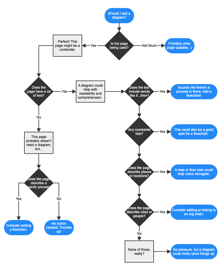
As I was writing this post, I realized I should probably follow my own advice. So, here’s a helpful diagram describing the list above. 😉
Even if you skimmed that numbered list list (like your users might be doing with a long confluence page), an eye-catching diagram can quickly break information down and improve understanding. Cool, right?
Want more ideas for how diagrams can help your team? Sign up for our webinar and we’ll see you next week!
Samie
Was this helpful?
Thanks!
Samie Kaufman - Your Gal at Gliffy

About this author
Product @ Gliffy
Perforce Software
Minneapolis, MN
23 accepted answers
Atlassian Community Events
- FAQ
- Community Guidelines
- About
- Privacy policy
- Notice at Collection
- Terms of use
- © 2025 Atlassian


0 comments