Community resources
Community resources
Community resources
Confluence Cards: Because Your Content Deserves Better 🎨💡
Having trouble keeping your team awake and engaged with those dense Confluence pages? You’re not alone. Endless blocks of text can drain focus and make it hard for colleagues to find what they need.
Here comes your savior: Confluence cards.
They’re your secret weapon for transforming those information walls into visually appealing and easy-to-navigate pages.
This guide will show you how to create them and keep your team entertained.
Let's dive in!
💡 What are Confluence Cards?
Confluence cards are bite-sized bits of info that supercharge your pages and make them easier to read. They organize your content into an engaging format, so your audience can quickly grasp key points and zip through the page.
With Confluence cards, you can turn boring text into a fun browsing experience.
📌 Use Cases for Cards
Think you don’t need cards? Think again!
They can do more than just display content. Use them as a navigation menu on your Confluence homepage or to organize articles in an FAQ. Icons and colors can make blog posts and company news pop.
Curious about how this looks? Check out our Confluence card sample pages.
🛠️ Creating Confluence Cards: Built-in Approach
The big question: Does Confluence have a built-in feature for creating these awesome cards? Sadly, no. Confluence doesn’t come with a native card-making tool. But don’t sweat it!
There are still ways to get the card layout you want.
Let’s explore some options.
🧩 Card Workaround: Layouts and Tables
This method uses the Layouts and Tables macros to create a grid-style layout that mimics cards.
Here’s how to do it:
-
Divide Your Page: Start by inserting the Layouts macro and choose a layout that lets you split your page into sections, like a three-column layout.
-
Create "Card" Containers: Use Confluence macros to create container-like sections.
-
The Expand Macro: This can help structure your content, but it doesn't allow direct linking. Alternatively, insert images and add links to them for a bit of interactivity.
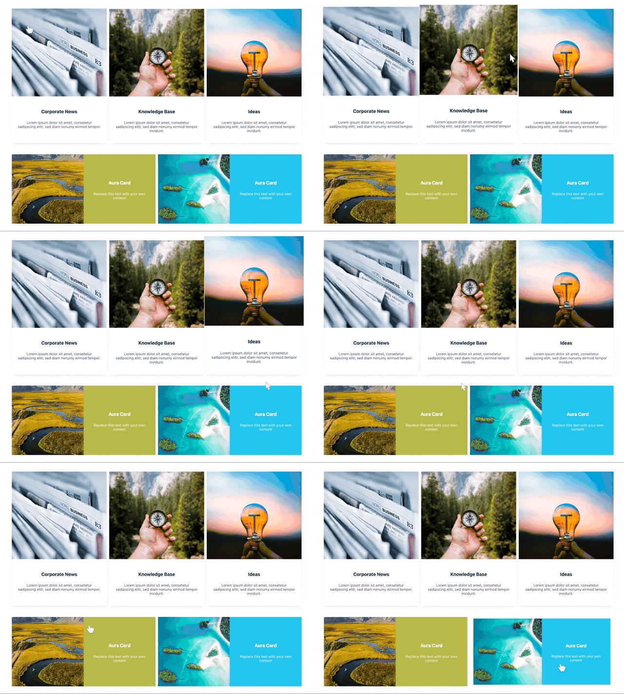
When published, it looks like this: -
Cards with Tables: Use tables to create cards by changing the background color of each cell. This way, your "cards" stand out from the rest of the content. Insert images and text into the table cells for a more engaging layout.
Put text in the top cell and add links to relevant resources. Copy and paste your DIY cards into other layout panels.
⚠️ Limitations of These Workarounds
While the Layouts and Tables method works, it’s not perfect. You’re stuck with a grid layout with a max of three "cards" side-by-side. Plus, these "cards" lack the pizzazz of animations or interactivity, and making them look polished can take time.
That’s where the Aura Content Formatting macro suite comes in handy. It offers a fantastic interactive card macro.
✨ Create Confluence Cards with Aura
With Aura Cards, you can easily create up to six cards, automatically organized in a clean and responsive layout. Each card is highly customizable, so you can make them just right for your needs.
Here’s how to insert an Aura Cards macro on a Confluence page:
-
Go to the Confluence page you want to edit.
-
Click the Edit button or press E.
-
In the page editor, click the + button (Insert More Content) and select Other macros – or use the shortcut key “/” to insert the macro.
-
Choose the Aura Cards macro from the list, and the configuration dialog will appear.
🛠️ General Tab: The Foundation of Your Cards' Design
Alignment: Decide how you want the text in your cards aligned – left, right, or centered for optimal readability.
Card Type: Choose the type of card you want to create:
-
Text Cards: For titles, detailed explanations, or key takeaways.
-
Image Cards: Mix visuals with informative text.
-
Icon Cards with Text: Add an icon to represent the content visually.
Pro Tip: Try out different Aura card types to see which works best for your content.
Card Grid: Column Selection: Pick how many columns you want for your cards. This helps organize your content based on the space available.

🎨 Designing Your Cards
Aura Cards offer a variety of pre-designed styles. Select one that matches your Confluence page's theme and branding.

Balancing Image Placement and Size
Adjust image size and position to fit your needs. You can also tweak padding, gaps between cards, and decide whether to use images at all.

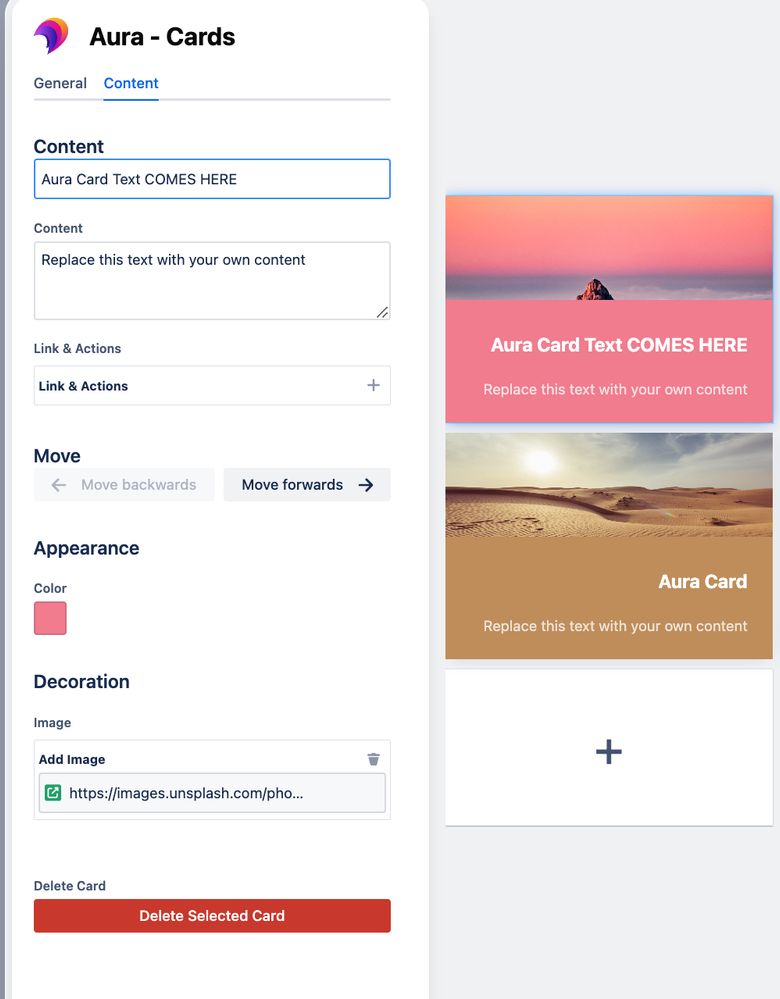
📝 Content Tab: Customizing Each Card Individually
The "Content" tab lets you personalize each card. Add unique titles to catch attention and boost engagement. Enter content with colors, images, and links – whatever your design heart desires is possible with Aura Cards!

Link Options: Embed Confluence content, create attachments, provide direct links, send via email, or trigger an action.

🔍 Live Card Preview
The live preview window is a game-changer. As you tweak settings in the “General” and “Content” tabs, the live preview updates in real-time. This way, you can see exactly how your Aura cards will look and make sure they’re perfect before saving.

✅ Saving and Enjoying Your Work
Once you’ve customized your cards, click "Save" in the configuration dialog. Your fabulous Aura Cards will instantly appear on your Confluence page, transforming it into a visually engaging and user-friendly resource.

🌟 Feel the Power of Engaging Content with Aura Cards
While Confluence's built-in options and workarounds provide a starting point, they often don’t fully unleash your creative potential for page design.
Aura Content Formatting Macros let anyone, regardless of coding skills, break free from traditional layouts. Imagine building a fun navigation menu, turning your FAQ into a user-friendly masterpiece, or enhancing your project pages with stunning visuals.
Ready to try Aura Cards for free? Head over to the Atlassian Marketplace and grab your 30-day trial.
Experience the Aura Cards-difference and see how easy it is to create content that keeps your team hooked!
Was this helpful?
Thanks!
Patricia Modispacher _appanvil_
About this author
Content Marketing Manager
appanvil
7 accepted answers
TAGS
Atlassian Community Events
- FAQ
- Community Guidelines
- About
- Privacy policy
- Notice at Collection
- Terms of use
- © 2025 Atlassian


0 comments