Hi community! I'm Elaine, a product manager on the Confluence Cloud team.
In late 2017, Atlassian launched a major navigation redesign across our products, Confluence included. It didn't go as intended. We learned some valuable lessons from your feedback. The learning led us to an important update to the Confluence navigation user experience. It's coming your way in this couple of months if it hasn't already.
I am excited to give you a sneak peek of the changes and would love to hear your thoughts.
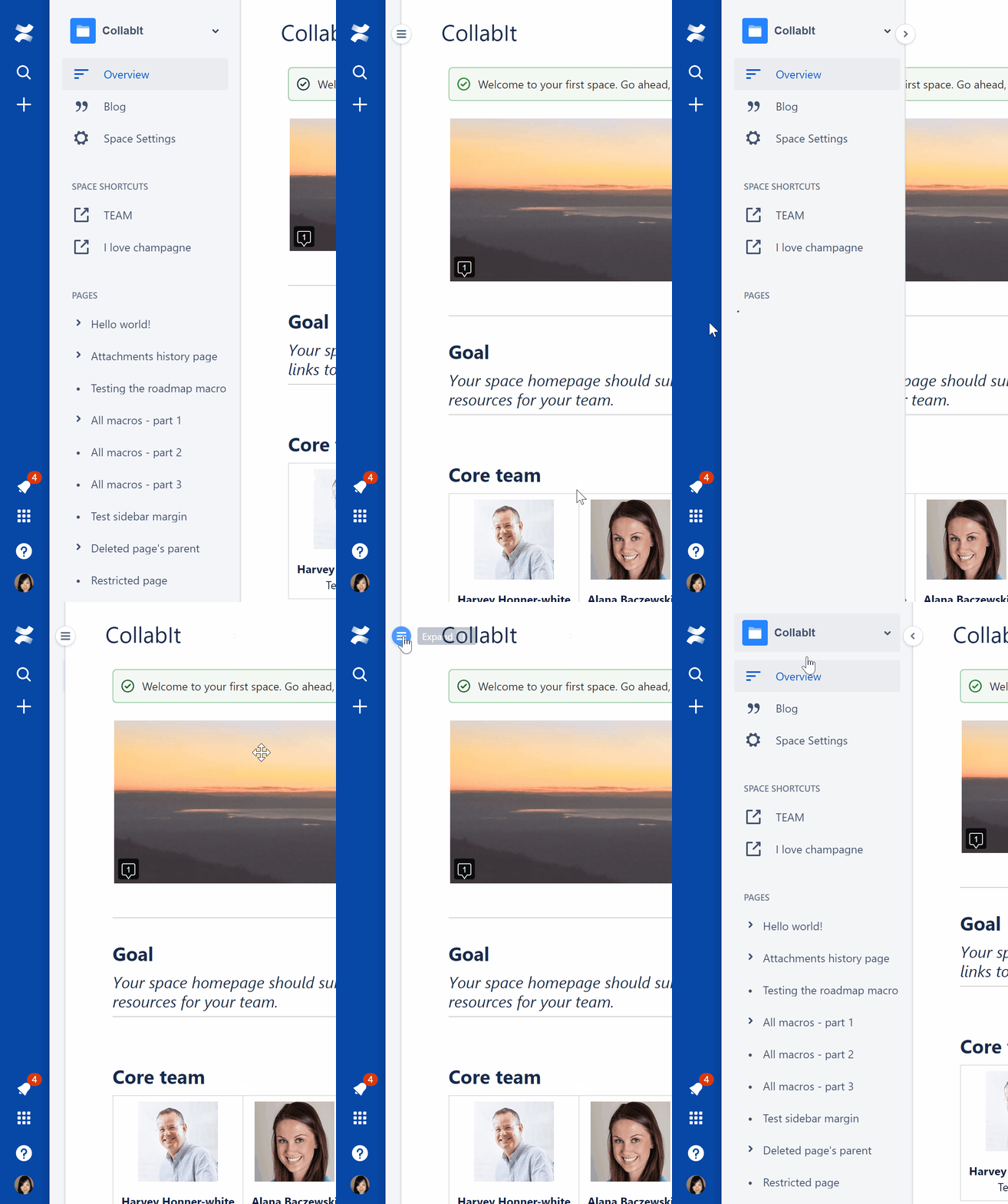
1. New nav expand/collapse UI
More intuitive and quicker way to switch between expanded and collapsed navigation menu:
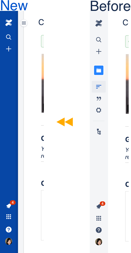
2. Simplified collapsed navigation
Decluttered collapsed navigation menu to help you easily zoom in on an essential menu item such as Quick Search. No more guessing on what icon does what.
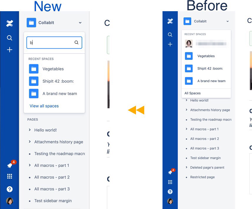
3. Enhanced space switcher
Get to the next space fast with more recent spaces (for 5 to 15) to browse and search from in space switcher.
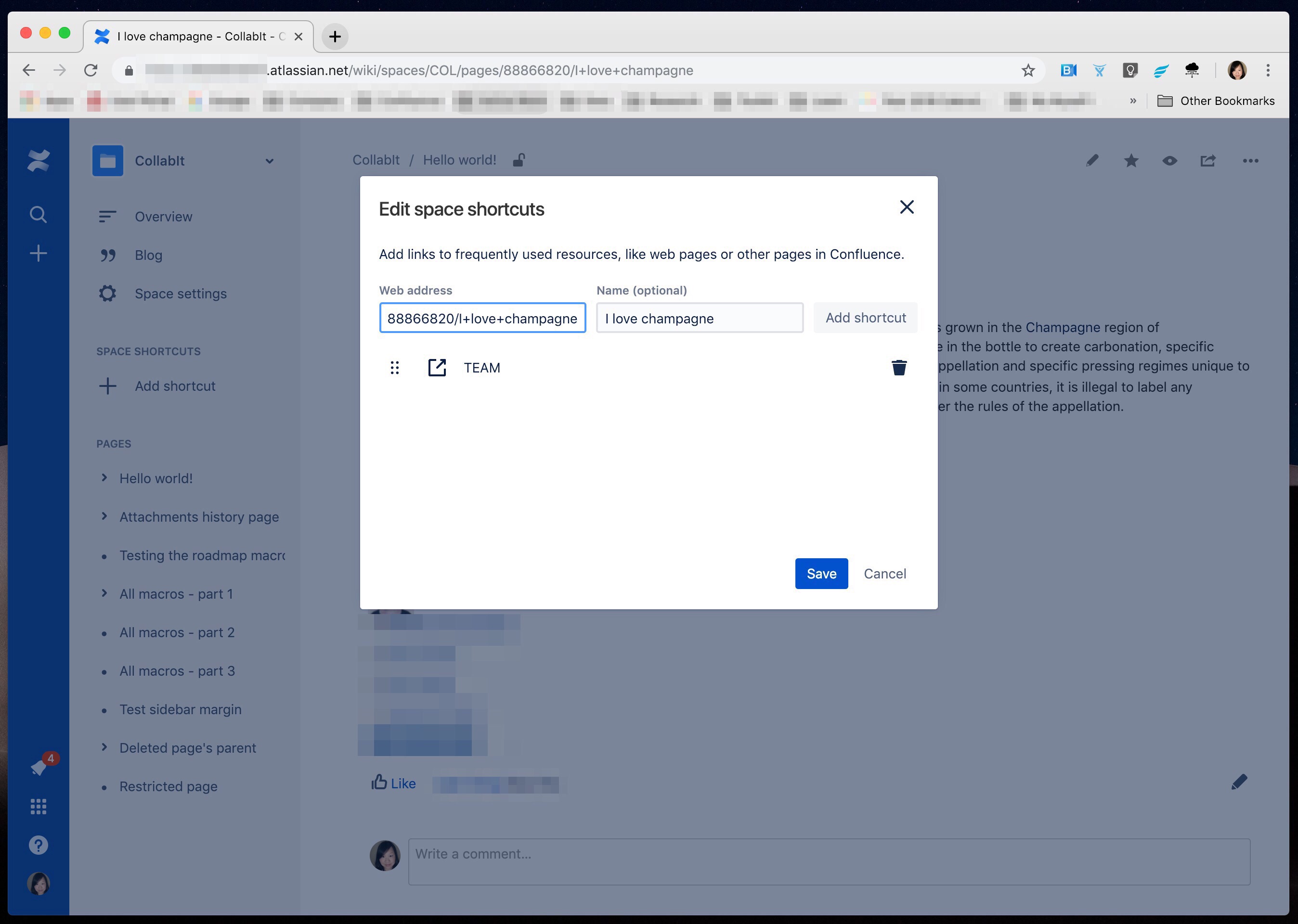
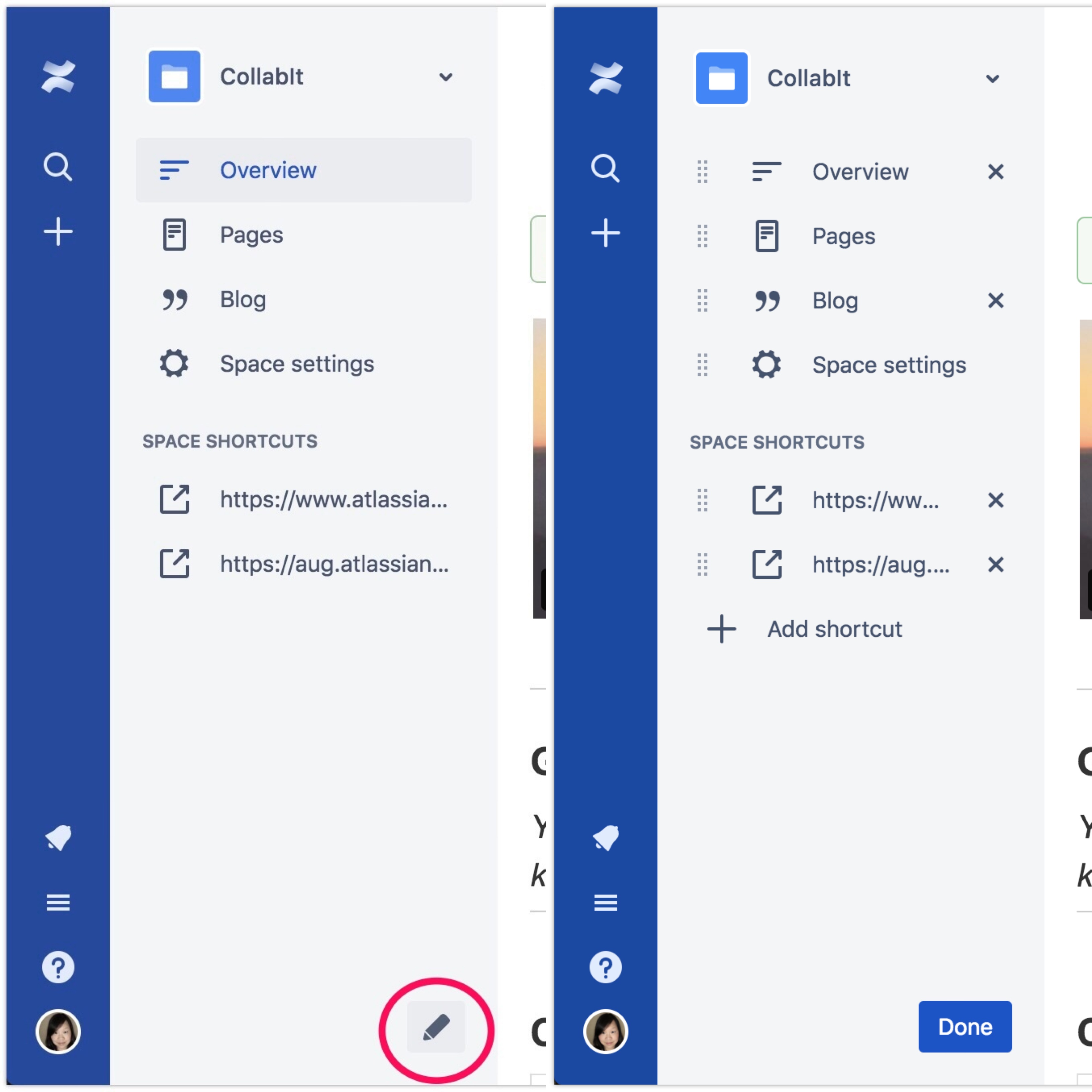
4. Updated sidebar configuration
(For space admins only) With Drag & Drop in the page tree, the previous sidebar configuration pencil icon gets in the way when organizing (Drag & Drop) and browsing pages in the page tree. The UI is updated to ensure a smooth user experience as new features are introduced.
New:

Before:
5. Other notable changes
No longer available in the updated navigation:
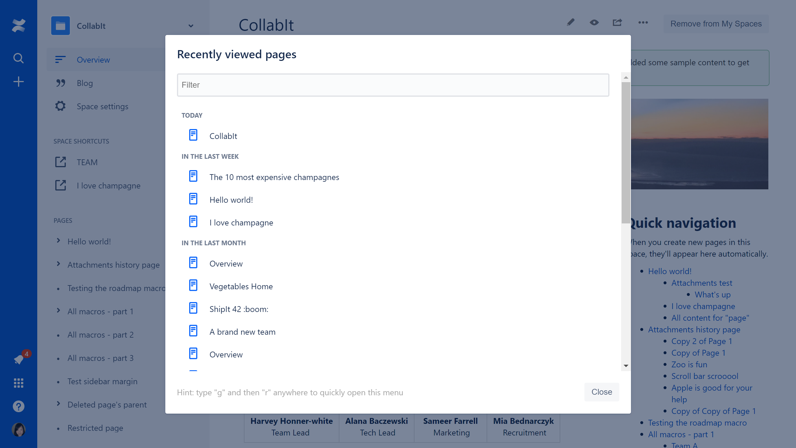
- Double-click on navigation border to reset sidebar width from manually adjusted width
So, what's next?
We have gradually rolled out this updated experience to 50% of customers from early February until now. We will expand our release to all customers in the next few weeks, if all goes well in terms of usability, performance, and stability. Please share your feedback with us and try it out if it's enabled for you. We'd love to hear from you all!
This is one of the initiatives we're taking to make Confluence navigation work for you. We'll continue to iterate and develop new features to help you find your way around Confluence. Stay tuned.


