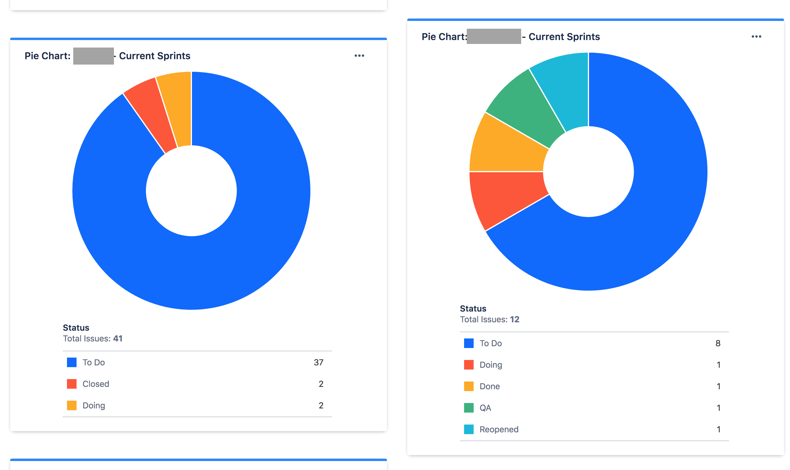
I just created two piecharts for two projects I'm tracking. They both have a saved filter that looks like this:
project = [projectname] AND Sprint in openSprints()
Where [projectname] is unique to each project. Then the "Statistic Type" is set to "Status" for each, to show where the tickets are in the workflow.
However, the colors don't match between the Statuses.
Red is "Closed" in one, "Doing" in the other.
Yellow is "Doing" is one, and "Done" in the other.
...
I have another set of Dashboards for our engineers, where they can see how the team is tracking with their tickets, and how they are tracking. It gets especially confusing there when a developer sees Red for "To Do" on one, and "Done" on another, leading them to make mistaken assumptions about their progress.
Does anyone have some pointers that can help me set these up better for my team?Thanks.