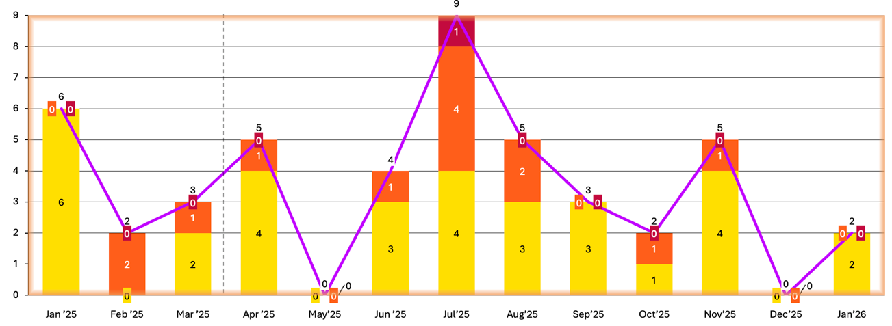
I have two fields, one is the severity (Sev1, Sev2, Sev3) and second is time range (Monthly wise)
The user can select multiple severity levels and can select the months range.
Based on the above inputs the graph needs to be generated, where months should be on the X-Axis and on Y-Axis there should be the count.
One way which I found to implement this is create a filter, link it to a dashboard. But every time, the user needs to edit the filter (severity and months range), then access the dashboard.