Hey there, Atlassian Community! 🎉
We're super excited to introduce our brand-new data visualization feature in Rovo✨ This awesome addition is here to revolutionise the way you look at and understand data, making it a breeze to gain insights and share them with your team.
What is the data visualization feature?
Think of it as your personal chart wizard! You can create a variety of charts tailored to your needs, and these can be seamlessly integrated into your projects as Smart Links.
Whether you're keeping tabs on project progress or diving into complex datasets, our data visualization tool is your go-to buddy!
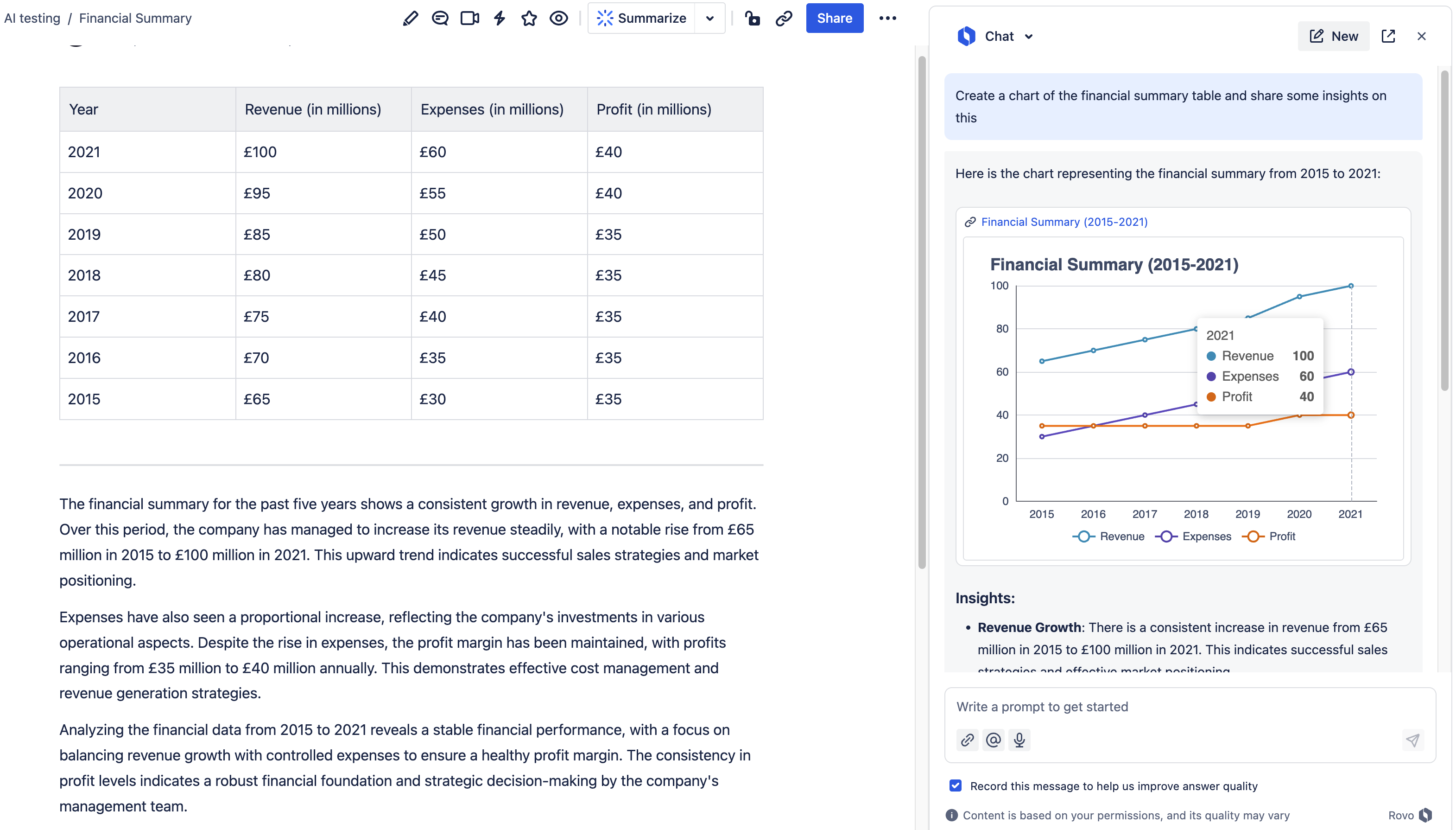
^ Here I am using the data visualization feature to create a line chart of the company’s financial performance, and to provide some insights around the data 📈
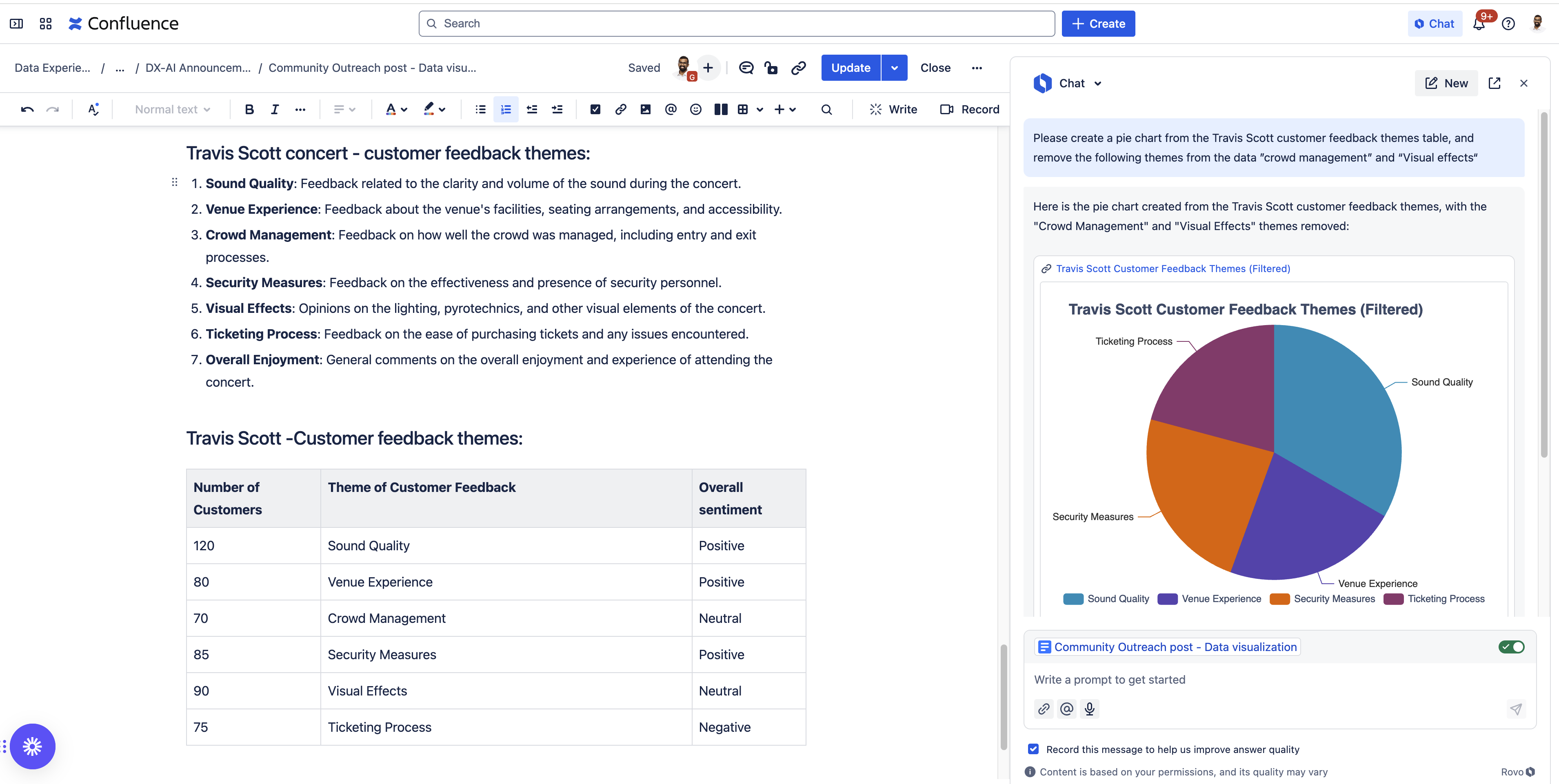
^ Here I've made a pie chart of the various feedback themes for the recent Travis Scott concert to report back to my team " data-emoji-text="😎">" data-testid="image-emoji- " data-emoji-type="image">
 " data-emoji-id="1f60e" data-emoji-text="😎" data-vc="emoji" />
How do I use it?
- Check out this Bite-Sized-Loom - a handy rundown of the feature!
- Super easy, just say the magic words in Rovo -“Chart this for me please“
-
Data visualization is generally available in Rovo chat :
-
Behind the scenes, Rovo will access the data from available sources to create the chart you desire - a handy tip is to be specific when prompting to mention what data you'd like charted and from where " data-emoji-text="😉">" data-testid="image-emoji- " data-emoji-type="image">
 " data-emoji-id="1f609" data-emoji-text="😉" data-vc="emoji" />
-
“Create charts” Agent action: When setting up new Rovo Agents, you can now add the "Create charts" action to boost their capabilities.
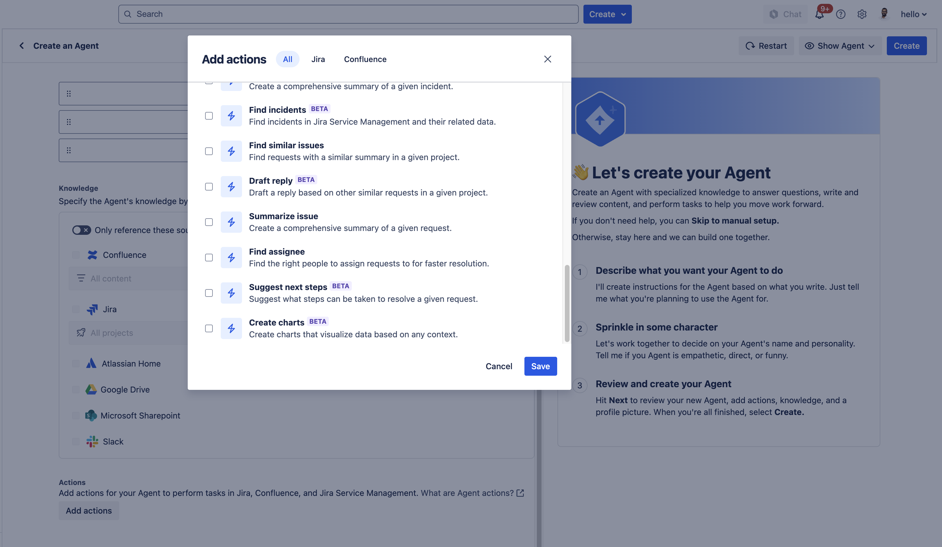
The “Create charts” action in Agent creation 🤖
Would love to hear your feedback please!
Currently, data visualizations are limited to data that Rovo can access. The team is working hard to enhance this functionality and stay tuned for more improvements to come for this area of Rovo! 
We're also super eager to see how you'll use this feature to supercharge your projects. Share your thoughts and feedback in this forum - this will be crucial in shaping the future of data visualization at Atlassian 
Happy charting! 😁


