Hi,
I have some data that looks like this, in a table. Just a small sample!
ID | Created Date | State |
|---|
| 344886 | 05/07/2024 15:07:19 | New |
| 344848 | 05/07/2024 09:30:11 | New |
| 344817 | 05/07/2024 07:11:24 | In Development |
| 344705 | 04/07/2024 15:15:26 | In Development |
| 344687 | 04/07/2024 10:40:13 | New |
| 344686 | 04/07/2024 10:37:24 | In Analysis |
| 344677 | 04/07/2024 08:52:48 | Closed |
| 344651 | 03/07/2024 14:01:47 | In Development |
| 344618 | 03/07/2024 09:09:58 | New |
| 344598 | 02/07/2024 19:51:48 | New |
| 344597 | 02/07/2024 19:48:17 | New |
I want to create a chart out of it, that would look a lot like this (ignore the data and dates in the following chart, it's just to make the example):
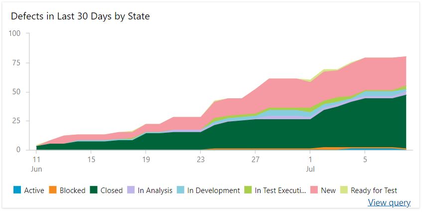
I can't see a way to cumulatively keep a count of items in a given state, across a given time frame. I'm getting some odd results where the Stacked Time Area chart is just totalling up numbers of issues per day, and also not recognising or showing the different State values (is this because it is text and not numeric)?
I'm certain there must be a way to do this, but I'm struggling too much with it right now!
Also, to note the date format from my export, including time, also seems to be causing a problem when I try and get a sensible chart from this. Any help on that too would be appreciated!


