Confluence Data Center
I am trying to create an automated chart from Jira Xray data that looks like this:

Each feature (represented by a row) has different numbers of test cases. Example data:
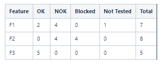
I need each row to be 100% with each status comprising some amount that equals 100%
I have been using Table Filter, Table Transformer, & Pivot Tables to try and accomplish this with no luck so reaching out for help from the community.


