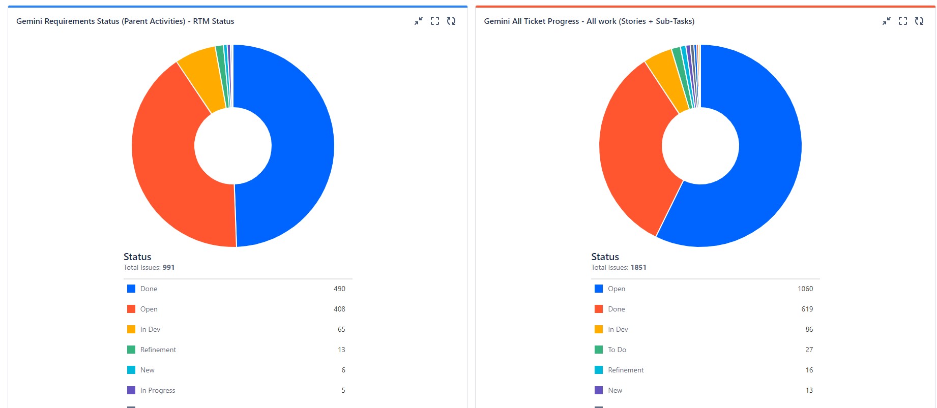
I get that we can't customize the colors within the Pie Chart without spending additional add-on money, but is there a way to make them consistent? Below are 2 graphs with the same data (albeit, one has an additional filter sliming down the results) for the same project, same teams, etc. Notice that the Status colors are different. On the left Done = Blue and on the right Done = Orange. Left is Open = Orange and right Open = Blue. Etc. Is there a way to align the colors? I honestly don't care what color is what status...we just want it consistent.
We're on Jira Cloud.