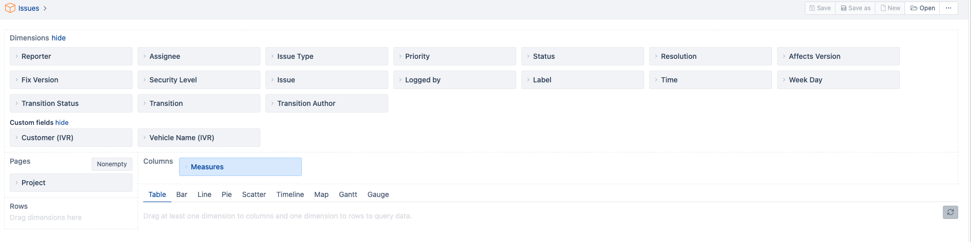
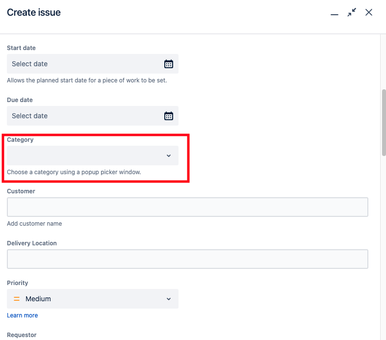
Category: ABC1, ABC2, ABC3...ABC9. There are around 8 to 9 category.
How can I plot Bar chart or Table by using Category (Dimension) vs Issue Created (Measures)?
There is only option for status category (To do, In progress and Done) but I am looking for Issue category(Custom field) marked in Red box in above screenshot.