Hi,
I have added an excel speadsheet to Confluence with the Excel Macro.
Now I want to diplay a chart of that table:
| Monate | Werte |
| Nov 19 | 242 |
| Dez19 | 150 |
| Jan20 | 192 |
| Feb20 | 175 |
But it only shows this:
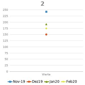
But I want a graph like this:
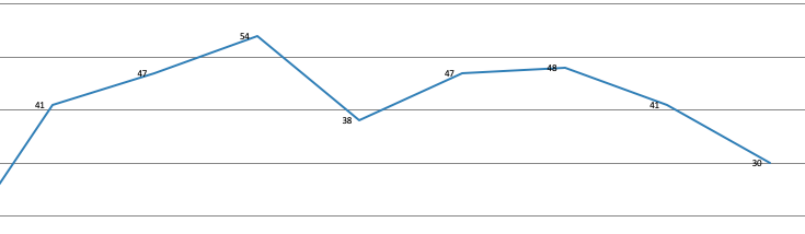
My chart settings are:
Type: line
Allignement: vertical
Table:blank
Columne: 1,2
Strange thing, the bar chart is working:
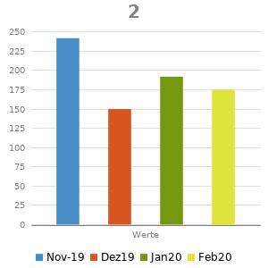
What Am I doing wrong?
One more thing, I have some tables with filter, that changes the chart:
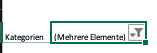
Is that possible as well in Confluence with the nativ macros?


