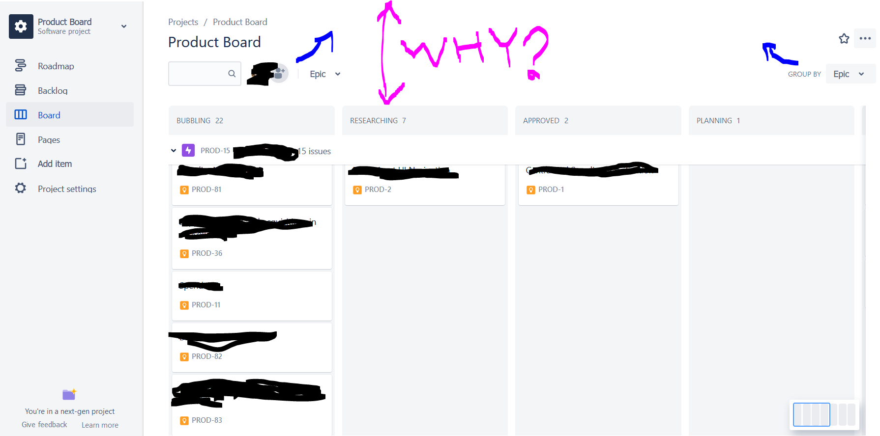
Why is so much vertical space unnecessarily wasted in the next-gen board?
Every bit of vertical space is important so I can see more of the board at once: KPI should be maximum number of issues visible vertically in the screen.
Consider:
- Plenty of white space is available in the top
- Components can be moved one row upwards to save some vertical space
- Also consider whether showing issue codes helps users; the issue type icon can be displayed on the same row as the issue name, with the issue code shown on mouseover