We are excited to be launching a Help Center to our university community soon, but have run into an issue where it's not meeting some minimum requirements for accessibility.
These accessibility requirements (WCAG 2.0) are important for all sites, but they are of particular importance to us as a public institution.
So far, we haven't found any options for adjusting the CSS of any part of the Help Center portal, other than the banner background and banner text color.
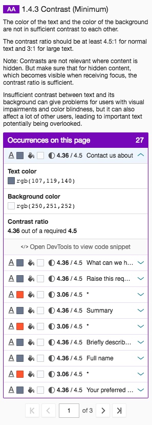
- Does anyone have suggestions for altering the Text color and Background color in the display of request forms, so that they meet the 4.5:1 contrast ratio? (The red-ish color used to indicate required fields should also be changed.)
I've added an image that shows the results of our check for sufficient contrast on the text elements that Atlassian controls -- the contrast is 4.36:1 and 3.06:1.
Thanks for any suggestions!