A lot of Confluence pages look dated for a reason that has nothing to do with Confluence: they're one long column of headings and paragraphs. The native editor actually ships most of what you need to break up that wall — layouts, panels, highlights, expandable sections, in-page navigation. It just doesn't advertise them.
This post walks through five things you can do with the native editor today, ordered by how often they help, and finishes with the point where native options genuinely run out. I'm Simon from NGPILOT — we build Confluence apps on the Atlassian Marketplace, so read that last section knowing that.
1. Break the single column: page layouts
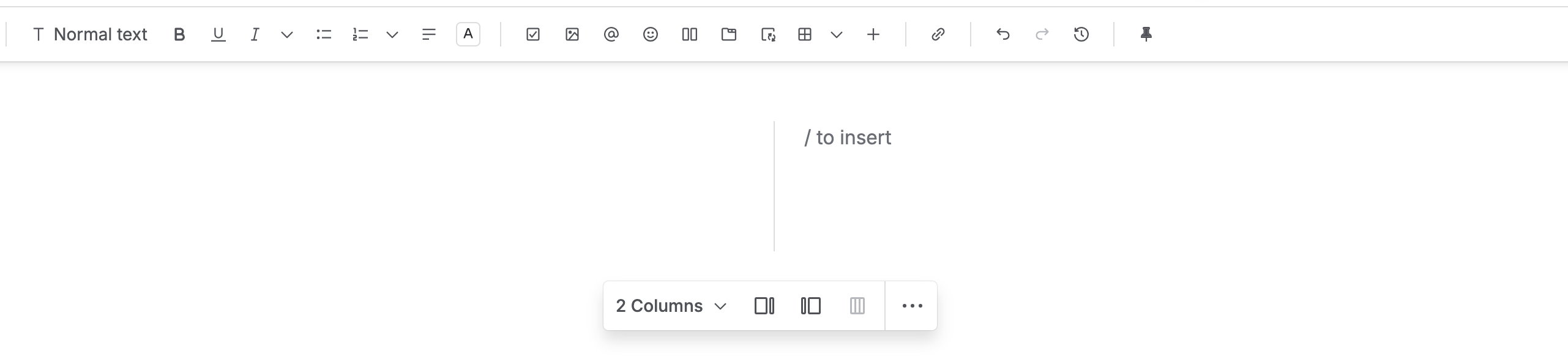
The fastest upgrade for any long page is also the most overlooked. Type /layout — or open the layout button in the toolbar — and split the page into sections with two or three columns.
Where this earns its keep:
- A spec page with the summary in a narrow left column and the details on the right
- An onboarding page with steps on one side and the "why it matters" beside them
- Any page where someone has to scroll a full screen before reaching real content
Two layouts used deliberately look more "designed" than any theme. One layout per page is plenty — pages that alternate between one, two, and three columns every screen tend to read as noise rather than structure.
2. Say it with color: panels and highlights
Confluence gives you two native ways to make the important parts visible, and they solve different problems.
The panel macros (type /info, /note, /tip, /warning) are containers. They're the right tool when a whole paragraph matters: "do this before you continue", "this changed in the June release". The panel color does the triage for the reader before they've read a word.
For anything shorter than a paragraph, the toolbar's highlight and text color options do more than people expect. A yellow-highlighted date in a changelog, a red line in a policy that states the one exception — inline color says "this word matters" without breaking the paragraph's flow.
The mistake to avoid is using panels for everything. A page with five warning panels trains readers to skip warning panels. My working rule: highlight for words, panels for consequences, and never more than two panels per screen.
3. Hide the detail: the expand macro
Type /expand and you get a collapsible section with a title bar. This is the native answer to the most common complaint about documentation pages — "I can't find the three lines I need in this wall of text."
It works best for material that's real but rarely needed all at once:
- Environment variables and config snippets in a setup guide
- The full error-message reference under a troubleshooting section
- Per-role instructions inside one company-wide process page
Expand also changes how people write. Once detail has somewhere to live that isn't the main flow, the main flow gets shorter — and short pages with tucked-away detail read as more professional than long pages with everything visible.
4. Signpost: in-page table of contents
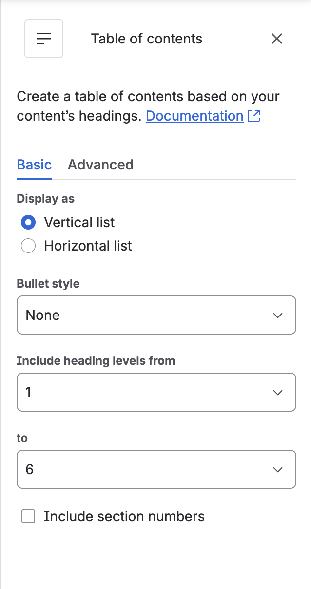
Any page longer than a few screens deserves a /table of contents macro at the top. It's native, it's generated from your headings, and it stays correct as the page changes.
Two things that make the difference between a TOC that gets used and one that gets ignored:
- Consistent heading levels. The TOC can only be as good as the heading structure. If your H2s and H3s are arbitrary, the TOC is arbitrary too.
- Anchor links in cross-references. Every heading on a page has its own URL — right-click the heading, copy link. "See the Rollout plan section" with an anchor link beats "see above" every time.
5. Let the small things add up: dividers, emoji, and tables you actually configure
None of these move the needle alone; together they're most of what people perceive as "polish":
/divider between major sections — one line, and suddenly the page has rhythm. (The horizontal rule reads better than a blank gap.)

- One emoji in a heading (
🚀, ✅, ⚠️) — scannable, and it survives dark mode. Three per page is tasteful; ten is not.
- Tables with intent — a native table with a colored header row and consistent column widths reads as designed. Zebra striping and conditional coloring are where native tables stop, though.
That last point is a real boundary: native tables can't be styled much, headings can't be auto-numbered, and there's no way to reuse a style across pages. Which brings us to the honest part of this post.
Where native stops: the macro layer
Everything above is native and covers most day-to-day pages. There's a category of things the native editor can't do at all, and it's worth naming them so you can decide if any apply to you:
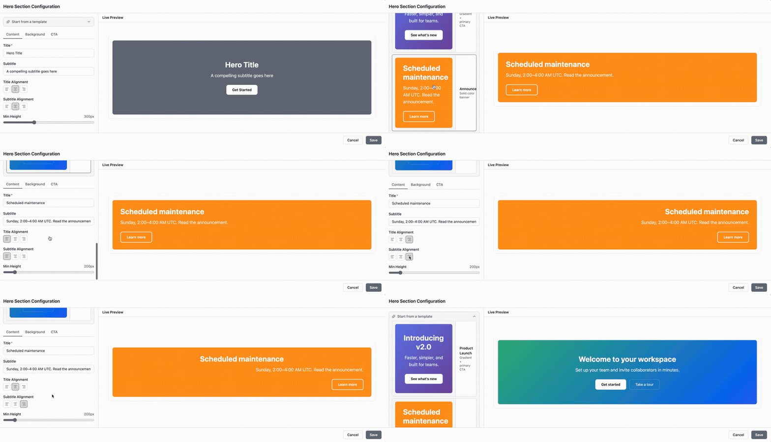
- Hero headers — a full-width title banner with a background and call-to-action buttons, for landing-style pages
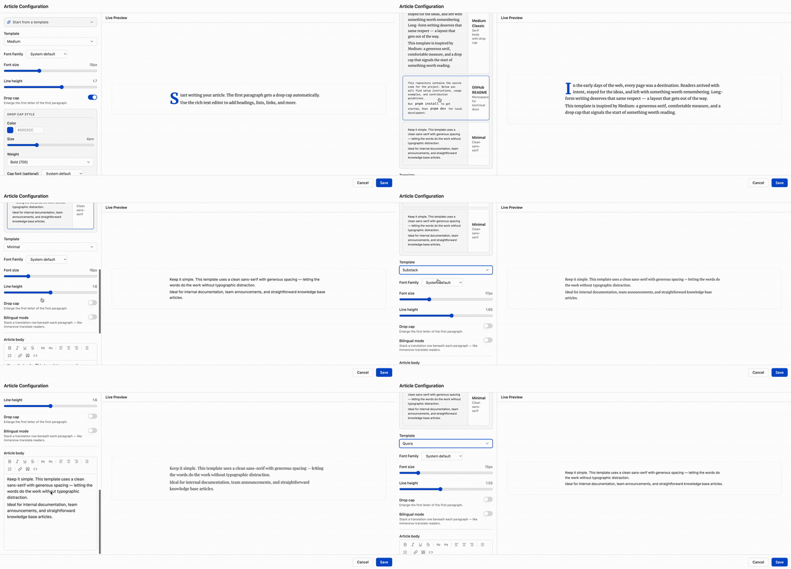
- Reading layouts for announcements — Medium-style article presentation for long-form posts, instead of documentation formatting
- QR codes generated on the page — for event pages, room signage, WiFi details
- Forms and surveys that store responses inside Confluence
- Inline term tooltips — hover a term, see its definition, no glossary page
If one of these matters to your pages, that's what Marketplace apps in the "page builder" and "formatting macros" category do. My team builds one of them — Content Formatting Macros & Page Builder for Confluence — which covers the five items above (here's its hero builder and one of its reading templates):
A Marketplace search for "confluence page builder" will also surface several other options with different strengths. Pick by the specific gap you're closing, not by the longest feature list.
Which do you reach for?
| Your page |
Reach for |
|---|
| Long spec or onboarding doc |
Layouts (#1) + TOC (#4) |
| Status-heavy project page |
Panels + highlights (#2) |
| Setup guide with config detail |
Expand (#3) |
| Anything with the five gaps above |
A formatting macro app |
Four of the five building blocks are sitting in your editor right now, and a page that uses just two of them well already stands apart from the heading-paragraph wall. If you've got a page that fights you no matter what you try, describe it in the comments — I read every one, and specific pages make better follow-up topics than general questions.
