There are multiple things I don't like, but the most glaring is the 100% horizontal flow. The are 4 vertical elements and 0 horizontal. For some reason this makes me super anxious. I can't really even verbalize why.
I also don't like a minimum of 2 clicks to view a list of issues. I like the old way of clicking on "issues" to see your most recent search/filter. This could easily be fixed. Related to this is having to click a "back" arrow to get back to the main navigation (I say main, but now there is a new, higher-level, nav to the left of this which is 99% useless).
Another problem I had was after viewing a dashboard, I struggled to return to the original menu. I ended up having to click "Projects" and pick my project again.
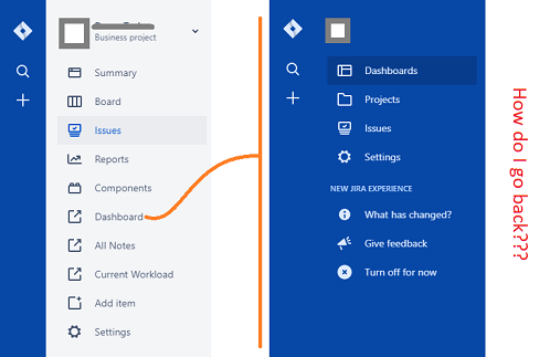
Why do these two separate menus even exist?


