We've started using the "New Jira Experience" in the past week, and while it's a refreshing take on JIRA, there's a lot of seemingly odd design choices going on.
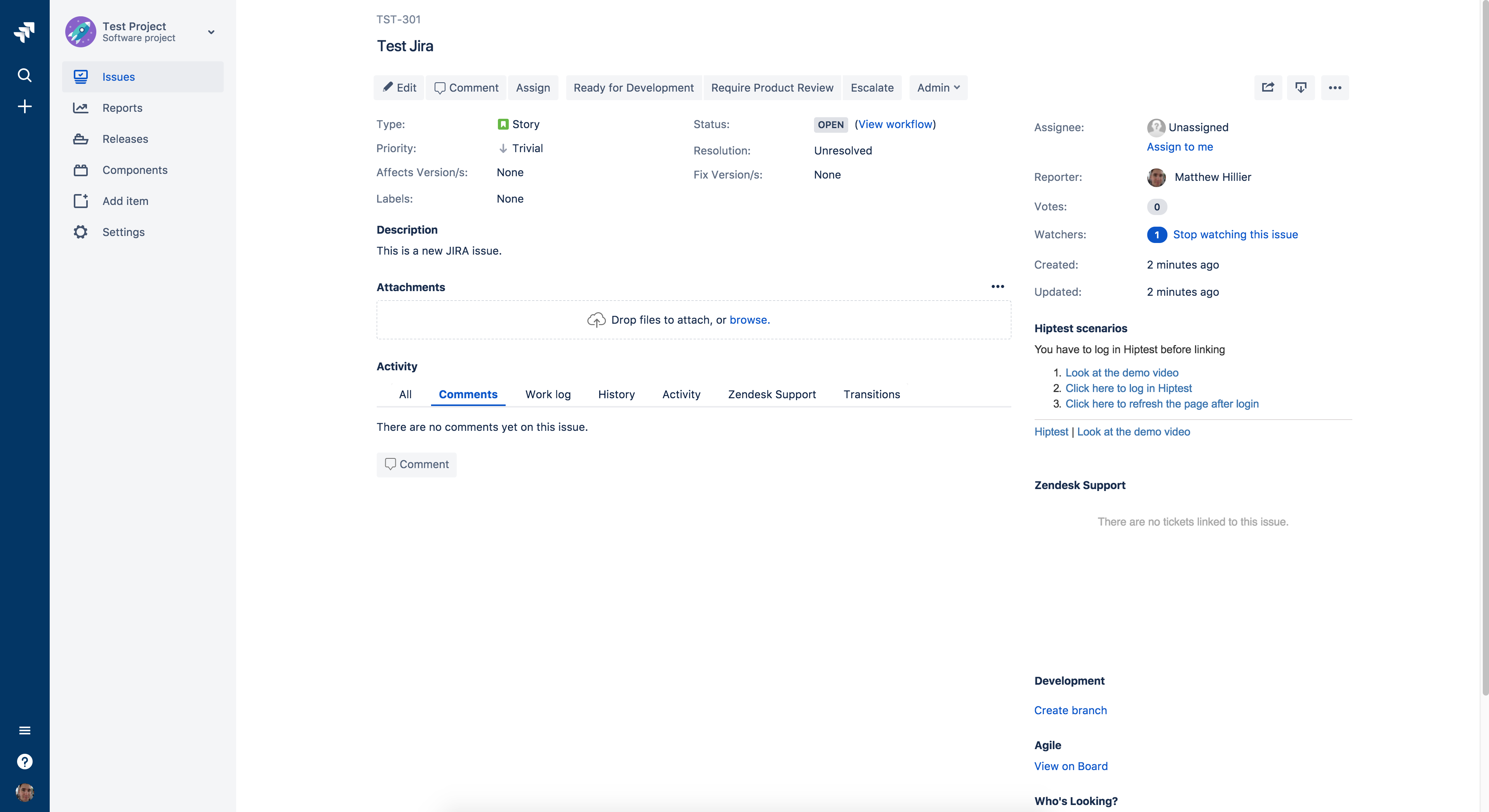
The latest one to bug my team is the Issue View. There seems to be a newly imposed maximum-width constraint on the Issue View, meaning that the content never extends beyond a specific width in the screen.
In it's default view on a regular 1080p display, there's some fairly odd padding showing up:
However when I collapse the side-bar (which I'm doing as I get more familiar with the new UI), this get's even more pronounced and starts to feel jarring:
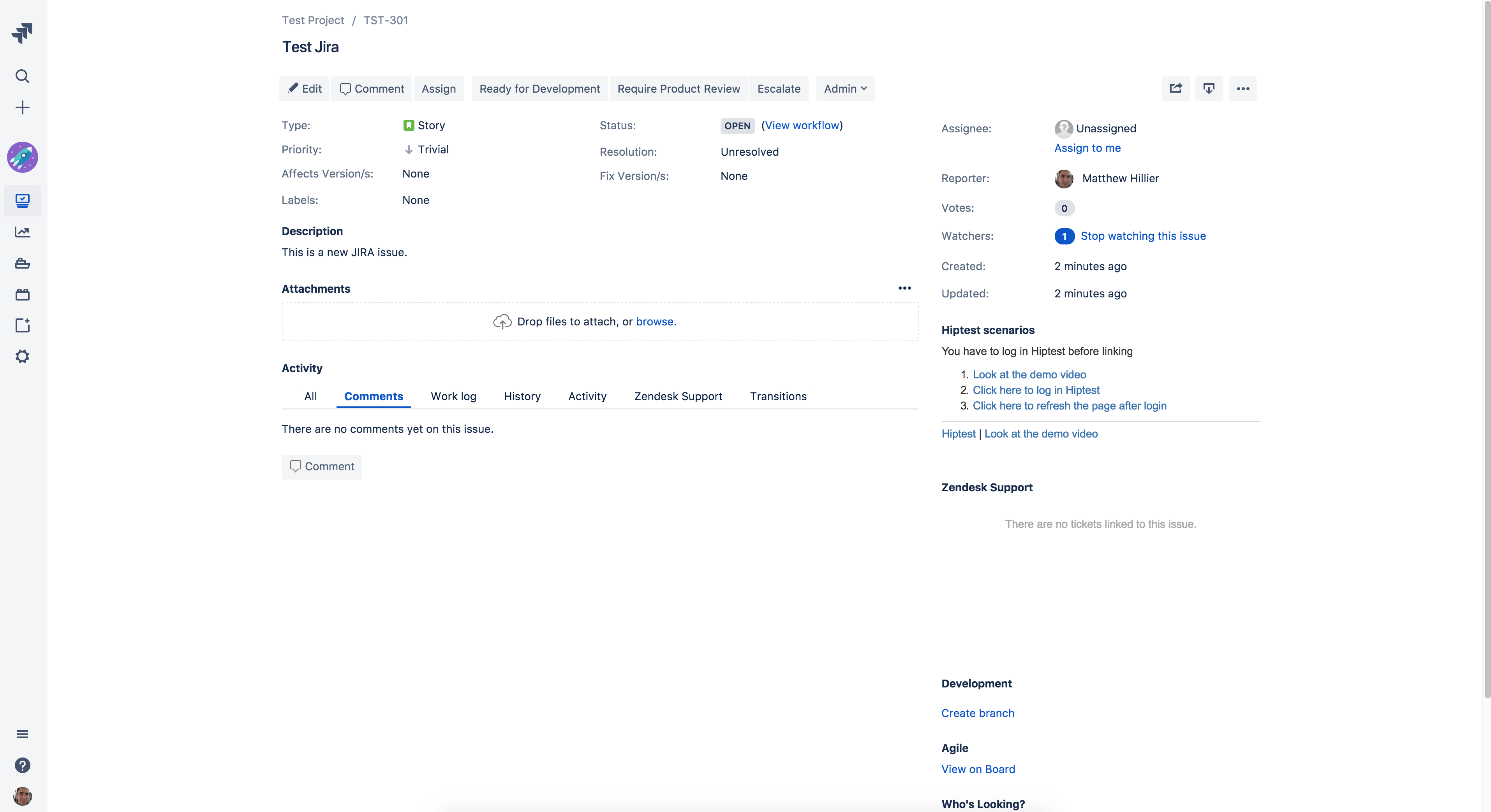
I've some IT and Design users who're starting to use 4k monitors and on those devices it looks, frankly, ridiculous.
When we factor in JRIA Issues with screenshots and lots of text, the somewhat arbitrary-feeling restriction just makes it annoying and enforces more scrolling.
One of my team raised this with Atlassian support, and were told that this is a design choice to improve readability, while my designer interprets this as form over function - I tend to agree.
Please review this, as it's just an unnecessary headache and, as device screens get more dense, is just going to become unnecessarily pronounced.


