Hello,
I recently switched to the new JIRA design/layout, which I realy like.
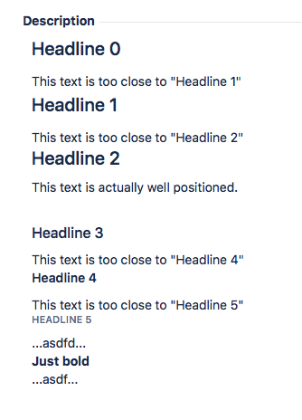
The only thing I don't like is how headlines are surrounded by space. Or rather how they're not surrounded by white space.
It's only .h3 which has propper top-padding (or top-margin). 
h1. Headline 0
This text is too close to "Headline 1"
h1. Headline 1
This text is too close to "Headline 2"
h2. Headline 2
This text is actually well positioned.
h3. Headline 3
This text is too close to "Headline 4"
h4. Headline 4
This text is too close to "Headline 5"
h5. Headline 5
...asdfd...
*Just bold*
...asdf...
Is there any hope that this is going to be fixed? Or does anyone know a workaround?
I found something about an announcement banner, but although I have the admin role I couldn't find it nowhere. But I don't even know if this would be of any help here.
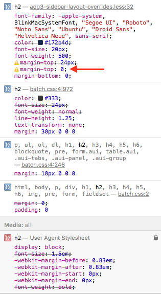
I did some tests with the CSS. When I remove "margin-top:0px" in one of the h2-spec (see screenshot), the space between "Headline 2" and the above text is what I would expect it to be.
Thanks a lot in advance!
Cheers,
Gabriel

