The Created vs Resolved report answers one of the most common questions in project management: is work leaving the backlog as fast as it enters? For single-board, single-question scenarios, the native Jira report handles this well. The trouble starts when you need to know why the gap exists – or when your scope extends beyond one board.
📊 Start with the native Jira surface
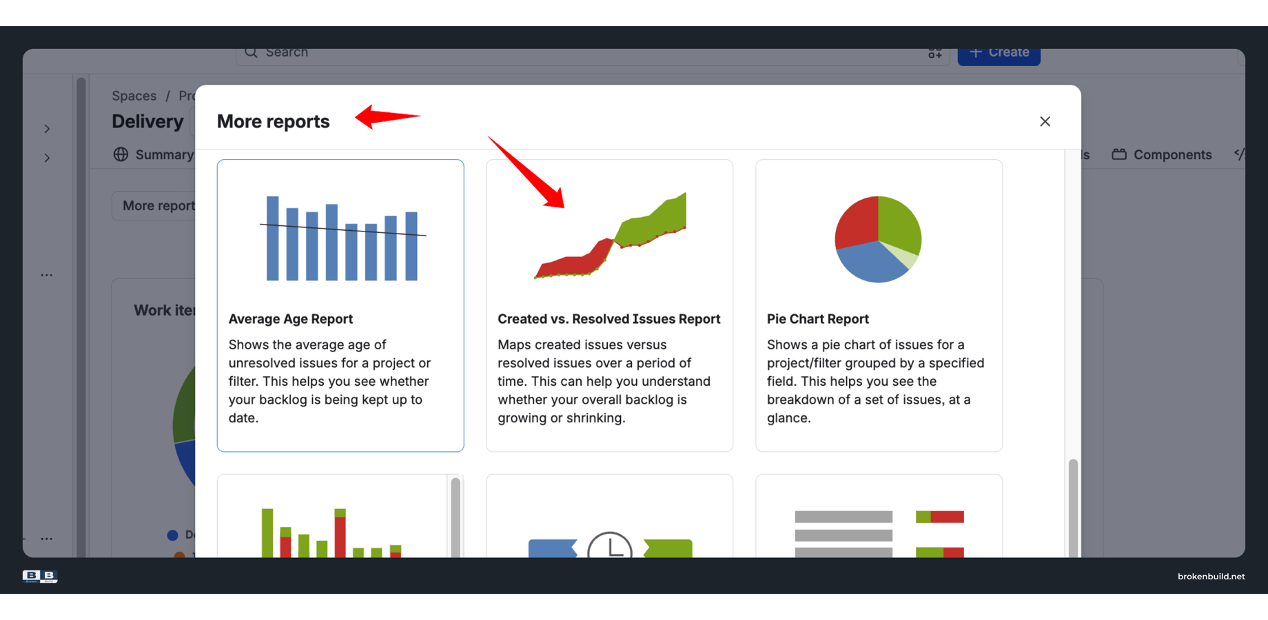
Navigate to Project → Reports → Created vs Resolved Work Items Report in any Jira project.
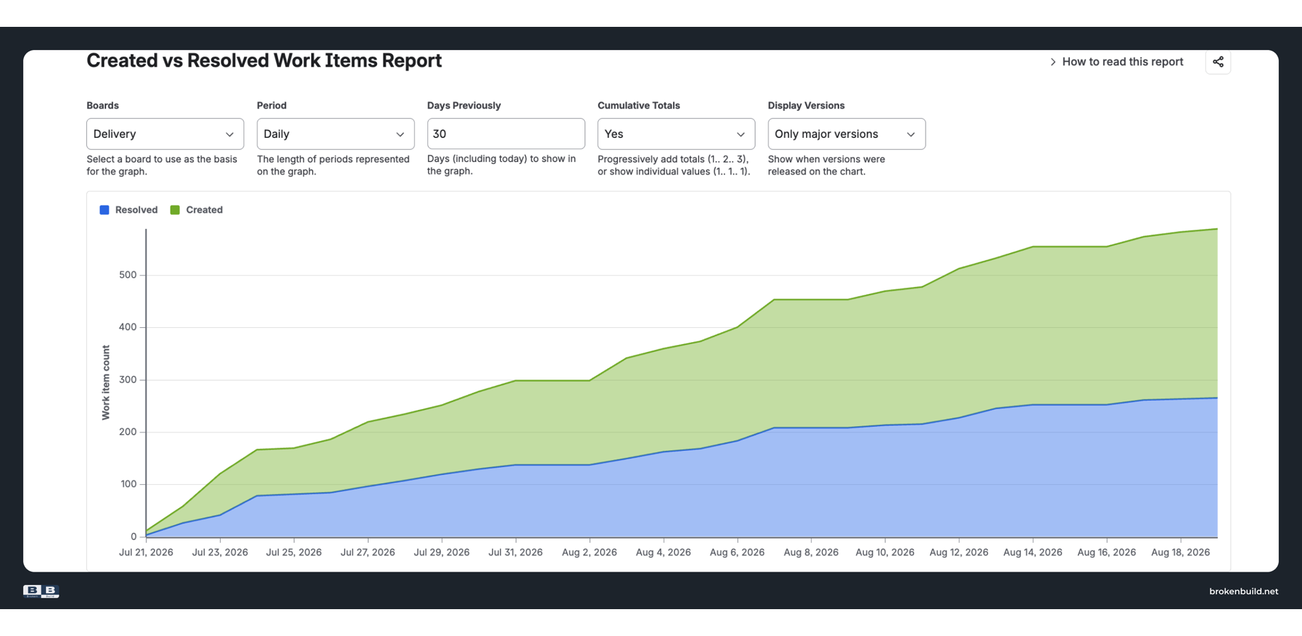
The chart plots two overlapping areas over time – green for issues created, blue for issues resolved.
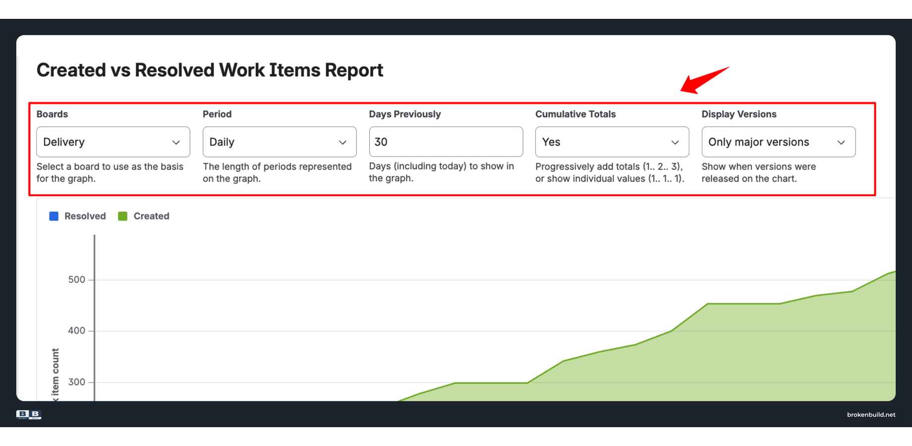
Configuration options
-
Boards – pick one board as your data source
-
Period – group by hour, day, week, month, quarter, or year
-
Days Previously – how many days to include (counting back from today)
-
Cumulative Totals – running totals (Yes) or per-period values (No)
-
Display Versions – overlay release markers on the chart
Reading the chart
With Cumulative Totals: Yes, the gap between green and blue represents your current backlog size. A widening gap means more work enters than leaves. A narrowing gap means the team is catching up.
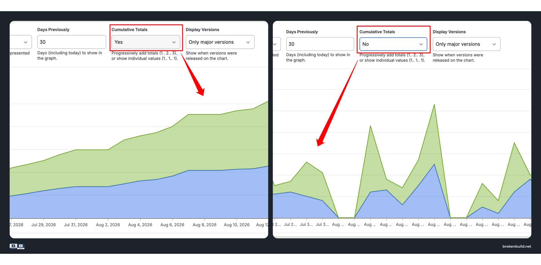
With Cumulative Totals: No, you see per-period counts – useful for spotting sudden spikes like a bug flood after a release or a quiet week during holidays.
When native works
The report serves well for:
-
Quick pulse checks during standup
-
Single-board backlog balance monitoring
-
Simple "are we keeping up?" questions
-
Teams with stable, single-project workflows
⚠️ Where native reporting starts to strain
Once you move past the basics, the native report hits its limits.
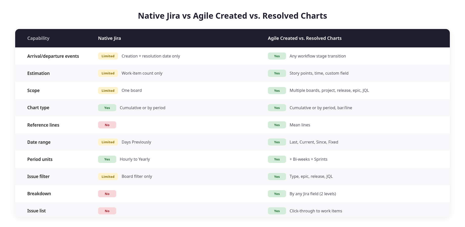
Locked to creation and resolution dates
The chart only knows two events: when an issue was created and when it was resolved. You cannot track whether dev is keeping pace with triage, whether QA is keeping pace with dev, or whether deployment is keeping pace with QA. If your bottleneck lives between workflow stages, this report will not surface it.
Work-item count only
Native counts issues. A five-minute config tweak and a three-sprint refactor count equally. If your team plans in story points, comparing created points against resolved points is the metric that actually matters – and native does not offer it.
Single-board scope
The board dropdown accepts one board. No aggregation across multiple projects, no release-level scope, no initiative or epic rollup, no JQL. Program-level questions require exporting data elsewhere.
No breakdown capability
Native offers no segmentation by issue type, priority, epic, assignee, or component. The chart shows the backlog is growing; it does not indicate which stream of work is responsible.
Reports tab only
The report lives on the project's Reports tab. No dashboard gadget. No Confluence embedding. Stakeholders who need this information have to navigate to each project individually.
🧩 What Agile Created Resolved Charts app adds
Agile Created Resolved Charts by Broken Build starts from the same concept – comparing arrivals against departures – but removes the constraints that make native reporting insufficient for real decisions.
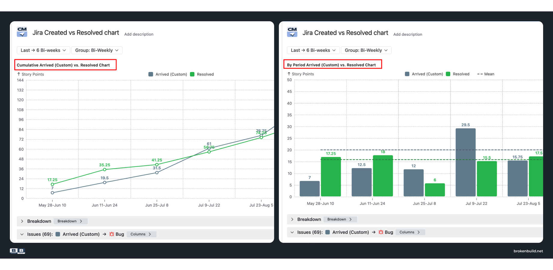
The app provides two complementary views:
Both views draw from the same configuration. Switch between them depending on what question you are answering.
Track any workflow stage
Define "arrived" as issue creation – or as first transition into a specific status. Define "resolved" as any set of statuses you choose.
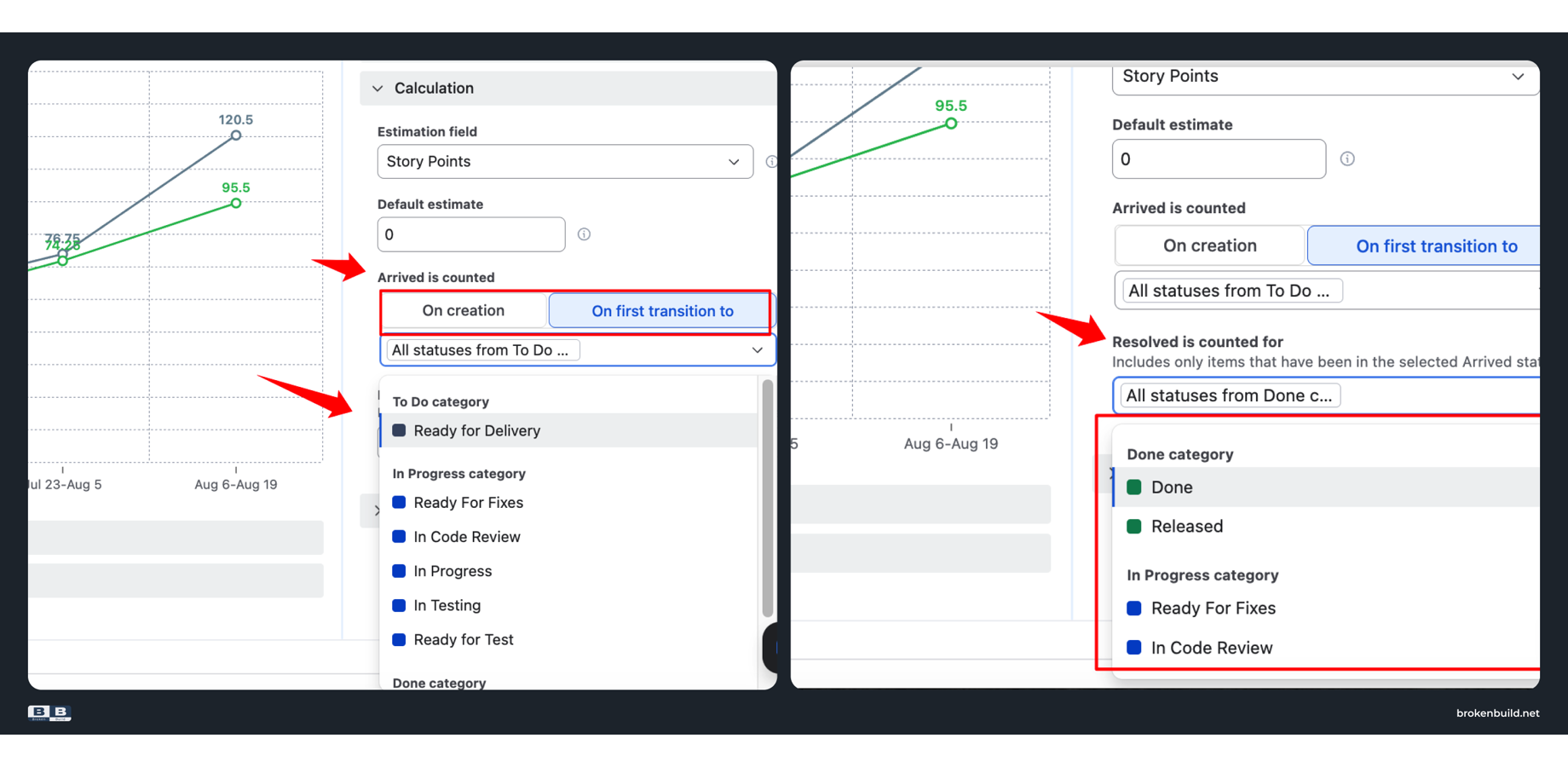
This lets you measure whether dev is keeping pace with what triage approves, whether QA is keeping pace with dev output, or whether deployment is keeping pace with QA sign-off. The bottleneck becomes visible exactly where it lives.
Measure in story points or time
Switch the Y-axis from issue count to story points, original estimate, time spent, or any custom numeric field.
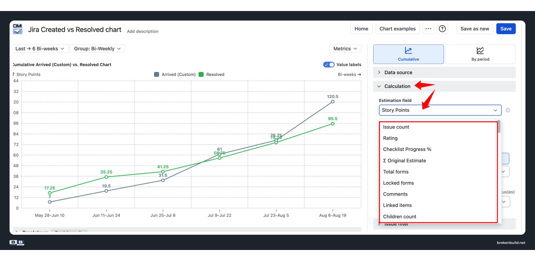
When your team plans in story points, this is the only way to compare demand against delivery in meaningful units. Ten one-pointers and two thirteen-pointers look identical by count – but represent entirely different workloads.
Scope beyond one board
Select from Scrum boards, Kanban boards, projects, releases, initiatives, epics, saved filters, or custom JQL. Combine sources when needed.
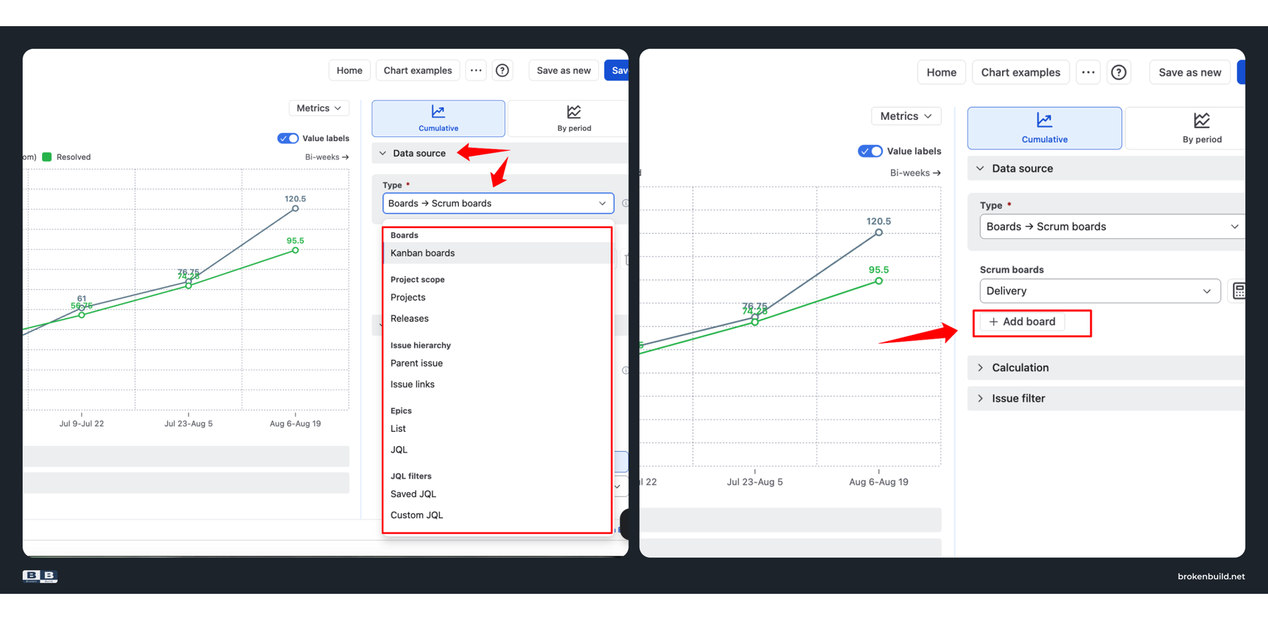
Release-level scope shows whether resolved work is keeping pace with scope additions across every project in the release. Epic-level scope shows whether a specific initiative is draining faster than it fills.
Bar or line chart with reference lines
For the by-period view, choose between a bar chart for side-by-side comparison or a line chart for trend visualization. Enable mean lines to see whether the current period's created or resolved rate is above or below your historical average.
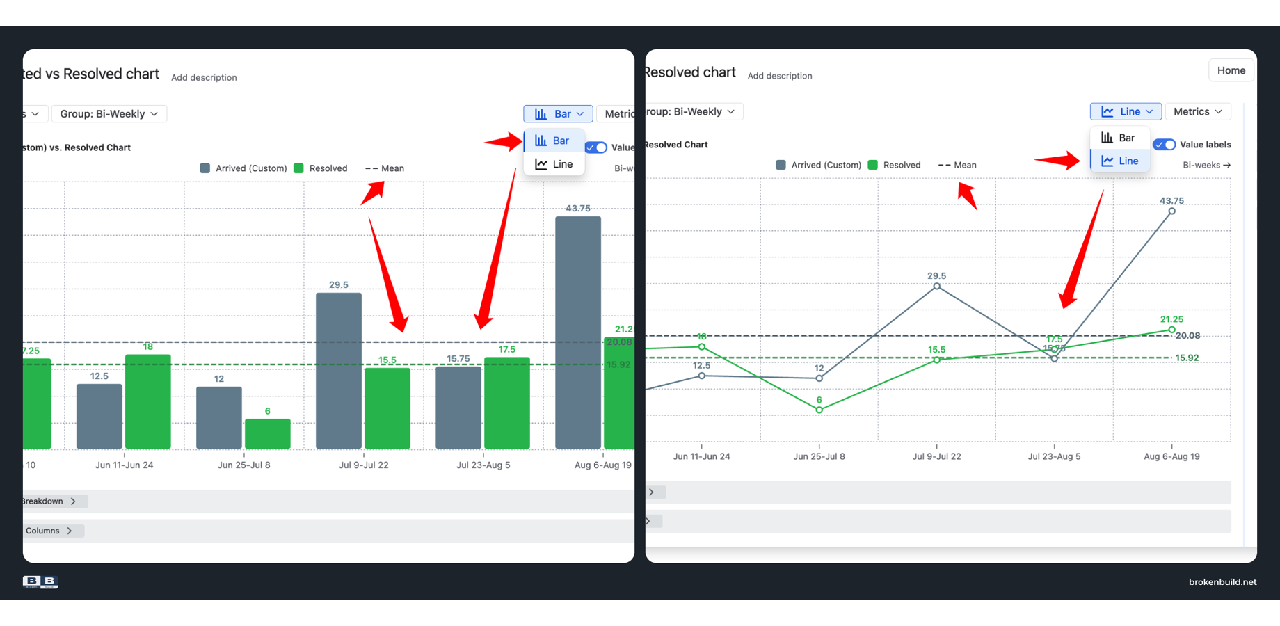
Without a reference line, you are guessing whether this week's throughput is normal or an outlier. With one, deviations are visible at a glance.
Flexible date ranges
Choose from four modes: Last X periods, Current period, Since a specific date, or Fixed date range. Period units include bi-weeks and sprints alongside standard calendar intervals.
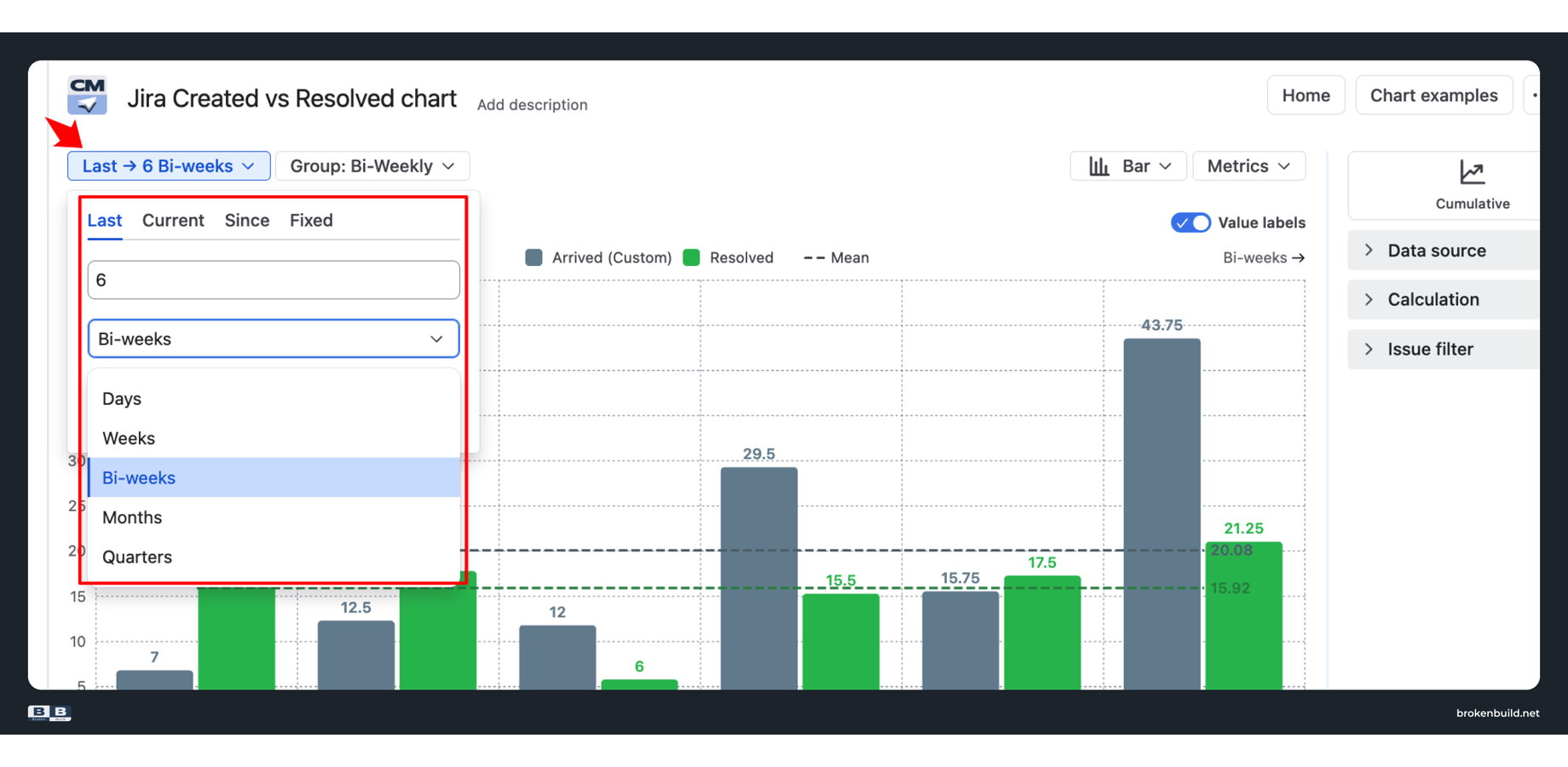
Comparing Q1 against Q2, or analyzing a specific release window, no longer requires calculating days back from today – a number that changes every day and makes saved configurations unreliable.
Filter without creating boards
Filter by issue types, specific epics, releases across projects, or custom JQL – all within a single chart configuration.
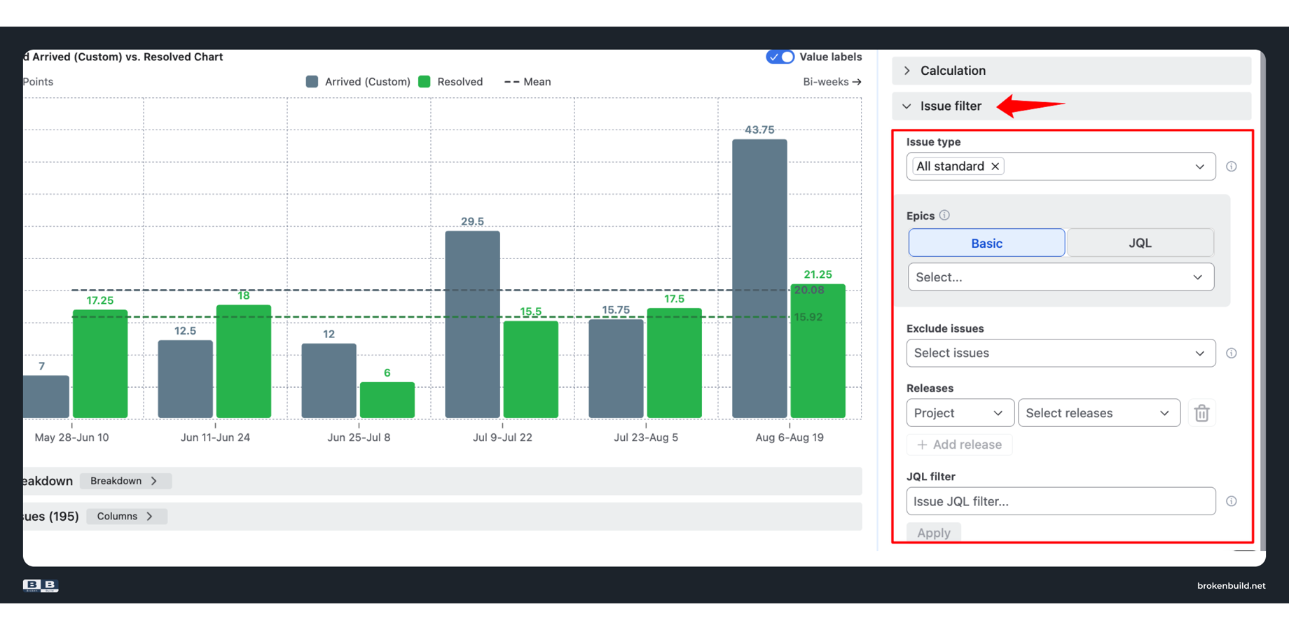
Need to track only bugs? Only one component? Only a specific customer escalation label? One filter configuration answers the question.
Breakdown that answers "why?"
Segment the chart by any Jira field – issue type, priority, epic, assignee, component – up to two nesting levels. Click any data point to see the exact work items.
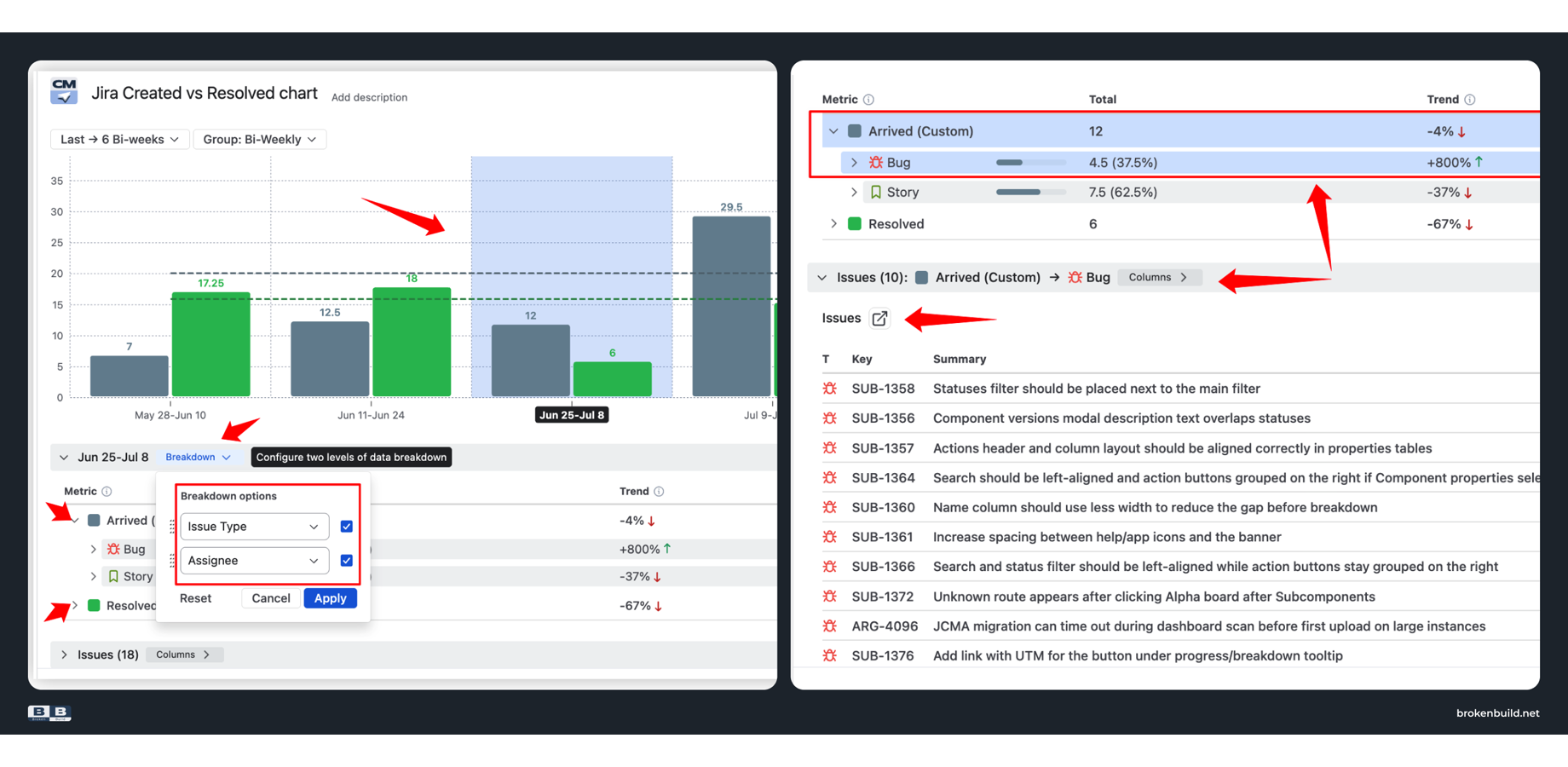
A widening gap becomes actionable: "it is a bug influx on this epic" or "this team's throughput dropped after the reorg." The chart moves from symptom to diagnosis.
Dashboard and Confluence integration
Add the chart to any Jira dashboard as a gadget. Embed in Confluence via Smart Links – filters, grouping, and calculations stay editable inside Confluence. Export to CSV, PNG, or PDF when you need a snapshot.
✅ Native Jira or Agile Created Resolved Charts?
Native is enough when:
-
You monitor one board at a time
-
Creation-to-resolution is your only flow question
-
Issue count is an adequate measure
-
You do not need to know which epic or team is responsible
-
Charts stay on the Reports tab
Evaluate Agile Created Resolved Charts when:
-
You need to track handoffs between workflow stages
-
You measure effort in story points or time
-
Your scope spans multiple projects or releases
-
You need breakdown by epic, team, or issue type
-
Charts belong on dashboards or in Confluence
-
Stakeholders ask why the gap is widening
🎯 A practical next step
If your reporting needs are still narrow – one board, one question, a quick sanity check during standup – the native report handles it. Keep things simple when simple is enough.
But the moment you need to track handoffs between workflow stages, measure actual effort instead of ticket counts, see across multiple projects, or understand what is driving backlog growth – the native report cannot help. It was not built for those questions.
Agile Created Resolved Charts picks up exactly where native stops. Any workflow stage, any estimation field, any scope, breakdown by any Jira field, and embedding wherever your team actually works.
The gap is not the insight. The cause of the gap is.
👉 Evaluate Agile Created Resolved Charts on the Atlassian Marketplace
Part of a larger toolkit
Agile Created Resolved Charts is also available in the Agile Reports and Gadgets bundle – nine agile charts covering velocity, burnup/burndown, cycle time, cumulative flow, and more. If your reporting gaps extend beyond Created vs Resolved, the bundle provides a faster path to comprehensive coverage.
From the Broken Build team behind Agile Created Resolved Charts
