Delivery problems don't announce themselves. Backlog grows quietly. Work stays in progress longer than anyone intended. By the time the slowdown becomes obvious, the window to course-correct is already closing.
That's exactly the gap Agile Reports & Gadgets 9.0 is designed to close.
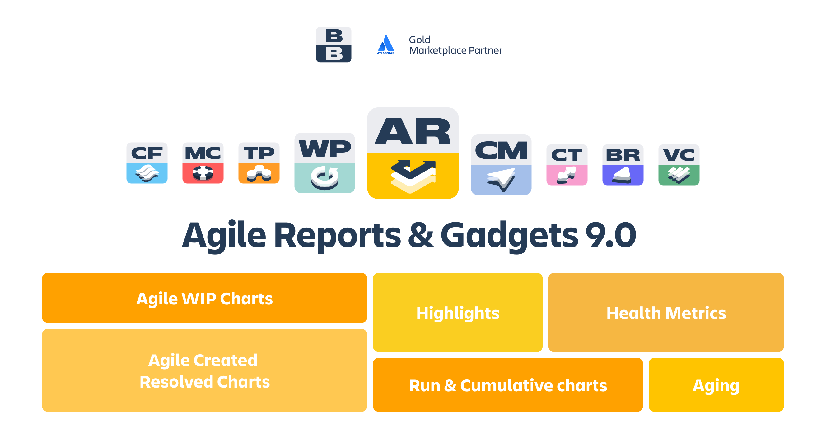
This release introduces two new chart families – Agile Created Resolved Charts and Agile WIP Charts – that make demand imbalance and execution risk visible before they turn into delivery failures. Together, they complete a broader analytical system built for teams that want to inspect, understand, and act on their delivery data in one unified Jira environment.
🔑 What's new at a glance
-
📈 Created vs. Resolved Charts – compare incoming and outgoing work to assess system balance
-
🧭 Work In Progress Charts – monitor active work as it ages, with data-driven health zones
-
⚙️ Configurable metrics – define what counts as "created" and "resolved" to match your real process
-
🔍 Breakdowns by any Jira field – slice data by team, component, issue type, assignee, and more
-
🚦 WIP Health zones – built from historical data, plotted visually to flag at-risk items early
📊 Created vs. Resolved Charts
🔷 Spot system imbalance before it drifts out of control
Most teams track what gets shipped. Fewer track whether the system is actually keeping pace with what's arriving. That's the question Created vs. Resolved Charts are built to answer.
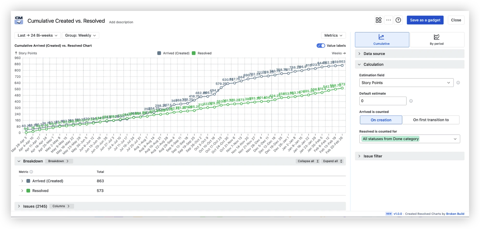
When arrivals consistently outpace resolutions – even slightly – backlog accumulates silently. This chart makes that dynamic visible in real time, so you can treat it as a process question rather than a delivery crisis.
Two view modes give you complementary perspectives:
-
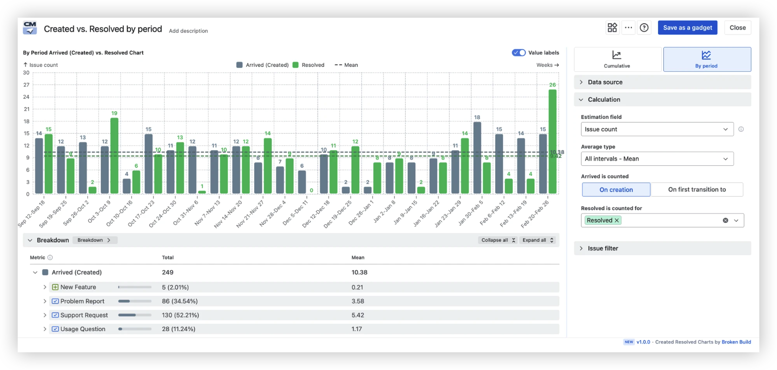
By-period view – examine Arrivals and Departures period by period, with an average line, to reveal whether the imbalance is a trend or a temporary spike. Especially useful for service queues and continuous-flow teams.
📊 Available in: Agile Reports & Gadgets, Agile Created Resolved Charts
🔷 Configurable arrival & departure metrics
Not every team uses the same definition of "created" or "resolved." The chart lets you configure both sides of the equation:
-
Arrivals can be counted on creation or on the first transition to a specific status of your choosing
-
Departures can be counted against all Done-category statuses, or scoped to a specific status, with an option to count only items that passed through the selected Arrival status
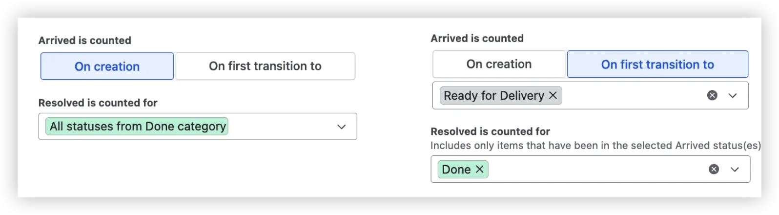
This ensures the chart reflects your actual intake and completion rules, not a generic approximation.
📊 Available in: Agile Reports & Gadgets, Agile Created Resolved Charts
🔷 Breakdown to see where the capacity actually goes
Aggregate numbers tell you that a gap exists. Breakdowns tell you where it comes from.
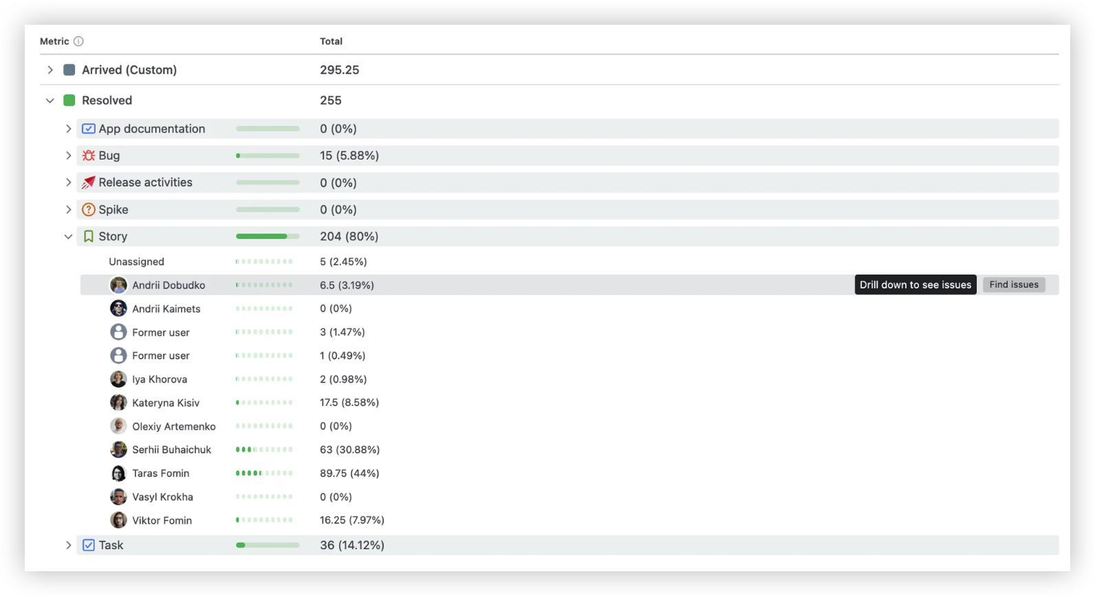
Slice the Created vs. Resolved data by any Jira field – team, component, request type, issue type, assignee, priority, or any custom field – to identify which work streams are consuming the most capacity and widening the gap.
-
Expand a breakdown row to see each segment's contribution to the total
-
Use the issue list to drill down to individual items
-
Combine dimensions to isolate, for example, a specific team and issue type simultaneously
📊 Available in: Agile Reports & Gadgets, Agile Created Resolved Charts
🧭 WIP (Work in Progress) Charts
🔶 Drive daily conversations with data-backed health zones
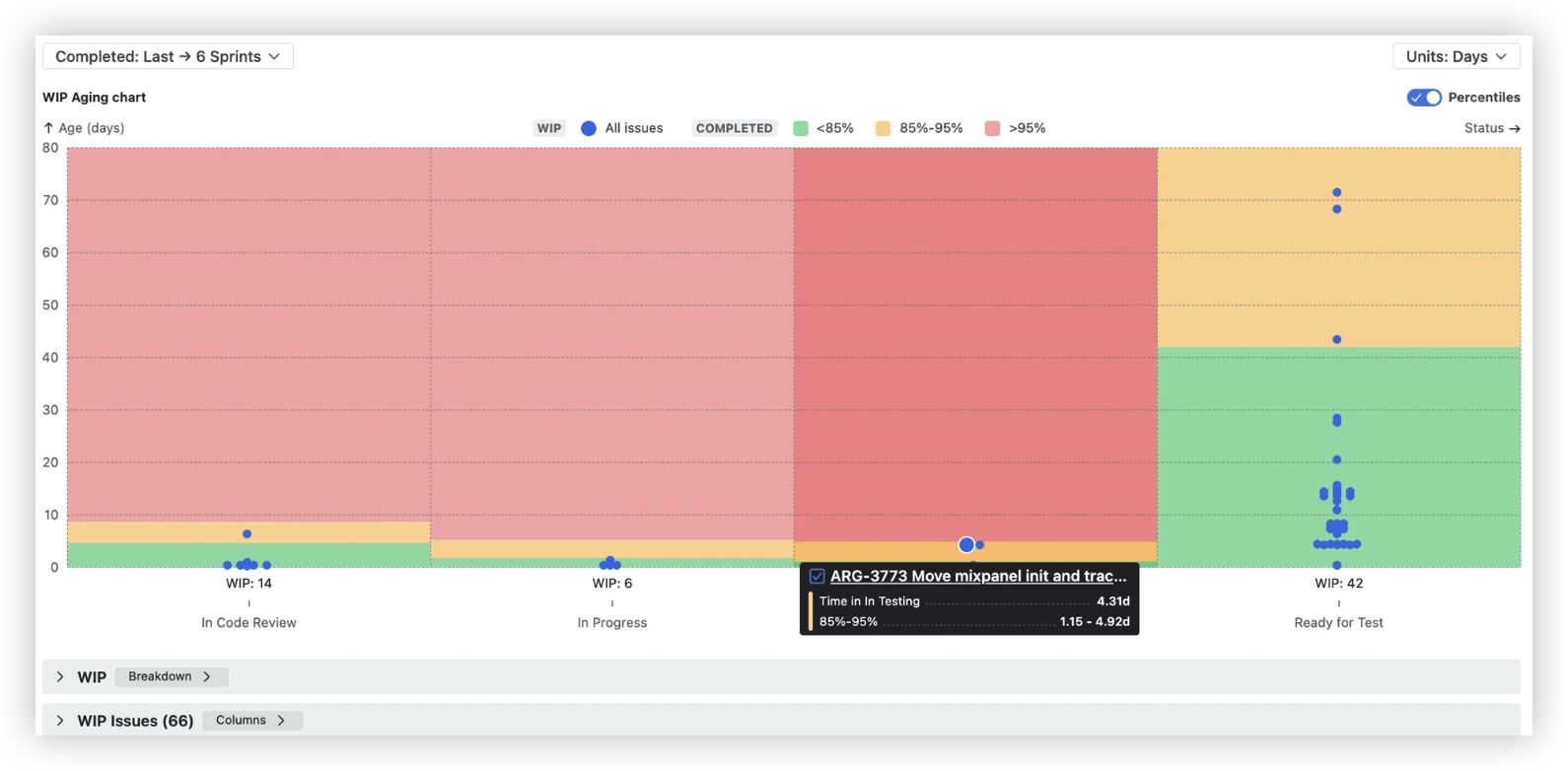
The WIP Aging chart gives your team's daily stand-ups a concrete starting point: which items in progress are showing signs of risk?
-
Health zones are built automatically from historical data on completed items
-
Each status column shows colour-coded zones – 🟢 green, 🟡 yellow, 🔴 red
-
Active WIP items are plotted within those zones to see at a glance which items are aging normally and which are drifting into risk territory
This replaces gut feeling with a consistent, data-grounded signal. When an item appears in the red zone, the conversation shifts from "is this a problem?" to "what do we need to do to move it forward?"
📊 Available in: Agile Reports & Gadgets, Agile WIP Charts
🔶 Catch at-risk items early with a breakdown and an issue list
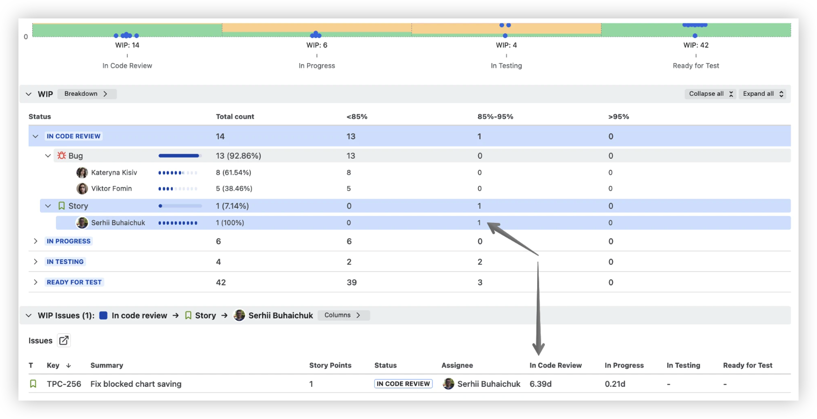
Below the chart, a breakdown panel lets you dig into specifics:
-
Segment WIP items by status, then by a second dimension (issue type, assignee, component…)
-
Each row shows item count distributed across health zone bands: <85% / 85–95% / >95% percentile
-
A concentration in the >95% band = drill deeper
-
Open the issue list to see individual items with time spent in each status
📊 Available in: Agile Reports & Gadgets, Agile WIP Charts
🔶 Configure which part of the flow is in focus
The WIP Aging chart lets you select exactly which statuses appear – so health zones and WIP items stay focused on the segment of the flow that matters most for your team's current context:
-
Development team? Spotlight In Code Review, In Progress, Ready for Test
-
Service team? Focus on Waiting for Response, In Investigation
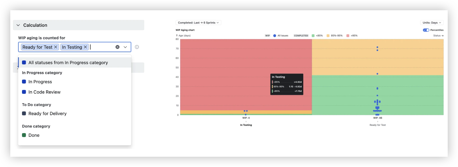
Each configuration produces a distinct chart with health zones calibrated to the statuses you've selected – relevant signal, no noise.
📊 Available in: Agile Reports & Gadgets, Agile WIP Charts
🗺️ The bigger picture: a complete Agile analytics system
These two chart families complete Agile Reports & Gadgets as a full-spectrum delivery toolkit, covering four analytical perspectives:
-
🌊 Flow & system health – Cumulative Flow, Created vs. Resolved, Work In Progress charts
-
⚡ Delivery & sprint metrics – Throughput, Velocity Charts
-
🔮 Forecasting – Monte Carlo, Burnup Burndown Charts
-
⏱️ Flow efficiency & time – Cycle Time, Time in Status charts
All charts draw from the same data sources – Jira boards, projects, releases, and JQL filters – enhanced with 30+ built-in delivery metrics and 38 ready-to-use templates, eliminating the need to reconcile numbers across separate tools.
🎉 Ready to see your delivery system clearly?
Agile Reports & Gadgets 9.0 closes the last visibility gap in a toolkit that already covers flow, forecasting, and sprint performance. With Created vs. Resolved and WIP Charts now in place, you can:
-
🟢 See demand balance in real time – know whether your system is keeping pace or quietly building backlog
-
🔍 Drill from trend to ticket – go from a chart-level signal to the specific item that needs action
-
🚦 Catch aging work before it becomes a blocker – health zones built from your own data, not arbitrary rules
Whether you're running Scrum, Kanban, SAFe, or managing Projects, Releases, and Epics – Agile Reports & Gadgets 9.0 gives your Jira dashboards the demand and execution visibility they've been missing.
📥 Install Agile Reports & Gadgets from the Atlassian Marketplace, add it to your Jira dashboards, and start every delivery conversation with data instead of guesswork.
Every release adds another layer of insight. Because the more clearly you see your system, the better decisions you make. 🚀
Cheers,
The Broken Build Team
