There’s a specific kind of chaos that only Jira can produce.
On paper, everything is “In Progress.”
In reality, half the work is parked in Review, three items are “Waiting for QA,” and one innocent ticket has been “Blocked” long enough to qualify as a historical landmark.
And the worst part? Everyone is working hard.
So when leaders ask, “Why are we late again?” the answers usually sound like:
- “Dependencies.”
- “Complexity.”
- “We got interrupted.”
- “We’re agile, so… things change.” (said with the confidence of someone who just used agile as a smoke bomb)
Here’s my opinionated take:
Most orgs don’t have a delivery speed problem. They have a waiting problem.
If you want maturity — predictable delivery, stable sprints, fewer surprises — you don’t start by policing effort. You start by measuring where time actually goes.
That’s exactly what Time in Status is built for: turning Jira status history into timing signals like cycle/lead time and Working vs Waiting, with calendar-aware accuracy and visibility across dashboards/boards/exports.
Let’s turn that into a KPI pack leaders will actually open more than once.
The maturity lens: “Working vs Waiting”
This is the simplest upgrade you can make to how your org reads Jira.
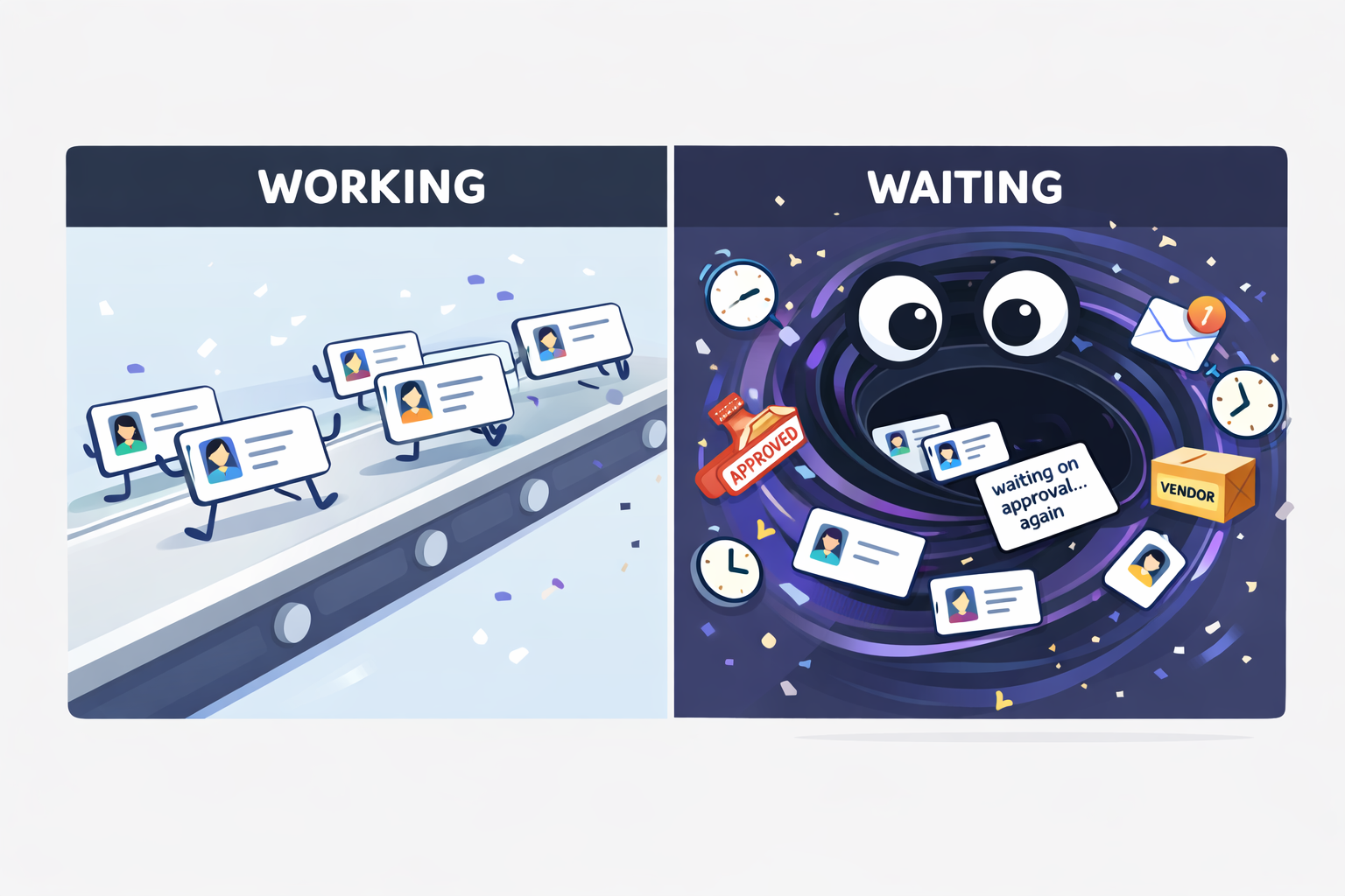
Working = time in statuses where someone is actively progressing the work.
Waiting = time in statuses where work is parked: queues, handoffs, approvals, customer/vendor replies, “ready for ___,” etc.
Why this matters:
Cycle time tells you how long.
Working vs Waiting tells you why it felt long.
And once you see the “why,” improvement stops being a debate.
A quick reality check: why Jira reports often fail leaders
Leaders don’t need more granular tickets. They need macro-level trends: where items get stuck, where rework happens, whether patterns are improving.
Traditional reporting often misses two things:
- It treats all time the same (as if “Waiting for Approval” is the same as “Implementing”).
- It surfaces data, but not decisions.
So the goal here isn’t “more reporting.”
It’s a system view of delivery.
Step 1: Make a boring status map (boring is good)
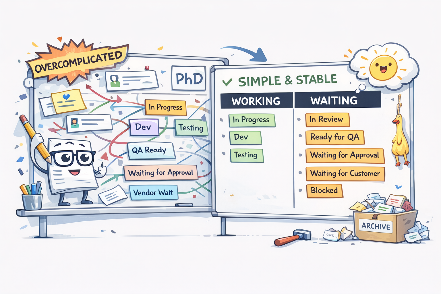
Here’s where teams go wrong: they build a status taxonomy worthy of a PhD thesis.
Don’t. Start simple and stable.
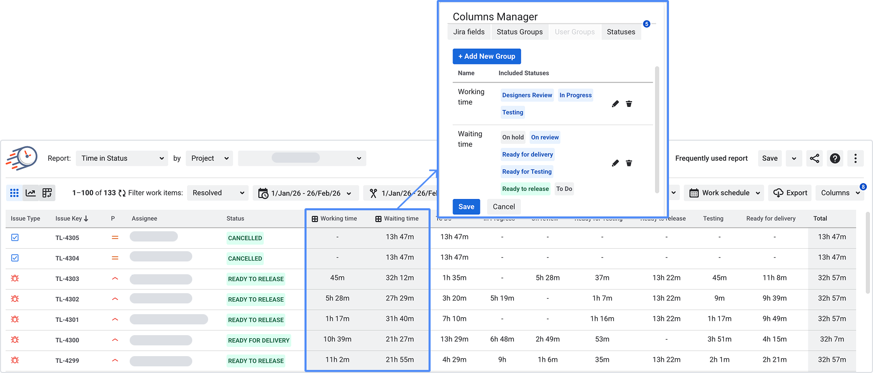
Create two groups:
Example mapping:
- Working: In Progress, Dev, Testing
- Waiting: In Review, Ready for QA, Waiting for Approval, Waiting for Customer, Blocked
If you want to level up later, you can split Waiting into sub-types (Approval vs Customer vs Vendor), but only after the team trusts the basic split.
This is the foundation for every KPI below.
Step 2: Make time fair (otherwise your data starts arguments)
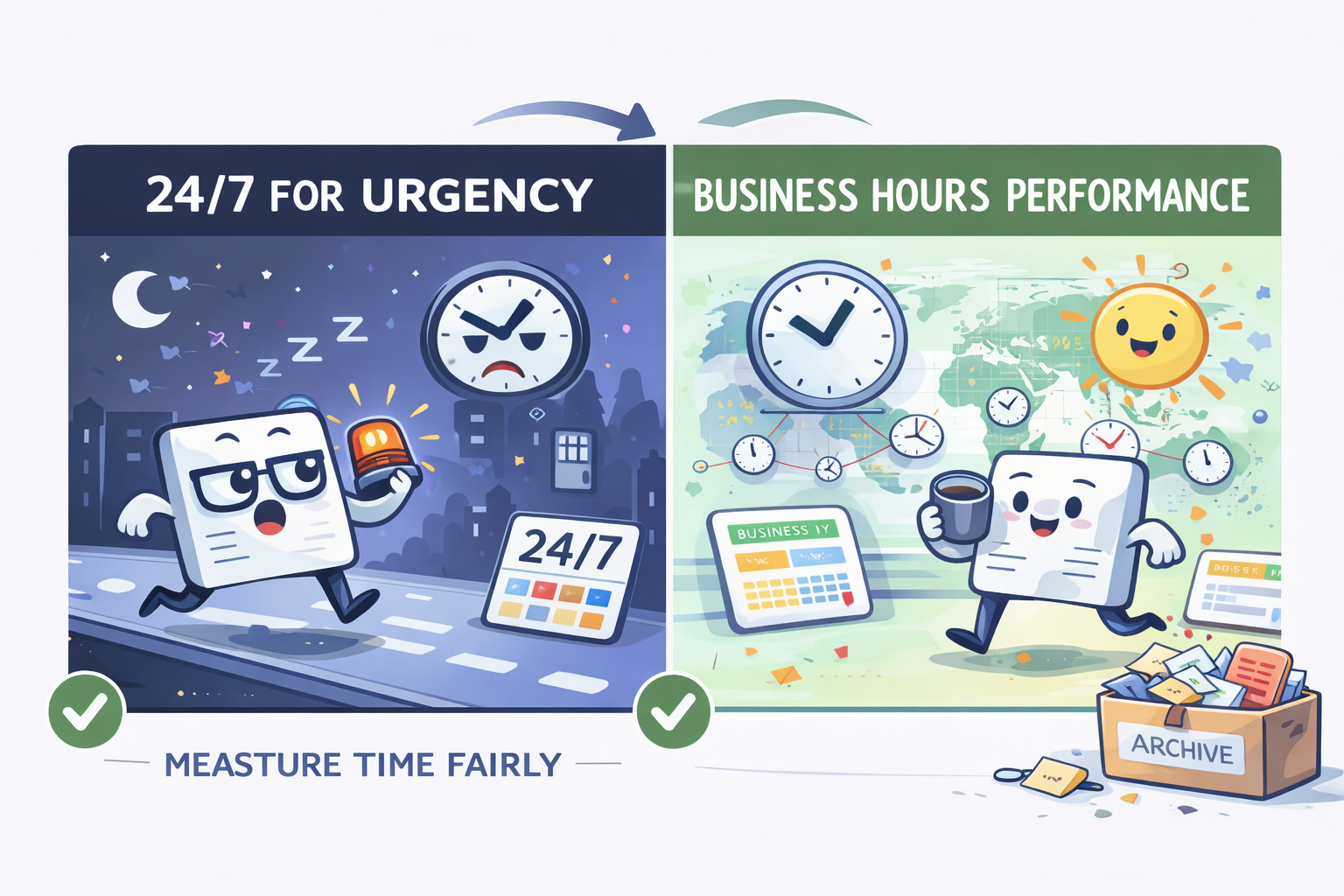
If you work across time zones, raw wall-clock timing can make teams look “slow” because… humans sleep.
Time in Status supports calendar-aware timing (business hours, time zones, holidays per team).
My rule of thumb:
- Use 24/7 if you’re measuring urgency (incidents, true wall-clock responsiveness).
- Use business-hour calendars if you’re measuring performance and process maturity (especially across regions).
Nothing kills adoption faster than “your chart is unfair.”
The KPI pack: what leaders actually use (and why)
Let’s be honest: a “KPI pack” sounds like a corporate ritual where joy goes to die.
So here’s the promise:
These KPIs are designed to answer real leadership questions without micromanaging teams.
KPI 1 — Working vs Waiting split (your maturity headline)
If you only track one thing, track this.
When leaders see that Waiting dominates, the conversation changes from:
“Why aren’t people faster?”
to:
“Why does work spend so much time parked between steps?”
That’s the start of maturity.
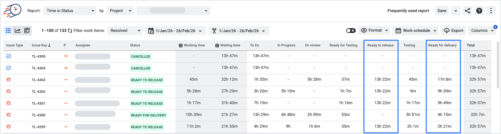
KPI 2 — Where Waiting lives (top waiting statuses)
Once you know you have a waiting problem, the next question is where.
Most orgs have one “king” bottleneck:
- Review queue
- QA readiness
- Approval chain
- Customer response
- Vendor/procurement
And this is where improvement becomes specific, not emotional.
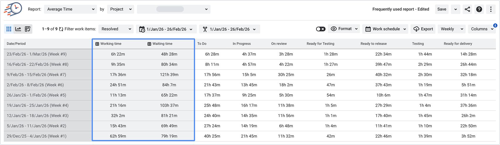
KPI 3 — Average time in key statuses (the “slow step” detector)
Averages aren’t perfect — but they’re very effective for this job:
“Which step stretches our delivery the most on average?”
This KPI becomes even stronger when you compare:
- by team
- by issue type (bugs vs features vs requests)
- by project/epic
- by time period
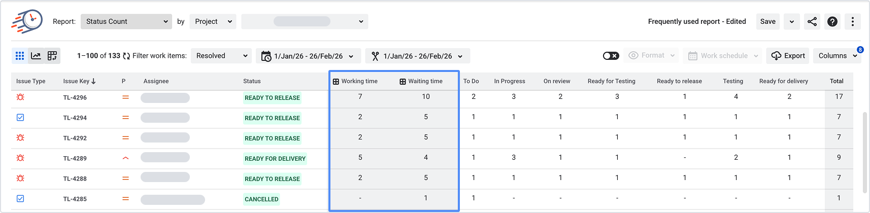
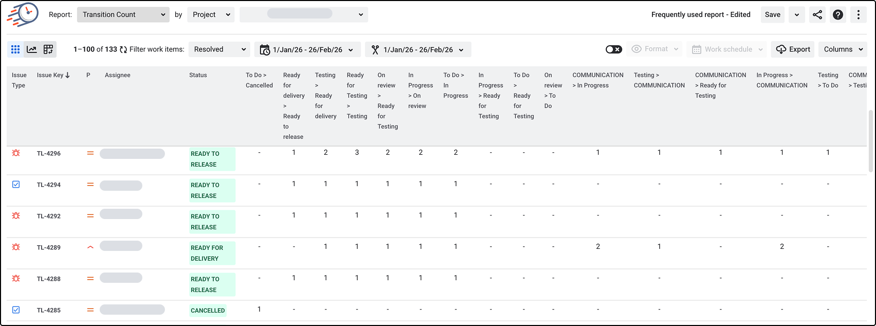
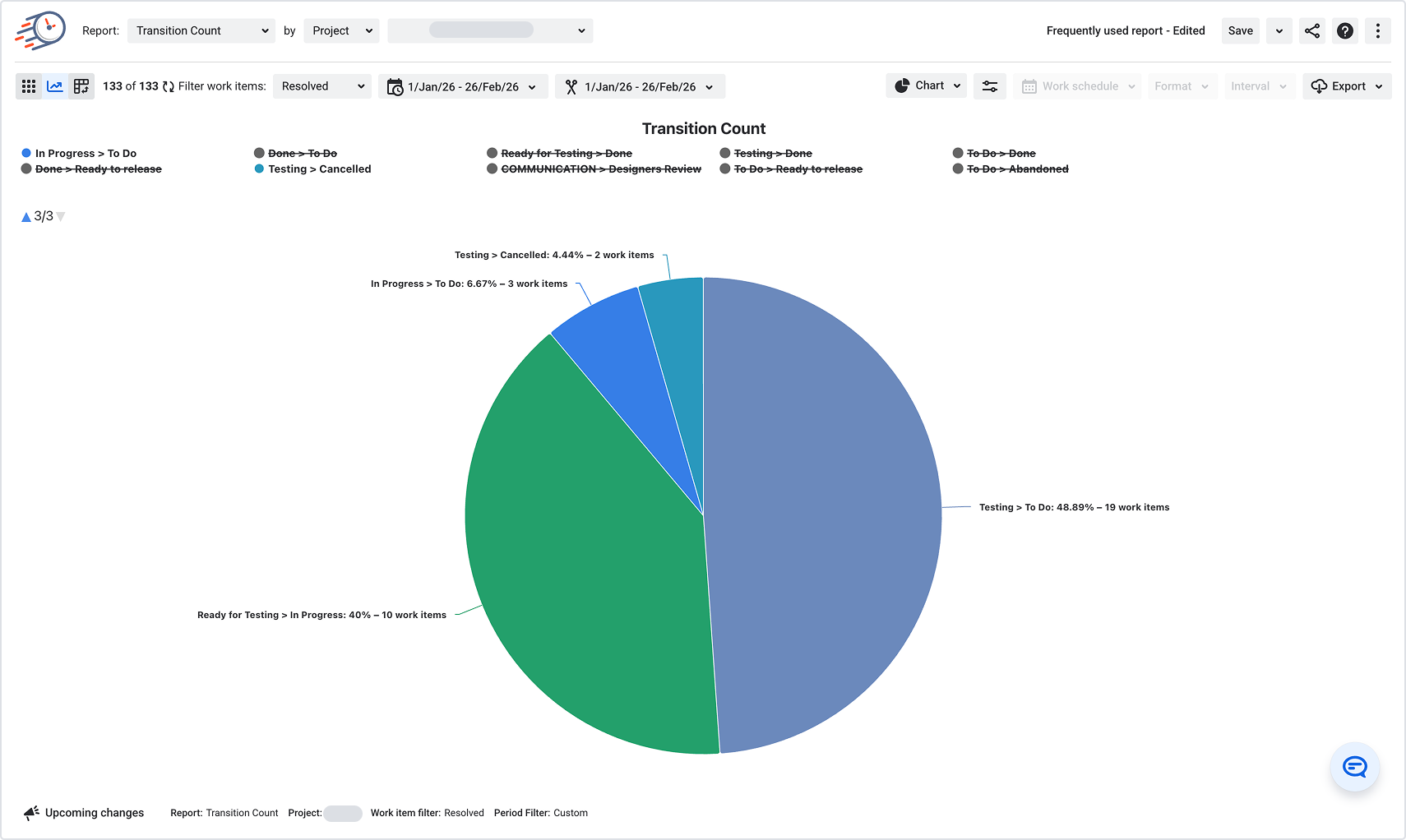
 KPI 4 — Rework loops (ping-pong tax)
Nothing quietly destroys delivery like bounce-backs.
Time in Status is explicitly positioned to help teams spot rework loops like Dev ↔ QA “ping-pong” and tighten entry/exit criteria.
Rework is expensive because it multiplies both:
- Working time (redoing things)
- Waiting time (re-queues, re-reviews)
If you want a maturity signal that leaders instantly understand, it’s this:
“Are we finishing… or recycling?”
KPI 5 — Who’s overloaded (flow bottlenecks by ownership)
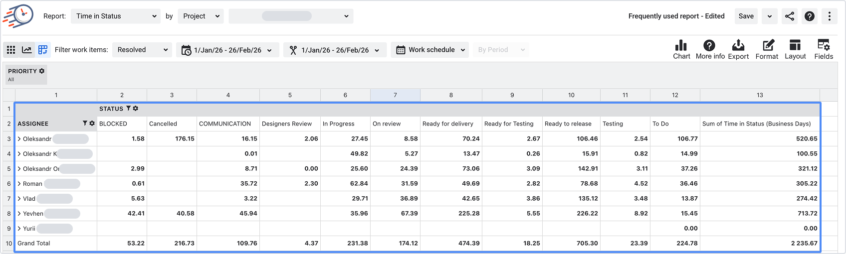
This isn’t about blaming people. It’s about finding structural chokepoints.
When one role is the only one who can approve, test, or review, the system queues behind them.
A leader can fix this without touching a single ticket:
- change the policy
- rotate responsibility
- reduce batch size entering that stage
- clarify “ready” criteria so fewer items bounce back
KPI 6 — “Aging” work (what’s stuck right now)
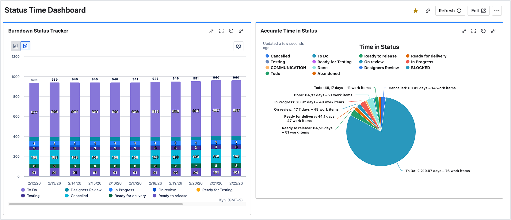
Leaders shouldn’t chase all work. They should chase the oldest waiting work.
This KPI answers:
- “What is currently most at risk?”
- “Where should we unblock first?”
Time in Status also supports enhancing issue visibility with time-tracking custom fields and monitoring key metrics on Jira dashboard gadgets, which is perfect for this “what’s aging” view.
KPI 7 — Sprint stability signals (why commitments keep slipping)
You can’t talk maturity without acknowledging planning reality:
- carryover
- workload balance
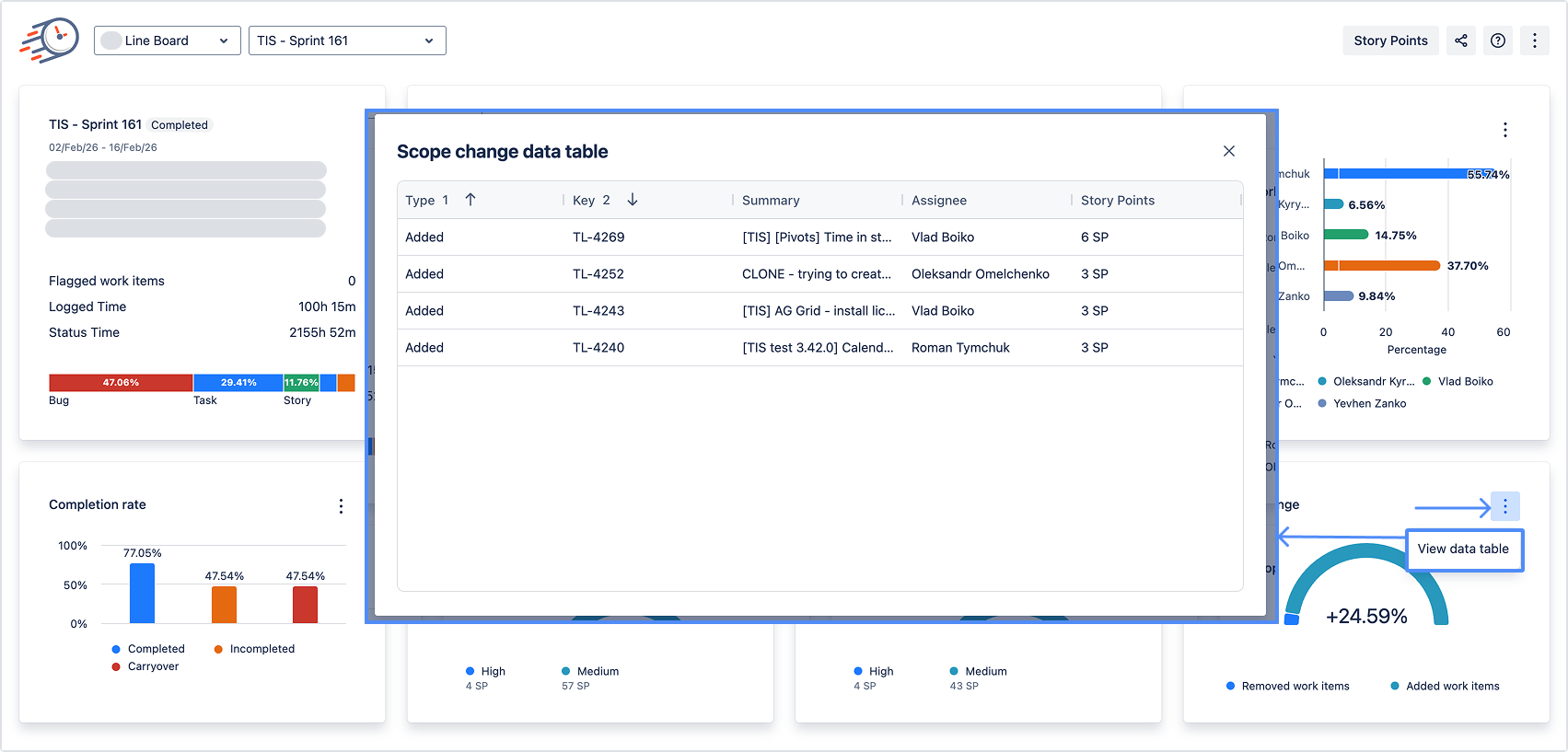
- constant scope changes
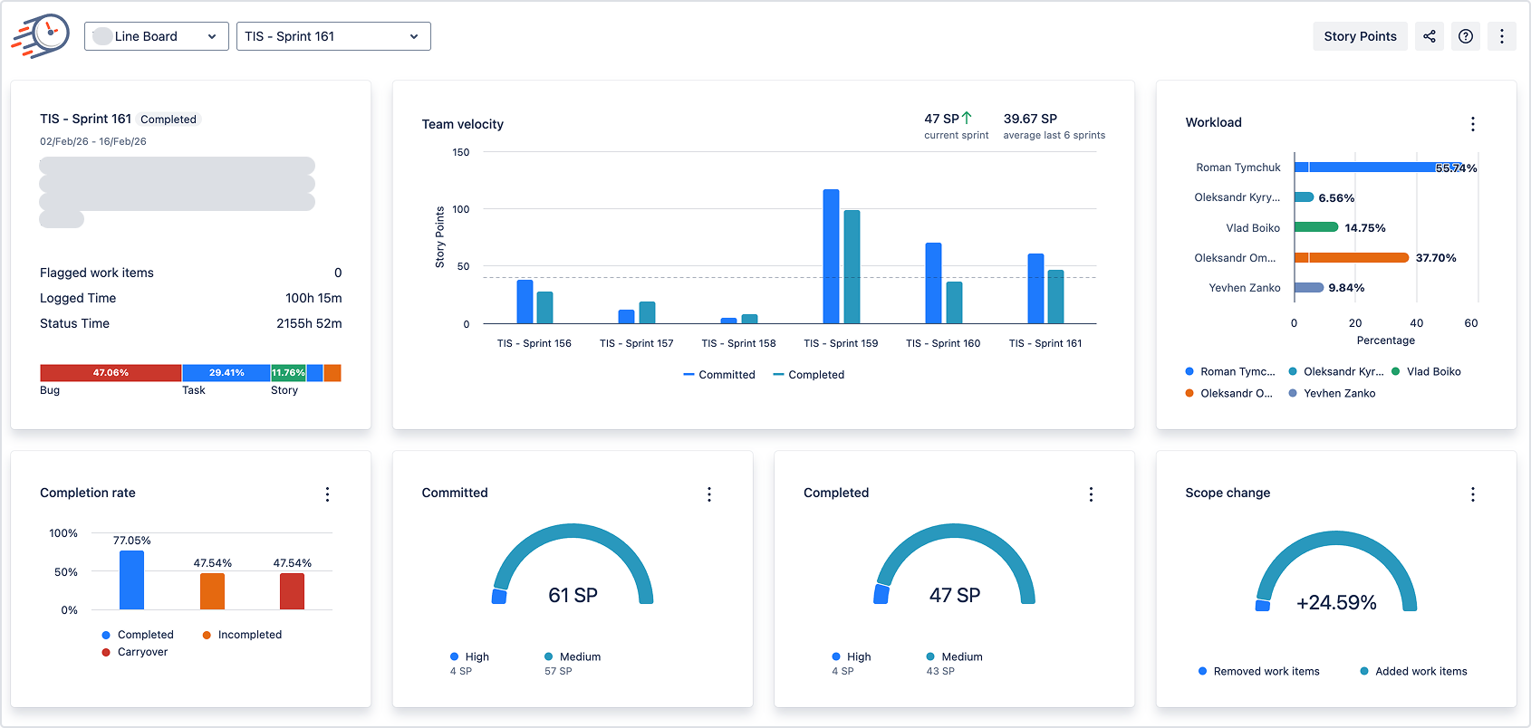
Time in Status supports sprint analysis with charts on velocity, workload, carryover, and more.
This KPI isn’t for “velocity arguments.”
It’s for answering one question:
“Are we missing commitments because we can’t execute… or because we keep changing the plan?”
Two mini case studies (because theory is cute, but results are better)
Case study 1: “QA Waiting” spikes — and the fix is surprisingly boring
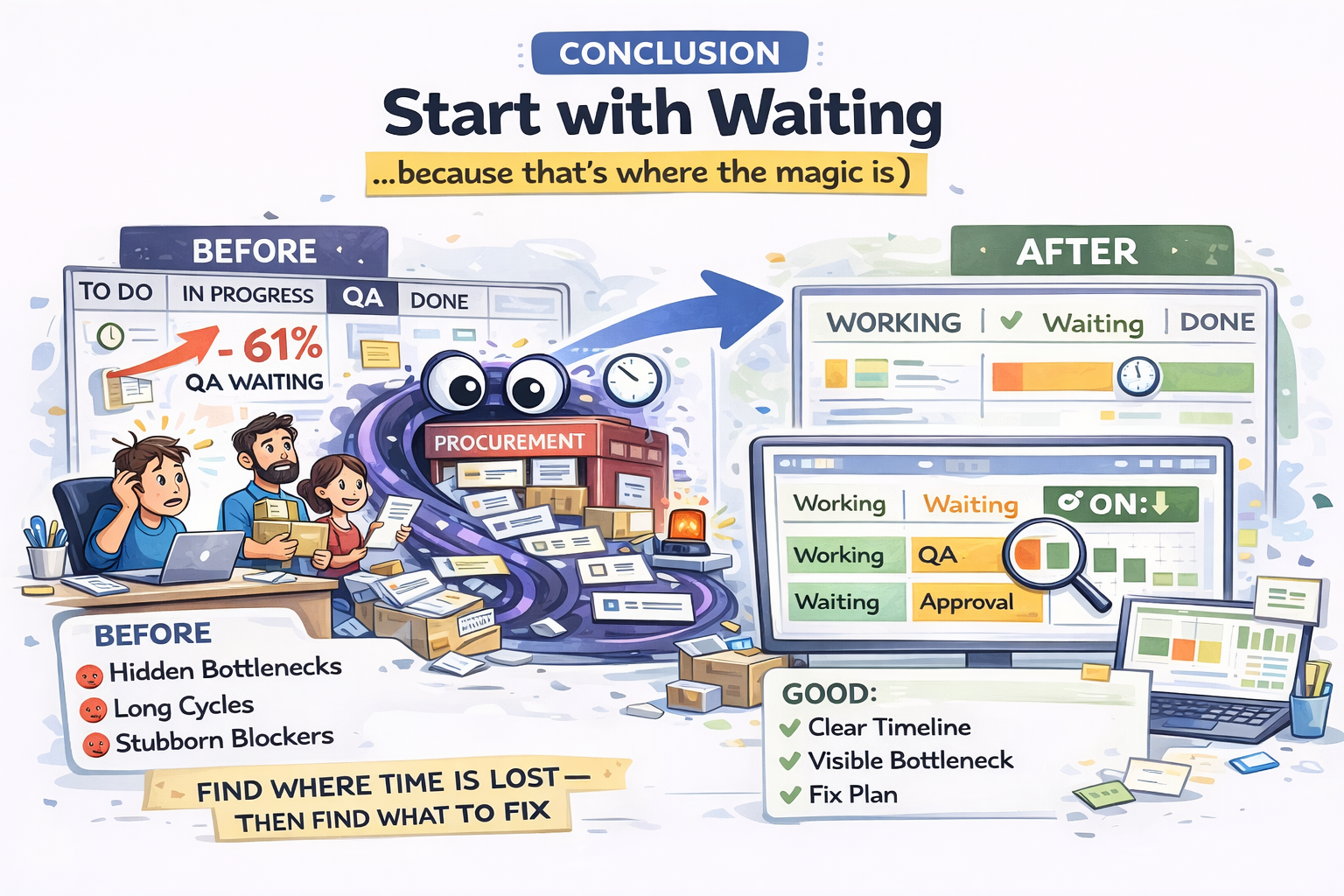
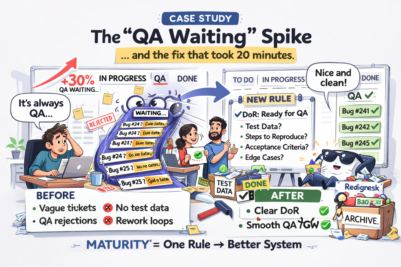
A squad sees QA ‘Waiting’ jump 30% week-over-week. Instead of hiring or adding meetings, they tighten Definition of Ready and add test data expectations to tickets. Result: rework drops next sprint.
My favorite part of this story is that it’s not heroic.
It’s mature.
Maturity looks like: “We changed one rule. The system improved.”
Case study 2: Procurement is the bottleneck (and nobody knew)
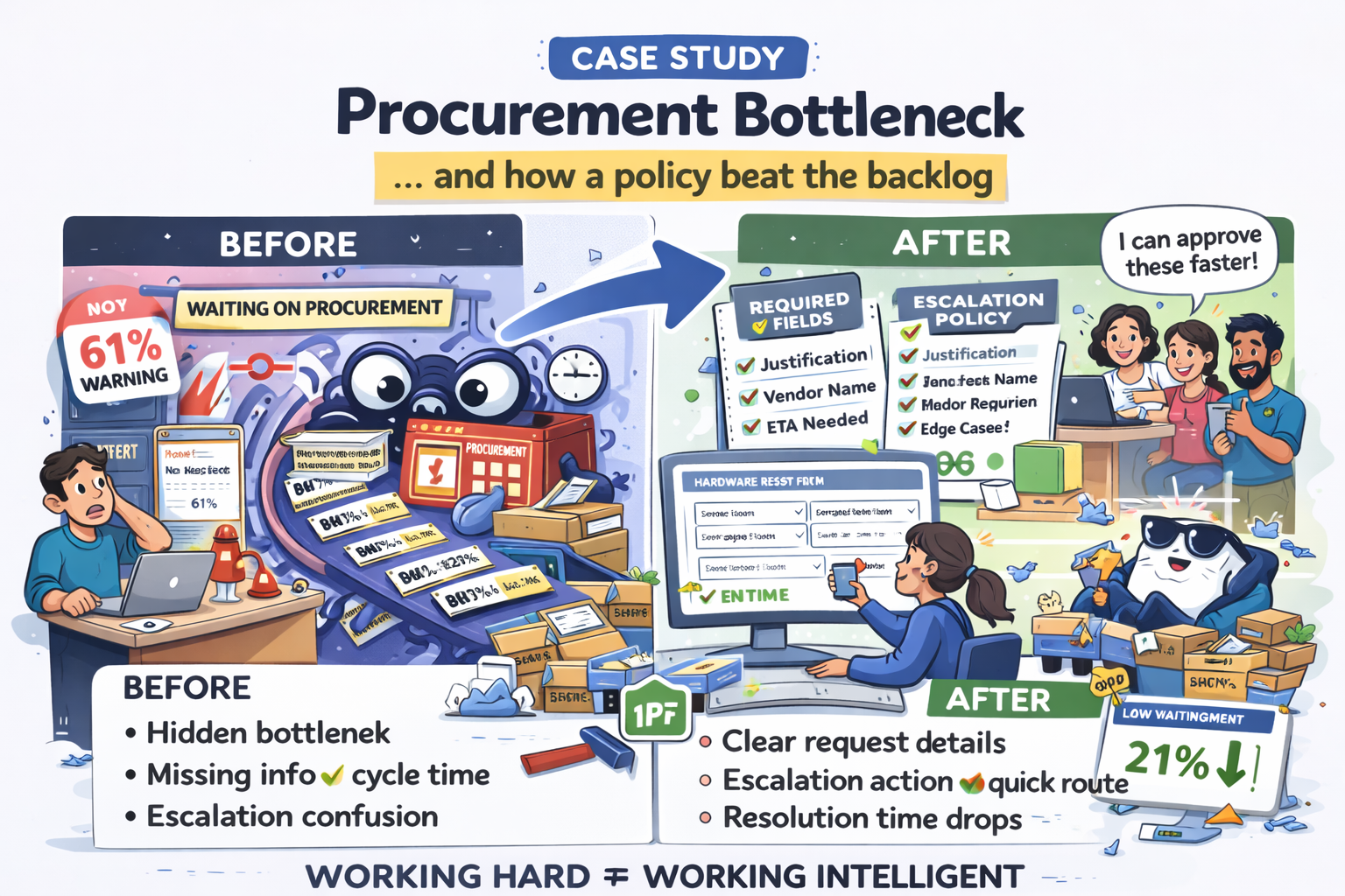
Hardware requests show 61% of time in ‘Waiting on Procurement.’ The team adds required fields and an escalation policy. Resolution time drops and breaches decline the next month.
This is why “working harder” is a trap.
The bottleneck wasn’t effort. It was missing information + unclear escalation.
Conclusion: Start with Waiting (because that’s where the magic is)
If you take one thing from this article, make it this:
Speed doesn’t come from pushing Working harder. It comes from reducing Waiting.
So here’s your simplest “leader starter kit”:
- Map statuses into Working vs Waiting
- Make time fair with calendars if needed
- Baseline: Working vs Waiting + top waiting statuses
- Pick one bottleneck and change one policy
- Re-measure next sprint
That’s it. That’s the loop.
And if you want an immediate “wow” moment for stakeholders, show them this sentence on a dashboard slide:
“Here’s where work is waiting — and here’s what we’re going to fix next.”
Time in Status exists to make exactly that sentence easy to prove, easy to share, and hard to ignore.