Annual planning is one of the most challenging moments for any team.
You’re expected to answer big questions:
-
How much work can we realistically deliver next year?
-
Where are our capacity limits?
-
What slows us down and will it still slow us down in six months?
-
Can we commit to roadmaps with confidence?
Most teams try to answer these questions using velocity, past sprint reports, or gut feeling. But year after year, plans slip, priorities change, and delivery becomes reactive instead of predictable.

One of the most overlooked, yet powerful, tools for improving long-term planning is the WIP (Work in Progress) Chart, especially when powered by Time Metrics Tracker.
In this article, we’ll explore how the WIP Chart of Time Metrics Tracker helps teams move from short-term delivery thinking to data-driven annual planning.
Why Annual Planning Fails Without Flow Visibility
Annual planning often focuses on what to build:
-
features
-
initiatives
-
epics
-
strategic goals
But it rarely focuses on how work actually flows through the system.
Common symptoms of weak planning include:
Without understanding WIP behavior over time, annual plans are built on assumptions - not evidence.
What Is a WIP Chart in Time Metrics Tracker?
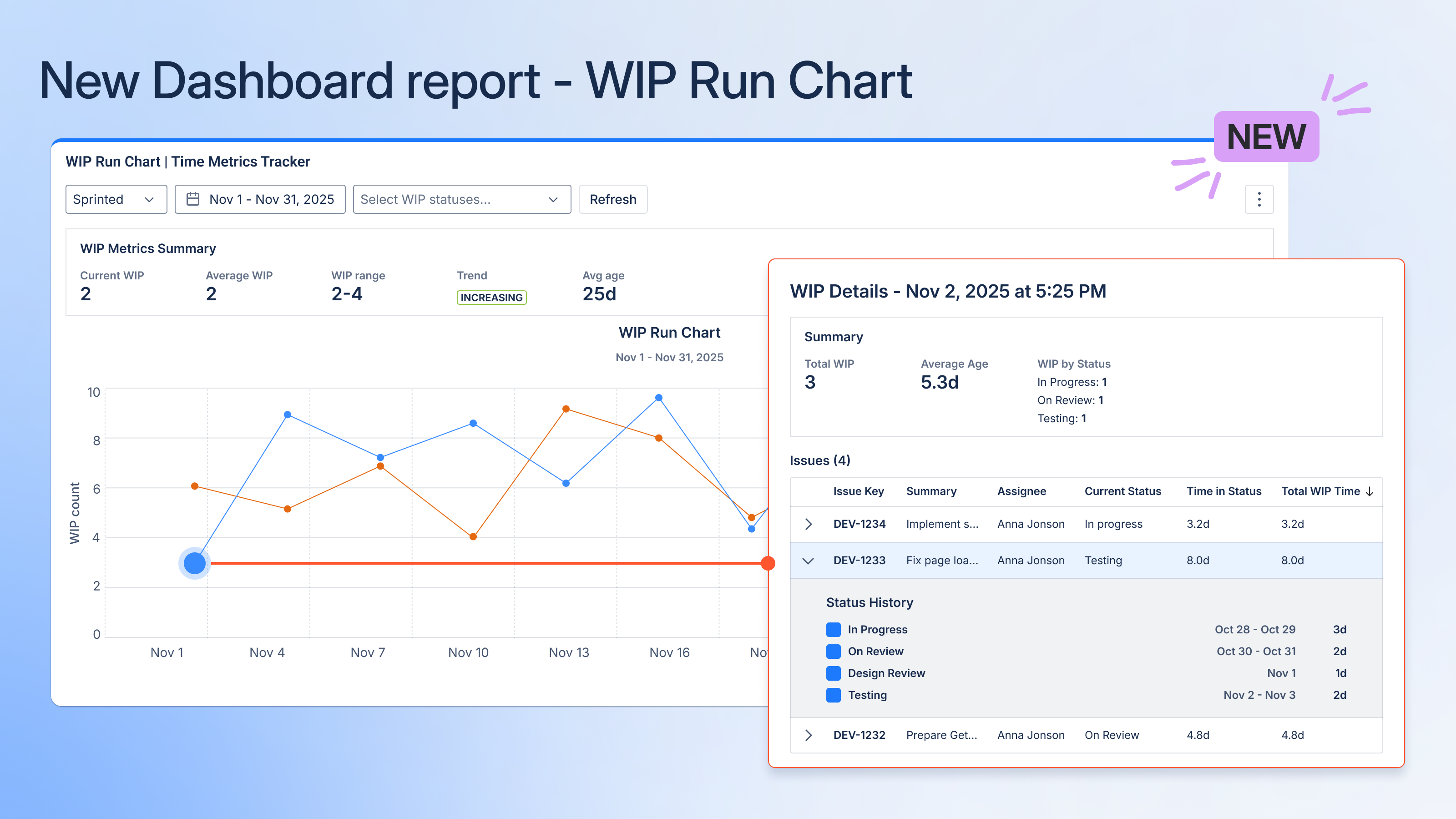
The WIP Chart in Time Metrics Tracker visualizes:
-
how many issues are actively in progress
-
how WIP changes over time
-
how work accumulates across workflow stages
Unlike static Jira reports, this chart is time-aware and flow-focused, showing how WIP evolves — not just where issues are today.
In simple terms:
The WIP Chart shows how much work your system is trying to handle at any given moment.
And that’s critical for planning.
Why WIP Is a Key Metric for Long-Term Planning
There’s a proven relationship between:
-
WIP
-
cycle time
-
predictability
As WIP increases:
This relationship doesn’t change with better intentions or stronger roadmaps. It’s structural.
That’s why WIP is one of the most reliable indicators for capacity realism during annual planning.
Moving from Sprint Thinking to Yearly Flow Thinking
Sprint reports are useful — but they’re short-term snapshots.
Annual planning requires a longitudinal view, and that’s where the WIP Chart excels.
With Time Metrics Tracker, teams can:
-
analyze WIP trends over months
-
identify recurring overload periods
-
see seasonal spikes in work
-
understand how WIP impacts delivery speed
This turns planning conversations from:
“What do we want to build next year?”
into:
“What can our system realistically absorb without slowing down?”
How Teams Use the WIP Chart for Annual Planning
1. Identify Sustainable WIP Levels
By reviewing historical WIP data, teams can identify:
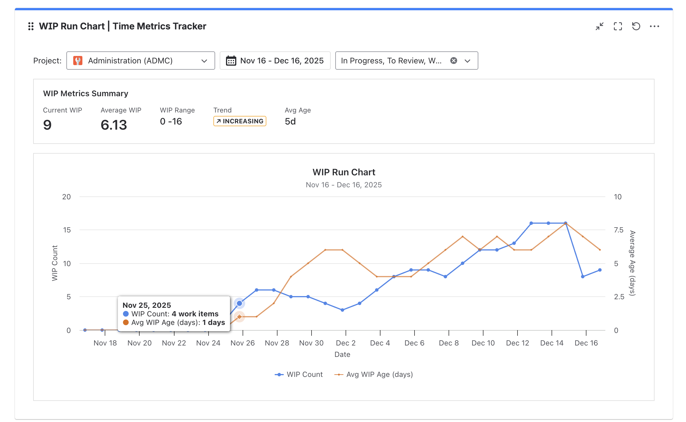
This creates a baseline for sustainable work, which becomes a foundation for annual planning.
Instead of guessing capacity, teams use evidence.
2. Spot Structural Bottlenecks Early
The WIP Chart often reveals:
-
persistent congestion in QA
-
backlog accumulation before releases
-
handoff bottlenecks between teams
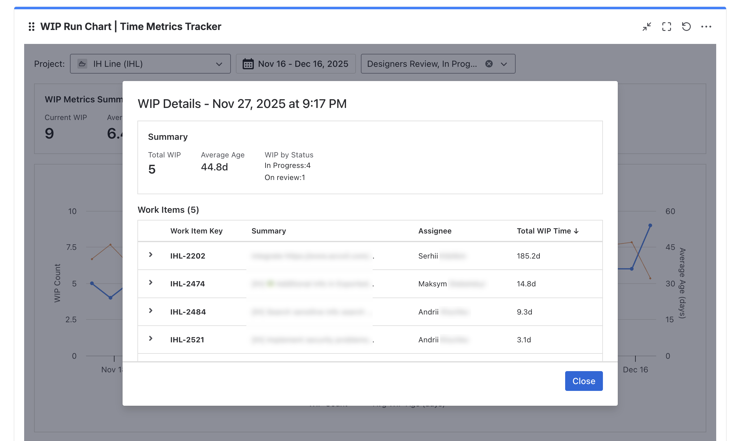
When these patterns repeat across months, they are not “temporary issues” they are systemic constraints.
Annual planning without addressing these constraints simply locks problems into the next year.
3. Align Roadmap Ambition with Flow Reality
Many roadmaps assume linear delivery. Real systems are not linear.
By combining:
-
WIP trends
-
cycle time metrics
-
time-in-status insights
teams can:
The WIP Chart becomes a reality check for ambition.
Why Time Metrics Tracker’s WIP Chart Is Different
Jira provides basic flow visuals, but they often lack:
The WIP Chart in Time Metrics Tracker stands out because it:
-
works with real workflow data
-
reflects actual status transitions
-
updates in real time
-
integrates with other time-based dashboards
It’s not just a visualization — it’s part of a flow analytics system.
Using WIP Charts to Reduce Planning Risk

Annual planning is ultimately about risk management.
High WIP equals:
With the WIP Chart, teams can:
-
simulate “what if” scenarios
-
evaluate impact of adding initiatives
-
detect overload before it becomes a crisis
Instead of reacting to delays mid-year, teams design plans that respect flow limits from day one.
From WIP Awareness to Better Decisions
The most valuable outcome of using the WIP Chart isn’t the chart itself — it’s the conversations it enables.
Teams stop arguing about opinions and start discussing evidence:
-
“This quarter failed because WIP doubled.”
-
“Every time we exceed this threshold, delivery slows.”
-
“If we add this initiative, something else must stop.”
That’s how planning becomes strategic instead of aspirational.
Why This Matters for Leadership and Stakeholders
Executives and stakeholders often ask:
-
“Why can’t we deliver more?”
-
“Why are timelines slipping?”
-
“Why does everything feel urgent?”
The WIP Chart provides a clear, visual answer:
The system is overloaded.
And more importantly:
Here’s how we fix it.
That transparency builds trust — even when plans need to be adjusted.
Final Thoughts: Planning with Flow, Not Hope
Annual plans fail when they ignore how work actually flows.
The WIP Chart in Time Metrics Tracker gives teams a rare advantage:
If your annual planning still relies on velocity and optimism, it might be time to look at WIP instead.
Because the future isn’t predicted by how fast you worked last sprint —
it’s shaped by how much work your system can handle sustainably.
👉 Install Time Metrics Tracker, explore the WIP Chart, and plan your next year with clarity instead of guesswork.
