
Happy Day 13 of the SaaSJet Advent Calendar! 🎄
We’ve all seen it—that Jira issue.
It started full of hope, moved to In Progress with the grace of a gazelle… and then it stayed there.
If that ticket were a person, it would have a driver’s license by now.
We joke, “Long live In Progress!”
But the truth is: aging work is one of the biggest silent killers of delivery predictability.
Today, let’s dig into why bottlenecks form and how data-driven insights from Time Metrics Tracker | Time Between Statuses. can help you finally break their reign.
🛑 The Diagnosis: Why do tickets actually get stuck?
We often blame complexity or people, but bottlenecks are usually systemic. Here are four patterns many teams discover once they start measuring flow:
1️⃣ High WIP (Work In Progress)
When too many items are active, the entire system slows down.
Little’s Law guarantees: high WIP → high cycle time.
2️⃣ Constant Context Switching
Developers jumping between tasks lose flow, and this invisible tax rarely shows up in stand-ups.
3️⃣ Hidden Friction
Approvals, reviews, waiting for environments — delays happen in the background unless you measure where the wait occurs.
4️⃣ The “Avoid the Big One” Effect
A tough, aging issue gets quietly ignored.
This single ticket can inflate your average WIP age and destabilize the whole sprint.
Outcome: Longer cycle times, unpredictable releases, and more “Why is this still In Progress?” conversations.
🛠️ The Fix: Visualize. Limit. Measure.
Here’s how Time Metrics Tracker | Time Between Statuses turns “I think we’re stuck” into “Here is exactly where we’re stuck.”
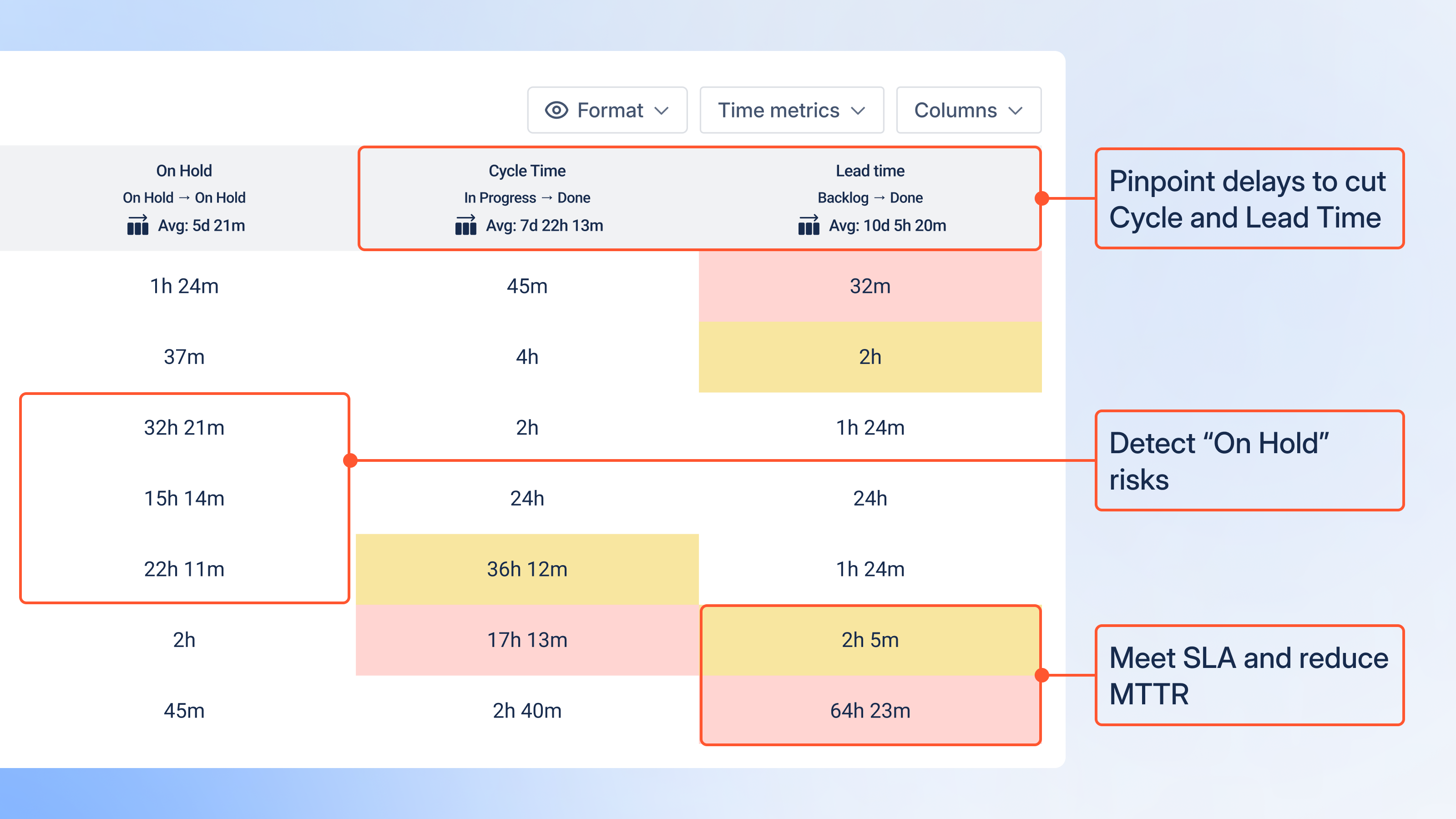
Track the Metrics That Actually Matter ⏱️
🔹 Cycle Time
Your real delivery speed — from “work begins” to “work completed.”
🔹 Wait Time
The most underrated metric.
Shows pure idle time when the ticket is not actively being worked on.
Teams are often shocked to discover that 60–80% of cycle time is just waiting.
🔹 Time in Status
Zooms in on specific phases like Review, QA, or Ready for Dev to pinpoint where slowdowns occur.
Master the WIP Run Chart 📊
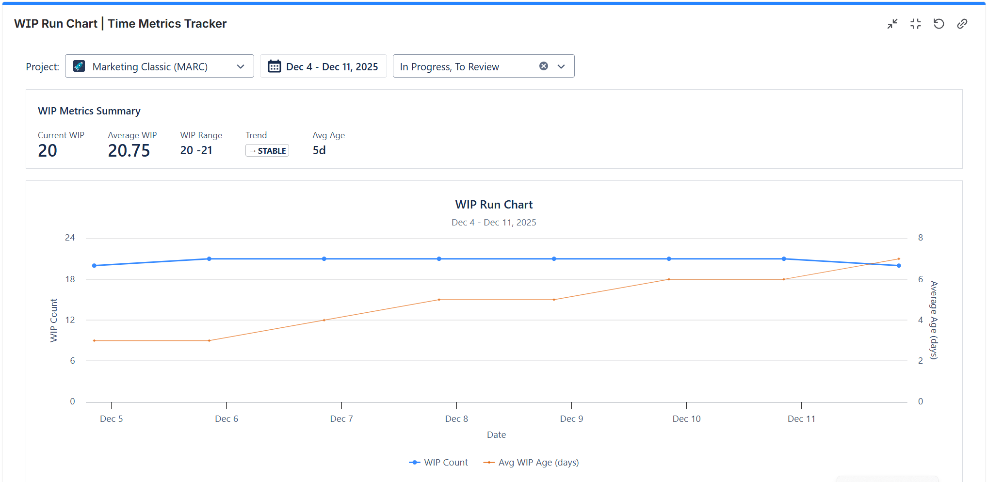
This chart is your system’s health monitor. It tracks:
🔵 WIP Count – how many items are in progress
🟠 Average WIP Age – how long in-progress items have been sitting there
How to read it:
-
Both lines rising → your system is choking.
-
WIP steady but age rising → overlooked, aging tasks piling up.
-
Age decreasing → you’re clearing bottlenecks effectively.
Spot Dangerous Outliers with the Scatter Plot 📉
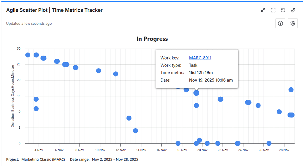
Averages can hide risks. The Scatter Plot shows individual item durations as dots so you can instantly spot anomalies.
Use it to answer:
-
Which issues took 3× longer than normal?
-
Do slow items share a common status?
-
Is delay caused by a specific step like Review or QA?
Tip: Many teams discover that a single workflow stage consistently adds the biggest delay
🎁 Quick Wins for This Week
These small changes often stabilize flow within a single sprint.
🎄 Final Thought — and a Question for You
“In Progress” should be a passage, not a final destination.
With the right insights, bottlenecks stop being mysterious.
They become visible — and fixable.
👉 What’s the oldest ticket currently sitting in your “In Progress” column?
Feel free to share your bottleneck stories below — I’d love to hear them!
