Hi everyone,
I’m experiencing a strange issue with the Dashcards Power-Up in Trello.
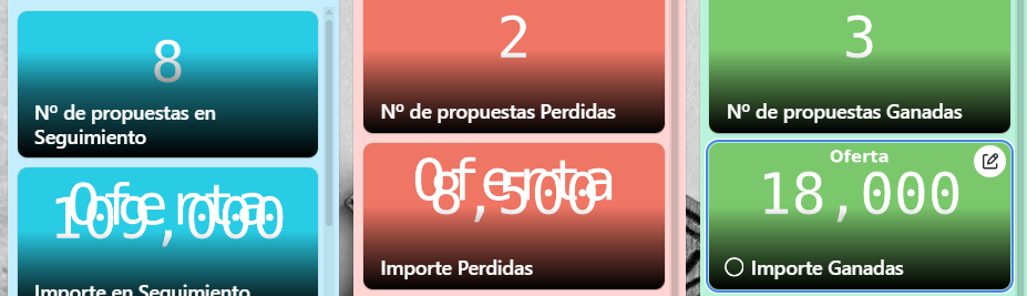
Some of my Dashcards are showing overlapping numbers and labels, making the information unreadable.
Here’s an example screenshot:
Things I’ve already tried:
Refreshing the page (Ctrl+F5).
Testing in different browsers (Chrome and Edge).
Checking zoom and display scaling (set to 100%).
Editing the Dashcard fields and re-saving them.
The problem persists and only happens on some Dashcards (especially when displaying numeric values like amounts).
👉 Has anyone else run into this?
👉 Is this a known bug, or is there a workaround to fix the layout so that text doesn’t overlap?
Thanks in advance for any help or insights!

