Disclosure, I’m Mia Tamm from Simpleasyty, the team behind Simple Tables for Confluence.
Two updates now live make category-heavy tables easier to read and summarize:
-
Enum → Colored text: show the value in color without a pill or dot — cleaner for dense pages.
-
Mode (most frequent value): use Mode in Grouping and in the table footer to summarize categorical fields like Status or Priority.
Notes: blanks are ignored; ties return one of the most frequent values.
Three real-world use cases
PMO / Product – “What’s the predominant status?”
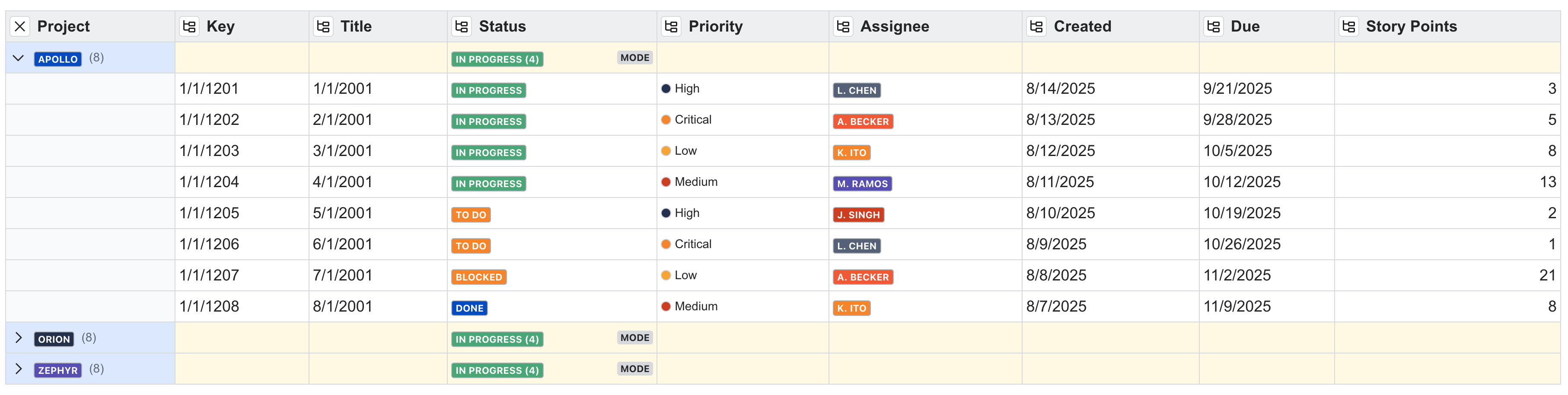
- Setup: Group by Project, set Status aggregation to Mode.
- Result: Each group shows the most common status (e.g., In progress) at a glance.
- Tip: Switch Enum appearance to Colored text for a lighter visual footprint.
Support / Ops – “What dominates the queue today?”
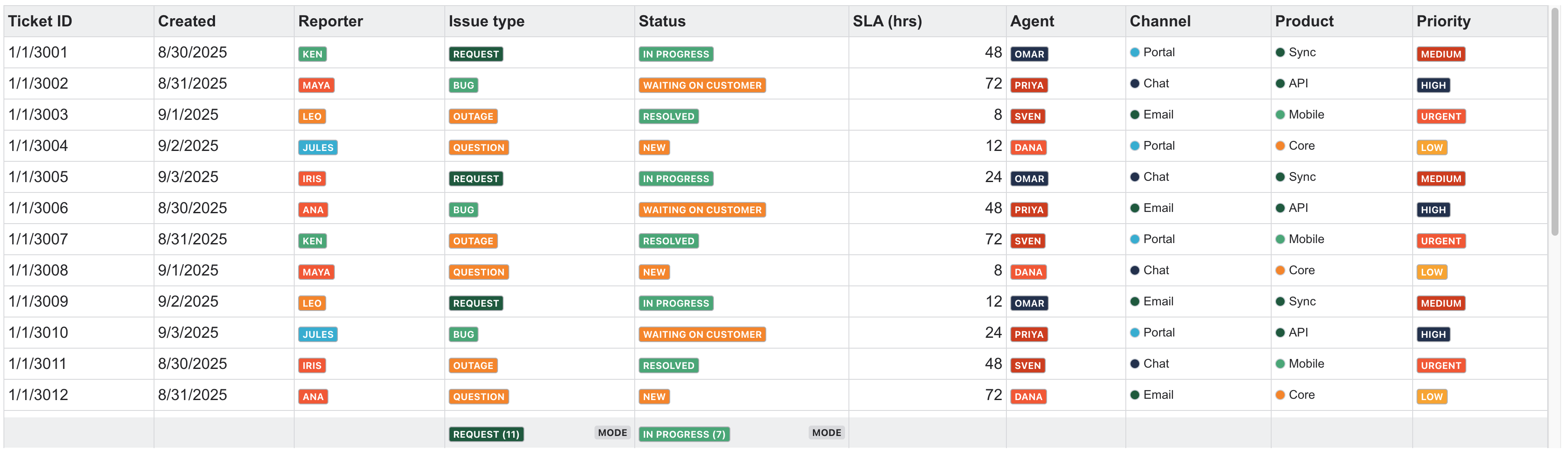
- Setup: In the footer, set Mode on Issue type or Status.
- Result: The footer highlights the most frequent label; pair with Count / Count distinct for volume and variety.
- Best for: Daily stand-ups and shift handovers.
Hiring / HR – “Where are most candidates right now?”

- Setup: Group by Recruiter, set Stage aggregation to Mode.
- Result: See the predominant pipeline stage per recruiter (e.g., Interviewing).
- Style: Use Colored text to keep large pipelines readable.
Try it quickly
-
Set data type: Choose Enum for your categorical column.
-
Grouping: Turn on Grouping and set the Enum column’s aggregation to Mode.
-
Footer summary: In Footer aggregation, choose Mode to show the most frequent value across the table.
You can find Simple Tables on the Atlassian Marketplace

