When it comes to managing service performance in Jira, dashboards are more than just a nice-to-have. They’re your control panel, a real-time overview of how your teams are performing against time-based goals. But the real power of a dashboard lies in its gadgets. And when you’re tracking SLAs, the right gadget can tell you instantly what’s working, what’s at risk, and where to act.
SLA gadgets help transform raw ticket data into actionable insights. You can spot trends, catch bottlenecks, and even predict breaches - all before they impact customers.
Let’s explore how the right SLA visualization can help you stay on top of your service commitments and actually improve them.
Types of SLA Gadgets You Can Add to Jira Dashboards (with SLA Time and Report)
Jira dashboards become truly powerful when they show what matters and for SLA-driven teams, that means tracking time-based performance at a glance. With the SLA Time and Report for Jira app, you can visualize SLA data using a range of gadget types designed for different use cases, reporting needs, and audiences.
Let’s explore the main SLA gadgets you can add to your dashboard:
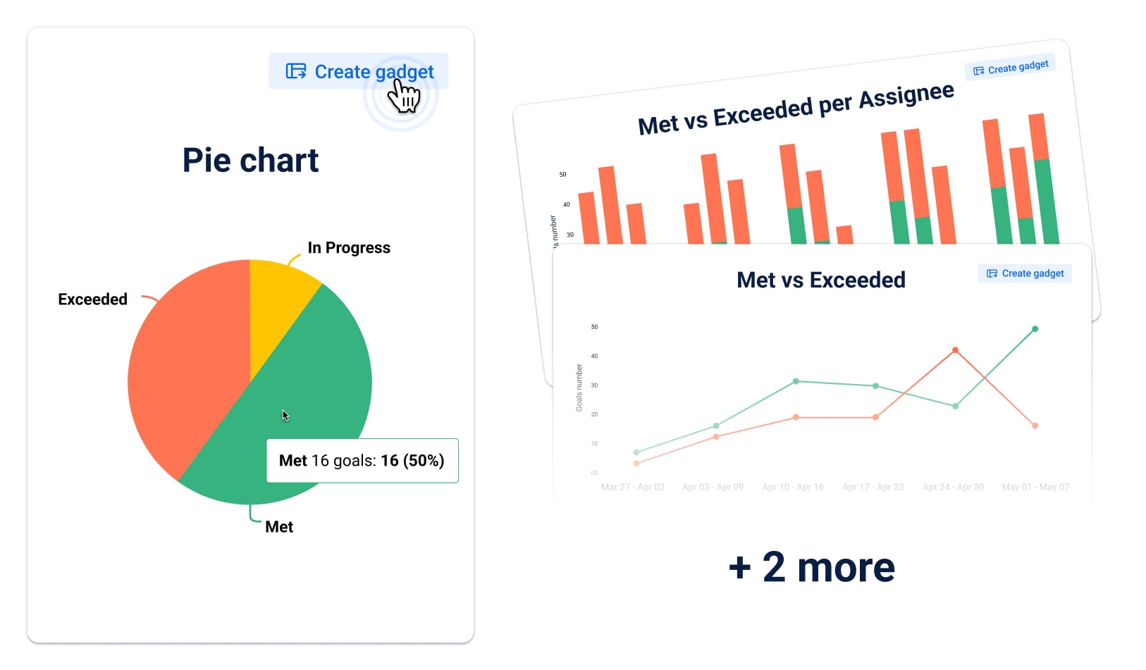
🟣 SLA Status Pie Chart
A clean, color-coded snapshot of SLA status across all issues. This gadget shows what percentage of tickets are:
- Met (completed within SLA),
- Exceeded (breached),
- In Progress (still counting down).
Best for: quick overviews during daily stand-ups, team performance health checks, or surfacing critical breaches.
Bonus: easy to digest for non-technical stakeholders.
🟩 Met vs Exceeded Chart
A powerful bar chart that compares how many issues were resolved on time versus how many breached the SLA, over a selected time period.
You can view:
- Trends over days, weeks, or months
- Total numbers vs percentages
- Stacked or grouped view
Best for: tracking SLA dynamics over time, identifying improvement areas, or measuring the impact of new processes (e.g., faster escalations).
🟦 Met vs Exceeded per Criteria
This advanced gadget adds another layer: segmentation. You can break down SLA performance by key fields such as:
- Priority
- Team
- Assignee
- Request type
- Custom fields (e.g., Complexity, Region, Customer Organization)
Best for: deep analysis across categories — perfect for team leads, project managers, and service owners who need to compare results and spot performance gaps.
📊 At a glance: When to use each gadget
|
Gadget Type
|
Best For
|
Key Features
|
|
Statuses Pie Chart
|
Quick overviews during stand-ups or SLA reviews
|
Simple color-coded pie: Met, Exceeded, In Progress. Easy to read at a glance
|
|
Met vs Exceeded
|
Trend analysis over time
|
Line/bar chart view grouped by day/week/month. Compare how SLA performance evolves
|
|
Met vs Exceeded per Criteria
|
Segmenting SLA results by assignee, team, priority, etc.
|
Stacked/grouped bars by custom field. Highlight gaps between performers or SLA policies
|
These visualizations not only help you monitor service health — they enable proactive decisions. Want to know who's consistently breaching SLAs? Which priority levels are slipping most often? Or how your team's performance has changed week over week? Each gadget gives you a different lens to see and act on the data.
How to Add an SLA Gadget to Your Jira Dashboard
Here’s a quick step-by-step guide to help you get started, whether you want a simple SLA status overview or a segmented performance chart by team, assignee, or priority.
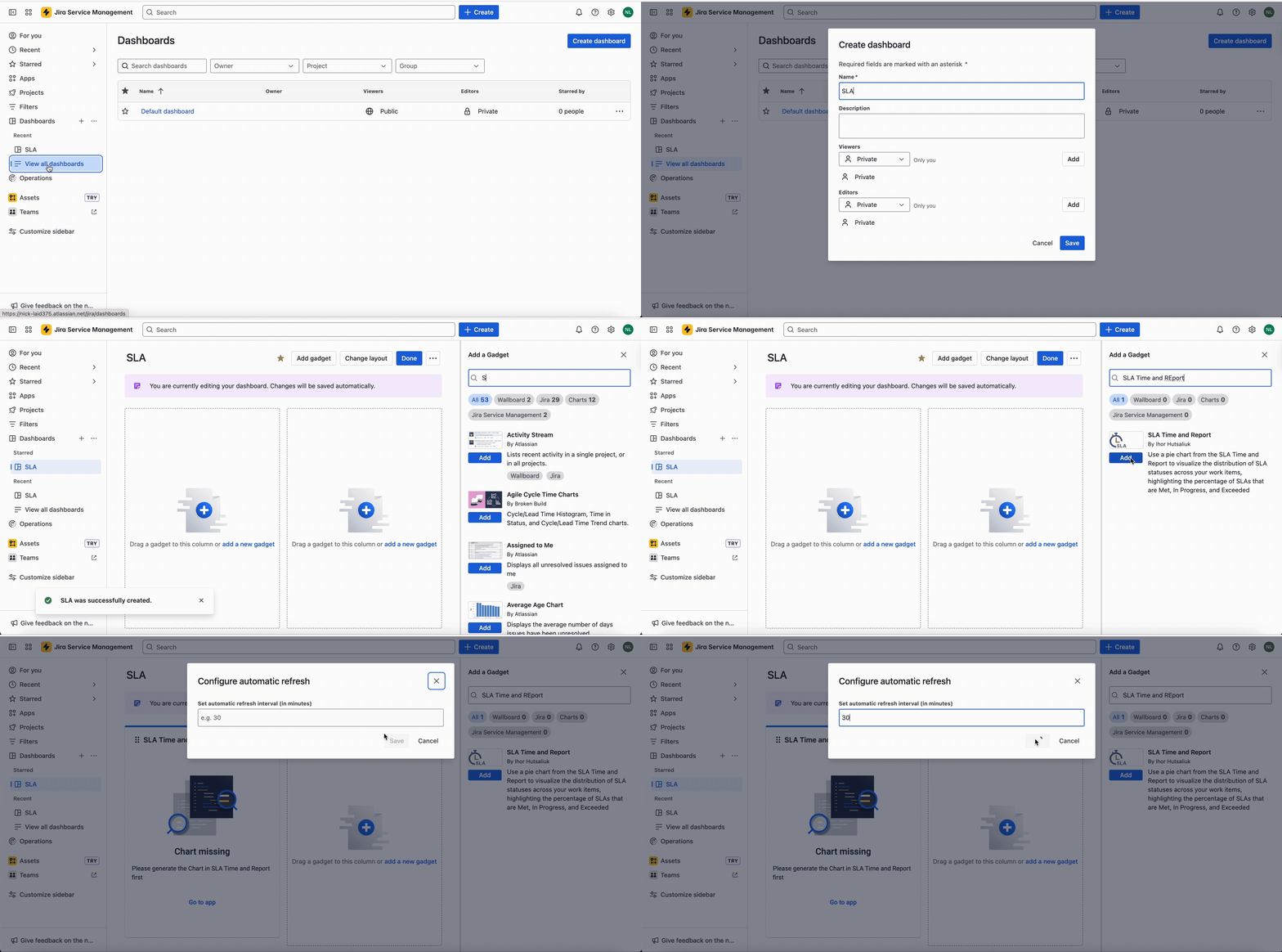
Option 1: Add a Gadget from the Jira Dashboard
Go to your Jira Dashboard
- From the top navigation, click on Dashboards → View All Dashboards.
- Select the dashboard where you want to add the gadget, or create a new one.
Click “Add Gadget”
- In the top-right corner, click the “Add gadget” button.
- Search for SLA gadgets powered by SLA Time and Report (or any other Jira gadgets you need).
- Click the “Add gadget” button
Customize Gadget Appearance
- Set the gadget title (what will be shown on the dashboard).
- Choose the Configure automatic refresh – e.g. every 15, 20, 30 mins
- Click Save to add it to the dashboard layout.
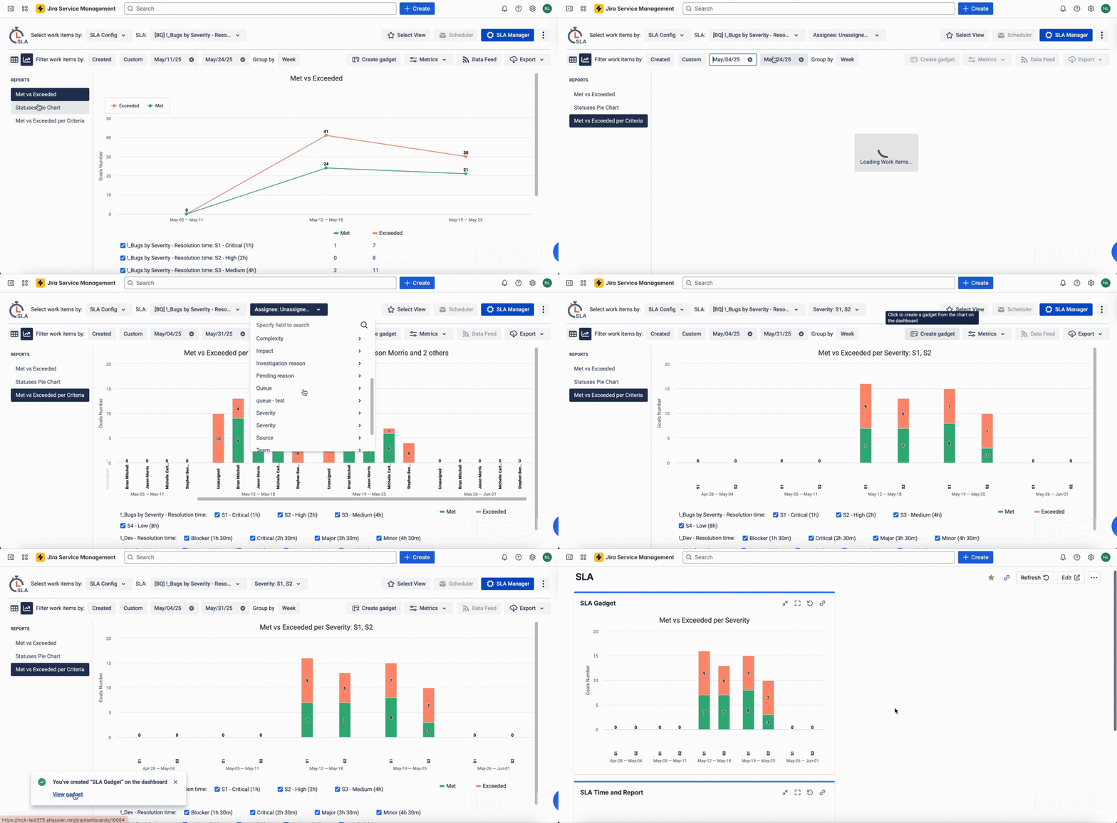
Option 2: Add a Gadget directly from SLA Time and Report app
You can also create and place the gadget right from the report view inside the app — with all filters and configurations pre-applied.
- Open the SLA Time and Report app
- Go to the main Reports page
- Choose the type of report: Pie Chart, Met vs Exceeded, or Met vs Exceeded per Criteria.
- Configure the report
- Select the relevant SLA configuration, date range, and work item filters.
- Group by time (week/month) or category (e.g., Assignee, Priority, etc.).
- Click the “Create Gadget” button
- Located in the top right above the chart.
- Enter gadget details
- Give your gadget a clear title.
- Choose which dashboard it should appear on.
- Click “Create”
- The gadget will automatically appear on the selected dashboard (fully configured).
🧩 Pro Tips
Use filters smartly: save time by creating reusable filters (e.g., only bugs, only high-priority requests, etc.).
Multi-dashboard strategy: use different dashboards for different audiences, support agents, managers, executives.
No extra setup for ticket view: Once SLA goals are configured, your charts automatically reflect relevant data, no additional connections or mappings required.
In the next section, we’ll dive deeper into the newest chart types: Met vs Exceeded and Met vs Exceeded per Criteria and explain when, why, and how to use them for deeper SLA insights.
Met vs Exceeded Charts: Spot SLA Failures Before They Escalate
Need more than a pie chart? Use Met vs Exceeded and Met vs Exceeded per Criteria gadgets to track SLA performance over time and by category, so you can act early, not after the fact.
📈 Met vs Exceeded
Shows how many SLAs were met vs breached over time.
Key options:
- Group by: day, week, or month
- View as line or bar chart
- Compare total goals over time
Use it when you need to:
- Track SLA trends
- Spot problem weeks/months
- Prove improvements after changes (e.g. automation)
📊 Met vs Exceeded per Criteria
Breaks down SLA performance by:
- Assignee
- Priority
- Team
- Any custom field
Best for:
- Comparing teams or agents
- Highlighting weak areas (e.g. High priority breaching often)
- Identifying who or what needs attention
🧭 When to Use Which?
|
Gadget
|
Use Case
|
Focus
|
|
Met vs Exceeded
|
Trend over time
|
SLA volume & shifts
|
|
Met vs Exceeded per Criteria
|
Comparison across categories
|
SLA performance gaps
|
Use both together to answer:
- When are we failing?
- Where or who is failing most?
Real-World Use Cases: How Teams Use SLA Gadgets Daily
SLA gadgets aren’t just for reports, they’re decision-making tools used across roles and departments. Here are real examples of how different teams put them to work:
🛠 Support Team – Weekly SLA Health Checks
Gadgets used:
- SLA Status Pie Chart
- Met vs Exceeded (weekly)
Goal: Get a quick overview every Monday to see:
- How many requests breached last week
- Whether SLA compliance is improving
- Where to dig deeper (e.g. certain request types)
Outcome: Faster response to trends and fewer recurring breaches.
🔧 IT / DevOps – SLA Failures by Request Type
Gadgets used: Met vs Exceeded per Criteria (Request Type)
Goal: Track SLA performance across types like Incidents, Changes, Service Requests.
Outcome: Helps prioritize automation for areas with frequent SLA failures — like critical incidents.
📋 Project Manager – Compare Team Efficiency
Gadgets used: Met vs Exceeded per Criteria (Assignee, Team)
Goal: Identify gaps in SLA performance across project teams or specific assignees.
Outcome: Start 1:1s or process reviews when metrics drop below baseline.
🧭 Service Owner – Monitor Customer Experience
Gadgets used: Met vs Exceeded per Criteria (Organization / Customer field)
Goal: Compare SLA adherence across different clients or support tiers.
Outcome: Back up conversations with enterprise customers with clear performance data.
Conclusion: From Data to Action
By combining visual dashboards with flexible SLA tracking, you can:
- Catch trends before they become issues
- Compare performance across people, teams, or services
- Keep everyone aligned with clear, shared goals
👉 Try it yourself:
Start by adding a simple Pie Chart or a Met vs Exceeded gadget to your dashboard.
Then go deeper with per-criteria charts to track what really matters for your team.
Want help building your perfect SLA dashboard? Book a quick demo or explore the SLA Time and Report app to get started.
