Hey Atlassian Community!👋
We're thrilled to share exciting updates from the Broken Build team with the latest releases of Agile Burnup Burndown Charts and Agile Cycle Time Chart version 2.1. These updates bring powerful forecasting capabilities and seamless project integration that transform how you track progress and predict delivery outcomes.
✨ Key highlights:
-
Standalone project reports are accessible directly from project navigation tabs
-
Monte Carlo simulation with 100,000+ iterations for probability-based forecasting
-
Velocity percentile scenarios for data-driven delivery predictions
-
Resource allocation modeling for realistic multi-team planning
-
Enhanced daily burndown tracking across any data source
Whether you're managing sprints, tracking epics, or coordinating cross-team initiatives, these updates provide the scientific accuracy and workflow integration that modern Agile teams demand.
Let's explore what makes these releases game-changers for project planning and delivery predictability👇
🧩 What's new across the Agile Gadgets: Powerful forecasting meets seamless integration
Both apps have received significant enhancements that address the most requested features from our community. From standalone project reports to advanced forecasting methodologies, these updates represent our commitment to providing sophisticated yet user-friendly project tracking tools.
1. 📊 Standalone project reports: Your new Analytics command center
Access burnup/burndown and cycle time charts directly from your project navigation tabs – no more context switching between tools. This breakthrough integration transforms occasional reporting into a daily workflow companion: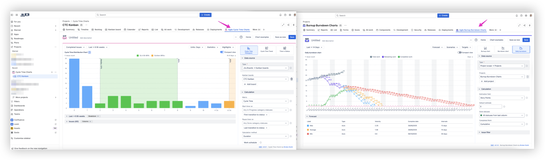
💡 What this means for your workflow:
-
Instant access to charts without leaving your project workspace
-
Create dashboard gadgets directly from the report view
-
Save configurations for future sessions
-
Experiment with different scenarios safely
📊 Available in:
☁️ Compatible with Cloud and Data Center
2. 🎯 Enhanced forecast experience: Crystal clear long-term visibility
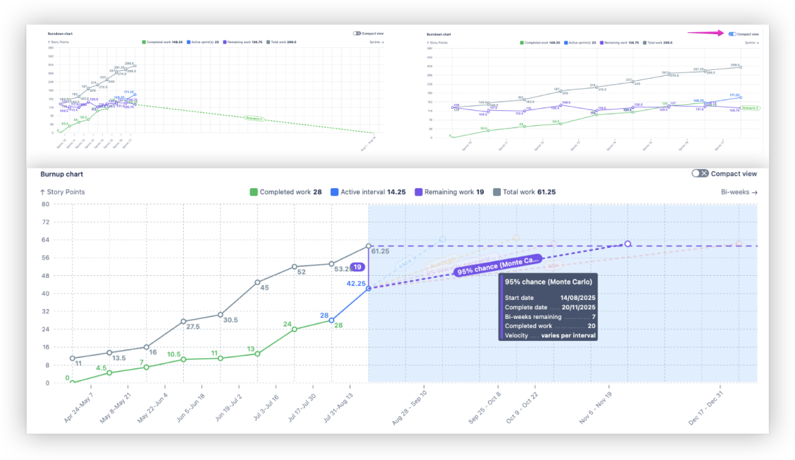
We've completely resolved critical UX issues that made long-term forecasting nearly impossible for complex projects. Charts extending far into the future now display all data clearly, with improved readability and smart label positioning:
✨ Key improvements:
-
Full timeline visibility regardless of project duration
-
Compact mode for better readability in dense data areas
-
Non-overlapping scenario labels with detailed hover interactions
-
Improved data density handling for complex scenarios
📊 Available in:
☁️ Compatible with Cloud and Data Center
3. 📉 Velocity percentile scenarios: Scientific forecasting beyond averages
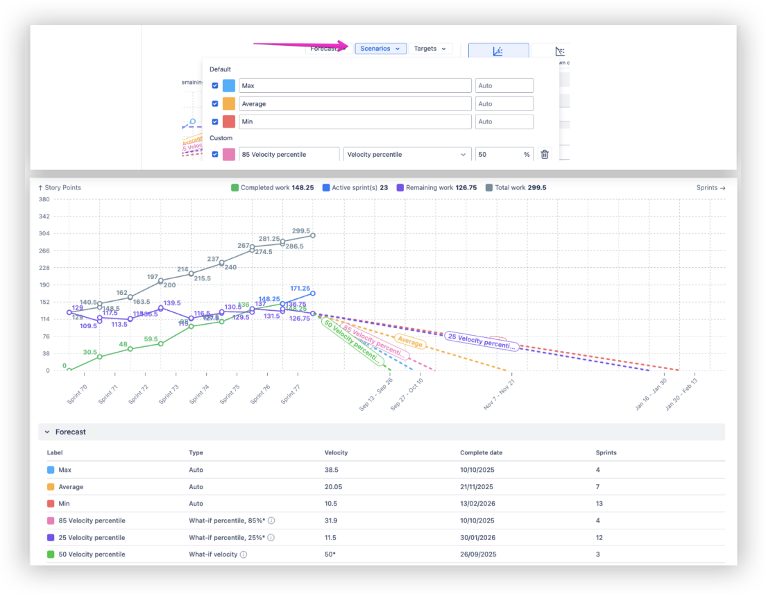
Move beyond simple average-based predictions with velocity percentile forecasting – a scientifically rigorous approach that provides more reliable delivery dates by accounting for natural team performance variability:
💡 How it works:
-
Sorts past velocities in ascending order to identify the value below which a chosen percentage (e.g., 85%) of velocities fall
-
Builds the forecast based on that percentile value
-
Provides multiple confidence levels for different planning needs
📊 Available in:
☁️ Compatible with Cloud and Data Center
4. 🎲 Monte Carlo simulation: The gold standard in value delivery forecasting
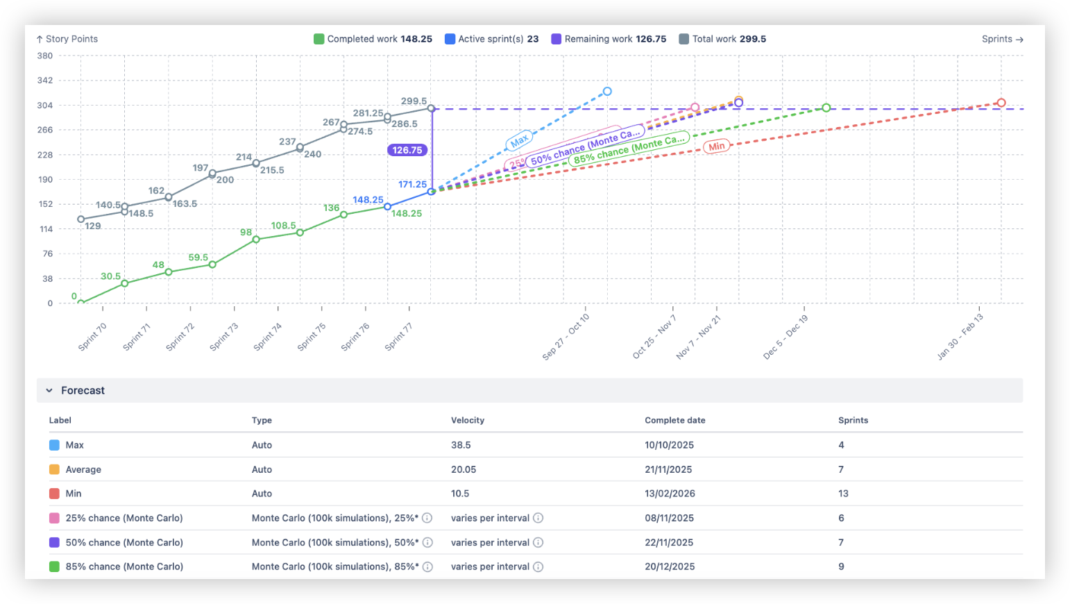
Experience the reliability prediction methodology used across various fields, and forecasting value delivery dates is no exception. Our Monte Carlo simulation uses a set of past velocities to run 100,000 simulations of future velocity for each sprint or interval. Choose a probability (e.g., 85%) to see when the work is most likely to be completed.
💡The science behind it:
-
100,000 simulation iterations per forecast scenario
-
Historical velocity patterns inform probability distributions
-
Real-world variability captured in predictions
-
Confidence intervals provide delivery date ranges
📊 Available in:
☁️ Compatible with Cloud and Data Center
5. ⚖️ Resource allocation coefficient: Real-world team capacity modeling
Finally, address the multi-team reality with configurable resource allocation modeling. Account for competing priorities and partial team dedication for truly realistic forecasting.
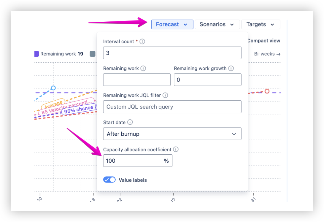
💡 Practical applications:
-
Model 30%, 50%, or 70% team allocation for competing priorities
-
Adjust forecasts for holiday periods and resource constraints
-
Compare full vs. partial allocation scenarios
-
Set realistic stakeholder expectations from project start
📊 Available in:
☁️ Compatible with Cloud and Data Center
6. 📉 True Burndown implementation: Complete progress visibility
Enhanced burndown charts now track both completed work AND remaining work evolution, providing the complete picture essential for finite scope projects like Epics, Releases, and Initiatives.
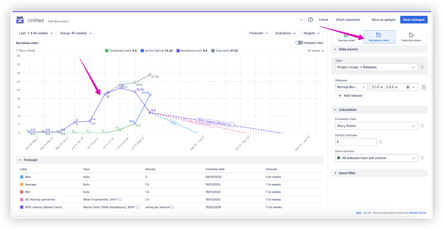
💡 Enhanced insights:
-
Visual scope change detection through remaining work trends
-
Complete progress tracking for better decision-making
-
Scope creep identification and management
-
Historical pattern analysis for future planning
📊 Available in:
☁️ Compatible with Cloud and Data Center
7. ⏰ Daily Burndown for any Data Source
The popular Sprint burndown functionality has been extended to all data sources, bringing daily granularity, weekend exclusion, and ideal progress lines to any work structure.
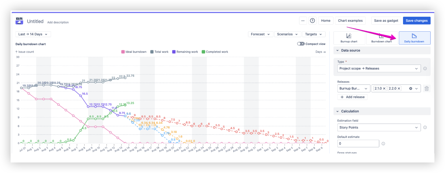
💡Universal daily tracking:
-
Weekend exclusion from velocity calculations
-
Ideal progress lines for any data source
-
Daily granularity for Projects, Kanban boards, Releases, and more
-
Quick deviation detection across all workflows
📊 Available in:
☁️ Compatible with Cloud and Data Center
🎯 Explore the Agile charts in action: live interactive examples
Want to see these powerful new features in real Jira environments? Our interactive chart examples let you explore how each enhancement works with actual data and common use cases.
🔗 Dive into examples like these:
…and more!
🛠️ We're constantly adding new use cases – keep an eye out as the library expands!
🚀 Advanced Agile Gadgets improvements are just a click away!
We hope you're as excited as we are about these powerful August 2025 enhancements! 🎉 With standalone project reports, Monte Carlo simulation, and resource allocation modeling, Agile Burnup Burndown Charts and Agile Cycle Time Chart now deliver the scientific accuracy and workflow integration that modern Agile teams need to succeed.
👉 Ready to experience the difference? Both apps are available now on the Atlassian Marketplace with free trials, so you can explore the new charts capabilities on your own Jira dashboards.
Agile Reports and Gadgets is a powerful bundle that unifies our core charting apps in one smart solution, built for deeper analysis and ultimate flexibility.
Prefer a more focused setup? Each app is also available separately:
Happy forecasting, and let's make project planning more scientific and reliable! 🚀🙌
🎯 See charts in action with our interactive examples.
💬 Have questions or feedback? Contact support
