Welcome back to our Report of the Week! This time, we’re highlighting a report designed to bring customer feedback: Average customer satisfaction and the count of user reviews by project components—tracked week by week.
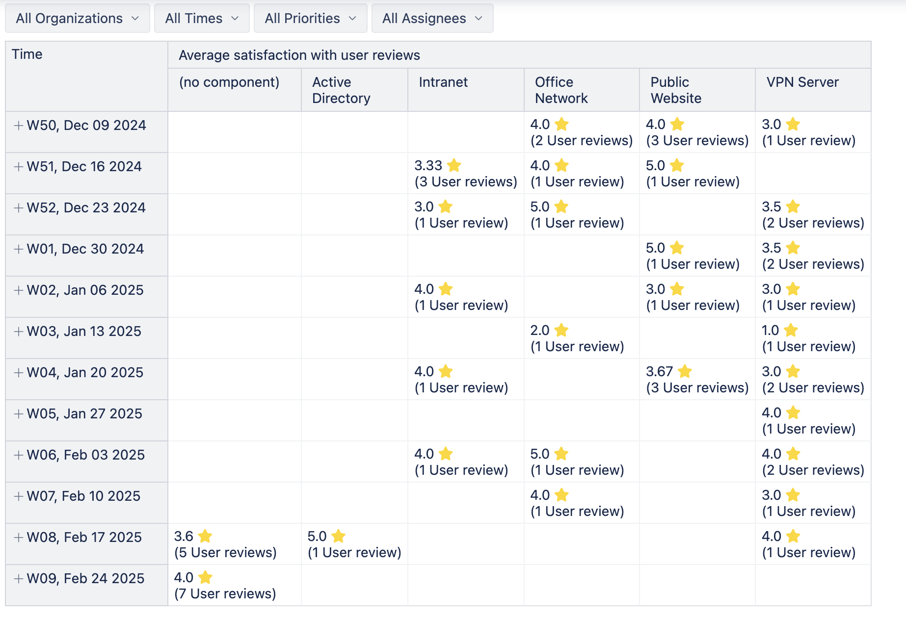
This table-based report makes it easy to monitor how different parts of your projects are performing in the eyes of your users:
🔍 Filters for Deeper Insight
Easily zoom in on the data that matters to you with page filters – Organizations, Time period, Priorities, Assignees, and others.
💡 Why Use This Report to:
✅ Spotting trends in satisfaction across specific components
✅ Identifying performance issues linked to certain priorities or assignees
✅ Monitoring customer sentiment week over week to ensure continuous improvement
Whether you’re running service teams, managing feature development, or tracking support quality, this report offers actionable insights into where users are happiest—and where extra attention might be needed.
📈 Try it yourself!
Add this report to your eazyBI dashboard to keep your finger on the pulse of customer satisfaction.
Let us know how it helps your team—and don’t miss next week’s Report of the Week! 🚀
