If you work in an agile team, you’ve likely heard the term Cycle Time thrown around. It’s a powerful KPI — but only if you know how to track it, visualize it, and act on it.
One of the most effective (yet underused) tools for doing just that is the Scatter Plot. In this article, we’ll explain what Cycle Time really is, how a Scatter Plot helps you analyze it, and how to use that insight to improve your delivery speed in Jira.
🧠 What Is Cycle Time?
Cycle Time measures the time an issue spends in progress — from the moment work starts (e.g., “In Progress”) to when it’s done (e.g., “Done”).
Formula:
Cycle Time = Date when issue entered “In Progress” – Date when issue entered “Done”
It’s one of the most important agile metrics for teams who care about:
- Speed of delivery
- Predictability
- Process efficiency
🎯 Why Improving Cycle Time
|
Reason
|
Why It’s Important
|
|
🕒 Faster delivery
|
You ship features and fixes to users quicker
|
|
🔄 Better forecasting
|
Helps with sprint planning and capacity estimation
|
|
🚫 Fewer bottlenecks
|
Long Cycle Time often reveals blockers or inefficient handoffs
|
|
📊 Transparency
|
PMs and stakeholders understand how work flows
|
📍 What Is a Scatter Plot in Jira context?
A scatter plot is a type of chart that displays each issue as a dot, based on:
- X-axis: A date (e.g., when issue was completed)
- Y-axis: A time metric (e.g., Cycle Time in days)
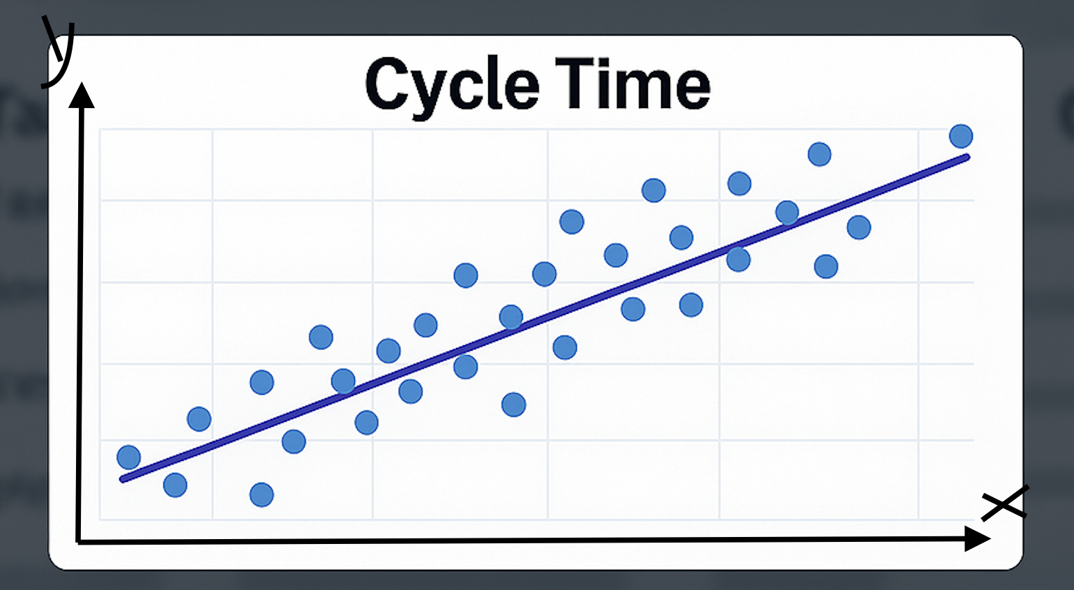
Each dot = one issue
Its position shows when it was delivered and how long it took.
This makes it easy to:
- See trends across sprints or months
- Spot slow-moving tasks (outliers)
- Monitor consistency across the team
🛠️ How to Create a Cycle Time Scatter Plot in Jira
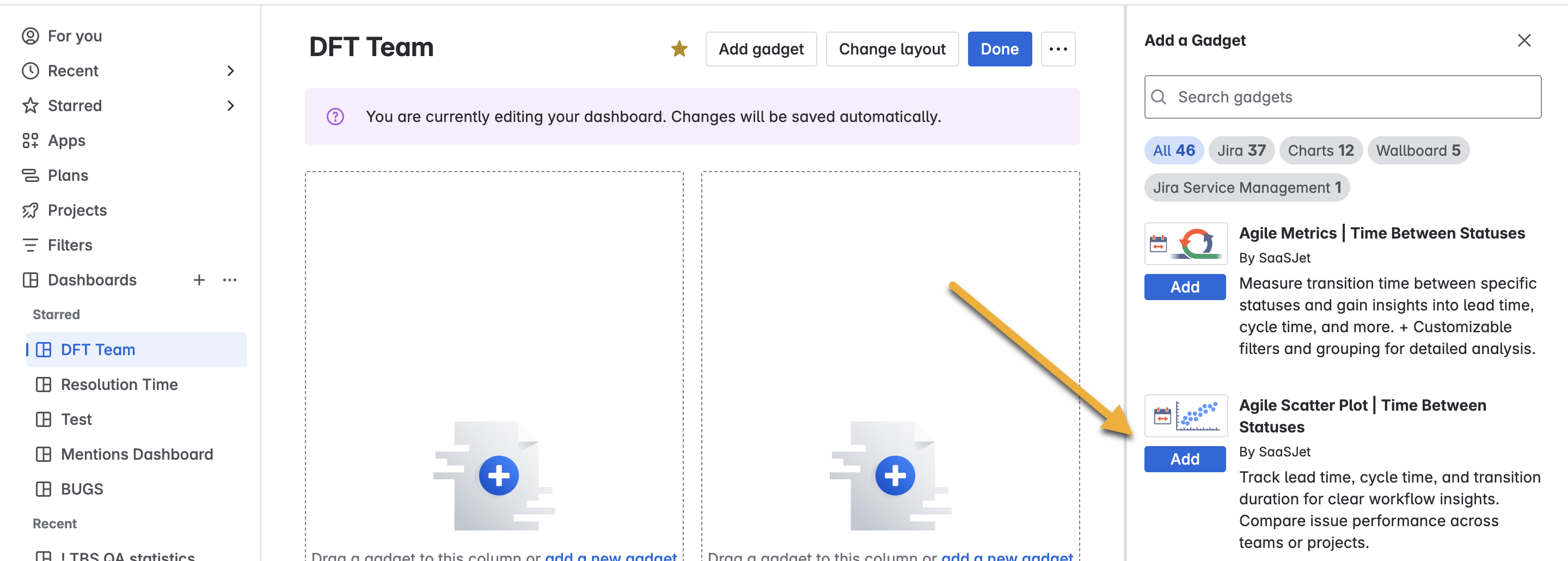
Jira doesn’t support scatter plots natively, but you can use the Scatter Plot Gadget from the Time Metrics Tracker | Time Between Statuses app.
Add the gadget to your Jira dashboard
🛠 Set up the Scatter Plot
-
Select project
-
Choose time metric
-
Pick issue types
-
Set date filter and range
-
Choose time format
-
Click Save
 Done! 🎉
Each dot shows an issue — how long it took and when it was done.
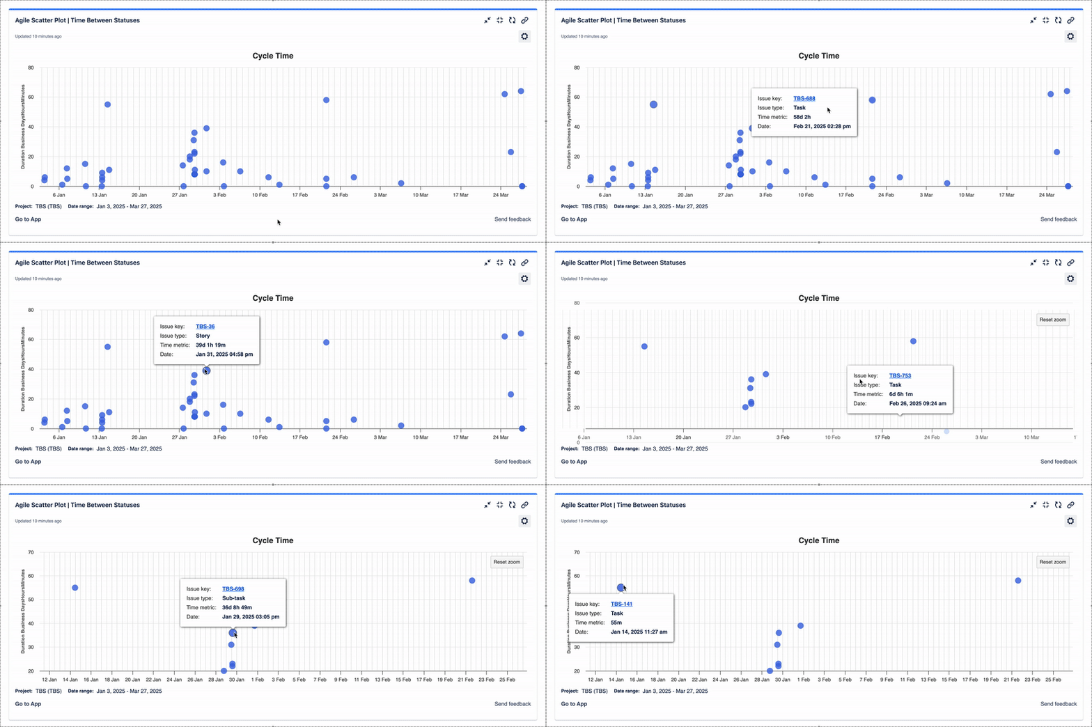
🔍 How to Read the Chart
|
Pattern
|
What It Means
|
What You Can Do
|
|
⬇️ Dots clustered low
|
Fast, consistent delivery
|
Great! Identify what works
|
|
⬆️ Dots scattered high
|
Slow or blocked issues
|
Investigate and remove blockers
|
|
📈 Upward trend
|
Team is slowing down
|
Review scope or WIP limits
|
|
⚠️ Single high outlier
|
One issue delayed everything
|
Dive into its history and fix the cause
|
💡 Tips to Use Scatter Plot for Cycle Time Improvement
1. Find Outliers
Focus on issues that took significantly longer than others.
Ask:
- Was the task blocked?
- Did the scope change mid-sprint?
- Was it reassigned or reopened?
🎯 These are opportunities to streamline your workflow.
2. Compare Across Time
Use the X-axis to track trends:
- Are issues taking longer sprint after sprint?
- Is your team slowing down or stabilizing?
You can filter by time period to visualize changes and see what helped or hurt productivity.
3. Monitor Team Consistency
Wide spread of dots = inconsistent delivery.
You may need to:
- Break down stories into smaller, more manageable tasks
- Clarify definitions of “Done”
- Align estimation practices
4. Use Filters to Drill Down
Filter by:
- Assignee (compare developers)
- Epic (analyze larger work items)
- Label or sprint (track feature development time)
Get tailored insights that lead to actionable change.
🧩 Example
Let’s say your average Cycle Time is 5 days. But your scatter plot shows two issues with 15+ days. You click into those and find:
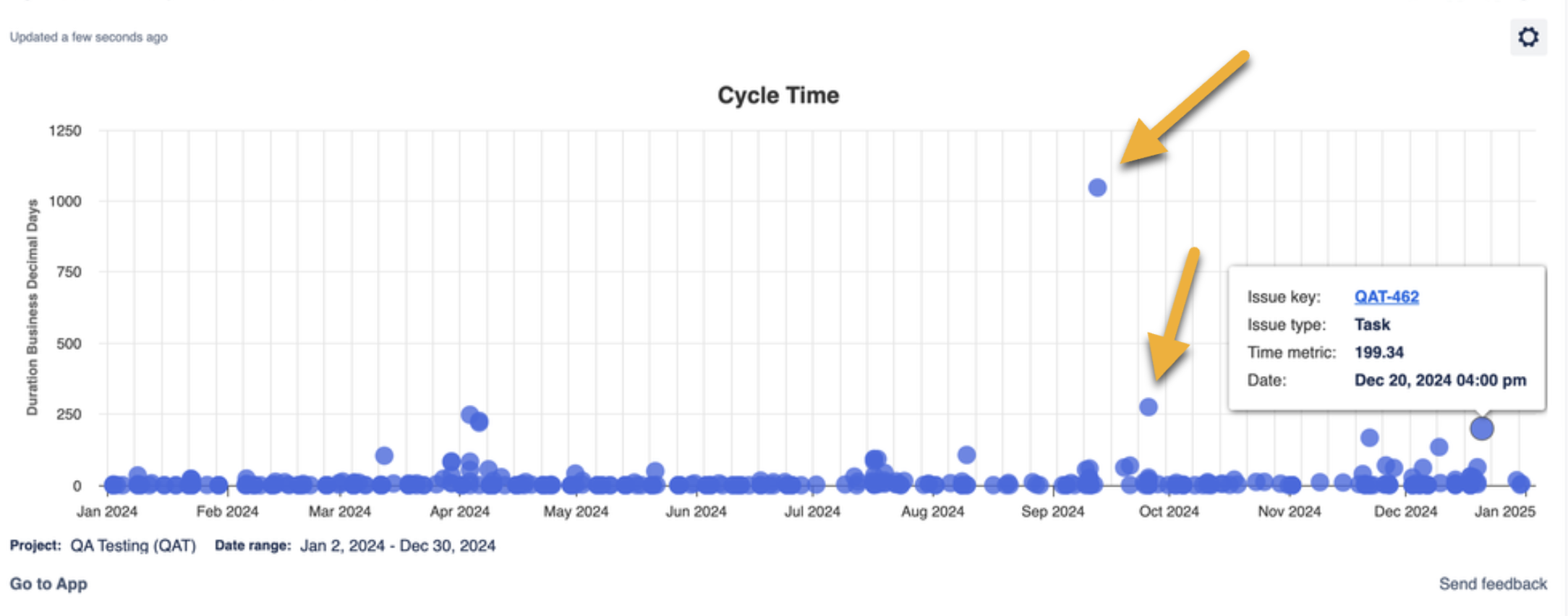
- One waited 4 days in code review
- The other sat in QA without testers assigned
Result? You set up automation to notify reviewers and allocate testers early — and your next sprint is 20% faster.
🤔 Common Questions
Q: Can I show multiple teams in one scatter plot?
A: Yes! Use filters to compare performance across teams or projects in a single view.
Q: Can I export the data?
A: Absolutely — export as Excel or CSV for reporting or deeper analysis.
Q: Can I use this for other metrics like Lead Time or Resolution Time?
A: Yes — the gadget supports multiple time metrics, including custom ones.
🚀 Final Thoughts
Tracking Cycle Time is essential — but visualizing it with a scatter plot is what takes your analysis to the next level.
Whether you're aiming to deliver faster, find blockers, or make better sprint plans, every dot on the chart tells a story. And the more clearly you see those stories, the better your team performs.
👉 Try the Time Metrics Tracker scatter plot today and start optimizing with clarity.
