Welcome to this week’s Report of the Week, where we’re highlighting a dynamic and insightful visualization of SLA Dependencies – a scatter chart that maps out the relationship between your team’s response time, resolution time, and customer satisfaction.
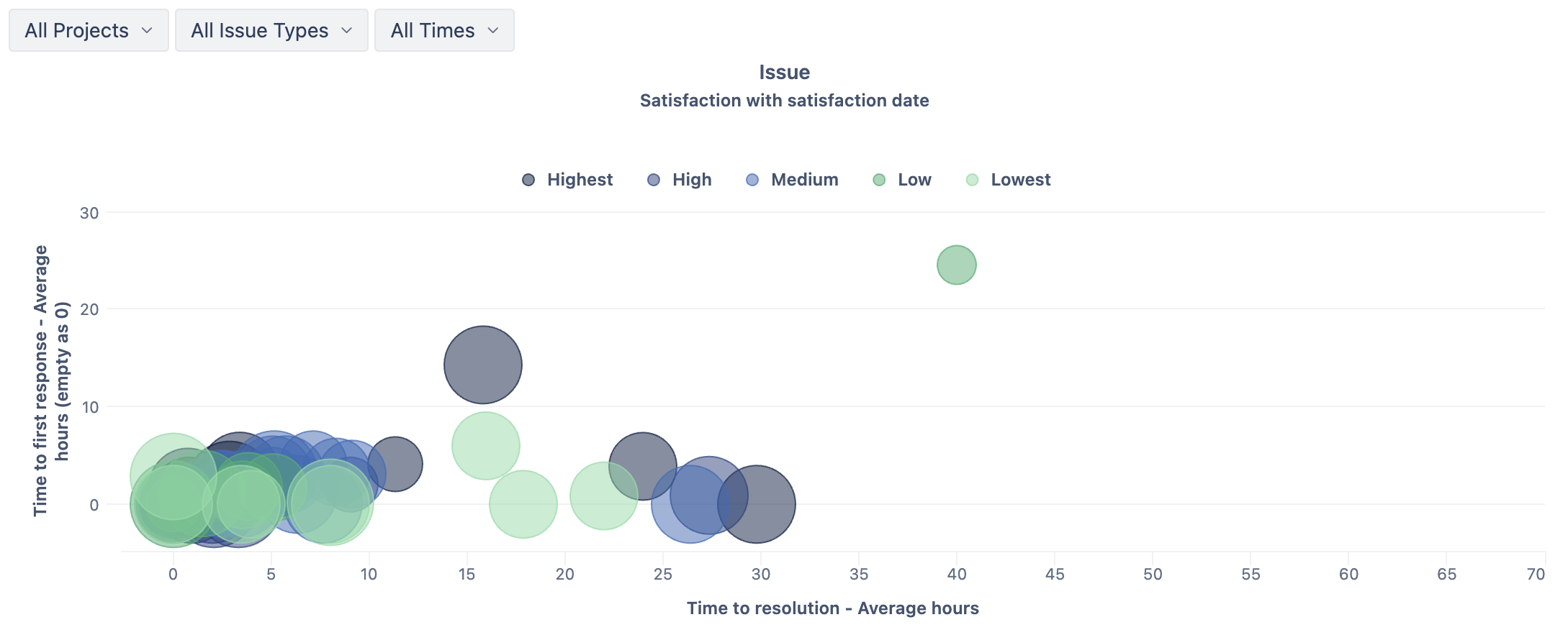
Each dot on the scatter chart represents a single issue, giving you a granular view of key service metrics:
-
X-axis: Average time to resolution (in hours)
-
Y-axis: Average time to first response (in hours)
-
Dot Size: Represents the customer satisfaction rating
-
Dot Color: Indicates the priority level of the issue
Plus, with page filters for Project, Issue Type, and Time Period, you can zoom in on the segments that matter most.
🔍 Why This Report Is Valuable
This scatter chart helps you spot trends and correlations between your service efforts and customer experience:
✅ Are faster response times leading to higher satisfaction?
✅ Do longer resolution times impact customer feedback?
✅ How does priority affect service metrics?
With a single glance, you can uncover dependencies between SLA performance and customer satisfaction—and take action where it matters.
📈 Try it out in your eazyBI dashboards, and share your insights with the community! Stay tuned for next week’s Report of the Week – and keep turning your data into decisions! 🚀
