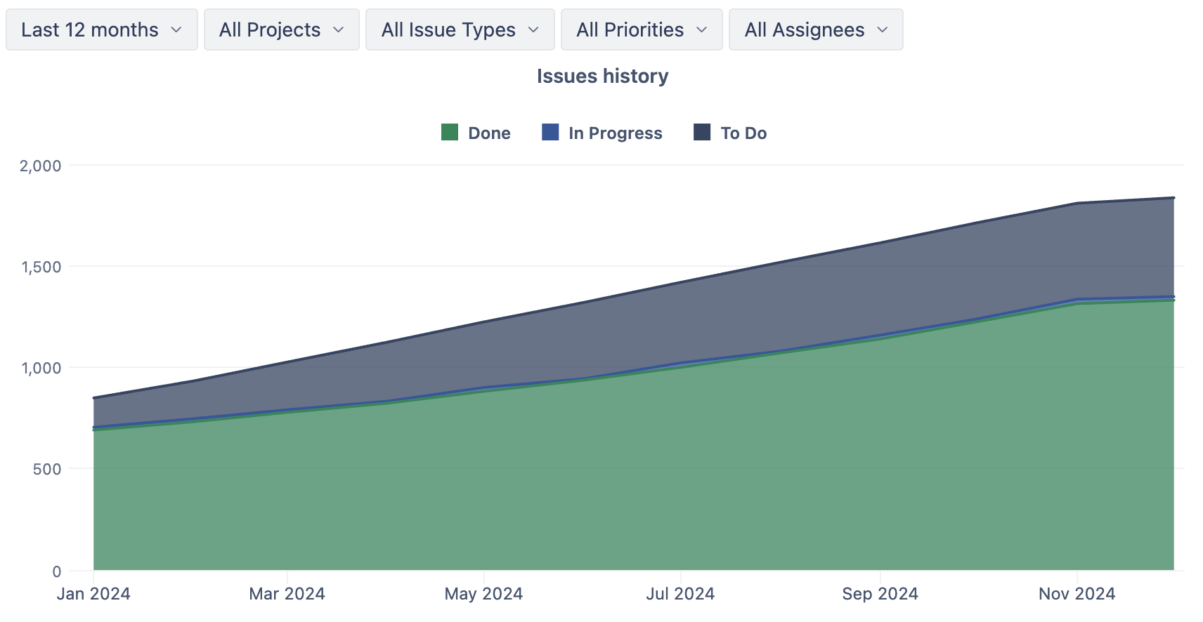
This week’s “Report of the Week” showcases the Issues Cumulative Flow Diagram, a powerful visualization that helps teams track the flow of work through different stages over time.
What Does the Cumulative Flow Diagram Show?
The report tracks issue flow on a monthly basis over the last 12 months, offering a long-term perspective on team performance and workflow trends. This timeframe allows teams to spot seasonal patterns, recurring bottlenecks, or gradual improvements in throughput.
Customization with Page Filters
To make the report even more actionable, page filters enable users to drill down into specific data points:
-
Projects: Analyze the workflow of individual projects or compare multiple projects side by side.
-
Issue Types: Focus on specific issue types, such as bugs, tasks, or stories.
-
Priorities: Examine how high-priority issues move through the workflow compared to lower-priority ones.
-
Assignees: Understand individual contributions and identify who may need additional support or resources.
Get Started Today
Ready to optimize your workflow? Import the Cumulative Flow Diagram report into your eazyBI account and start analyzing your data today.
Stay tuned for the next post in our Report of the Week series. Happy reporting! 🚀
