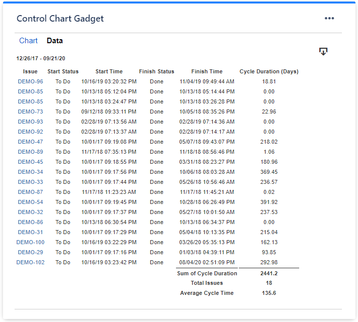
I'm putting together a lead time graph in COnfluence, extracting data from Jira and manipulating it in a transformer table in Confluence.
I managed to create the graph, using the Time line type, replacing the line with bubbles. All of this worked ok, but the problem is that when creating the graph when I have more than 1 record per date, it is adding up.
I don't want you to add up, I would like you to add the balls for each record.
it's possible?
example:
01 Feb 2024 3
01 Feb 2024 6
When placing the data on the graph, the values 3 and 6 are being added together, therefore it only shows 1 record with the sum (9).