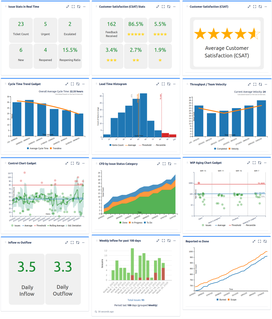
I'd like to display a chart that shows the amount of unresolved vs resolved issues per quarter in a dashboard. Essentially what I'm trying to show is a grouped line chart that shows unresolved vs resolved.
For example:
X-Axis = Date (Q1, Q2, Q3, Q4)
Y-Axis = Issue Count
Two lines being displayed one being unresolved issues and the other being resolved.
Thanks!