After some months of working with a Kanban board in Jira (6.4.7), the tool came up with the reports.
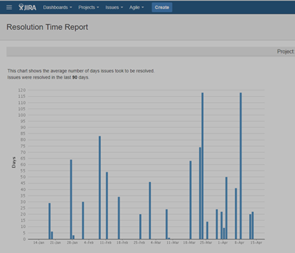
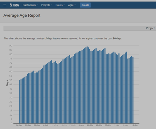
I think, I understand the concepts of Resolution Time (average number of days issues took to be resolved) and of Average Age ("average number of days that issues were unresolved for a given day over the past 90 days"). Yet, looking at the graphs, a number of questions pop up:
1) In the first graph: why is there not a bar on every day? Are bars maybe only shown on days that an issue was resolved? And is the lenght of the bar then the number of days it took *that* specific issue to be closed? But what average is then shown?
2) Do I understand correctly that the bars in the second graph shows a running average? If so, what happenend on, e.g., Feb 26, where the length of the bars decreases from 61 to 58? What does it require to decrease the average with 3 days? Have a lot of issues been resolved on that day in no time?
3) Is there a connection between the bars in the first graph and the growth/decline in the second? If so: what is that connection?
I love to use metrics to help the team draw conclusions on their performance, but with these questions, it is hard to know what conclusions can be drawn.

![Photo of Emre Toptancı [OBSS]](https://us.v-cdn.net/6038660/uploads/avatars/88/25/n8825d1e863017fd80882ab56e7550387.png)


