I regularly look at the control chart to see how our cycle times for reacting to and fixing problems are changing.
When I was looking at our recent data, I saw lots of issues placed on the chart which had been resolved years ago if you look at the resolutiondate, but which were recently updated due to a bulk change.
This bulk change was intended to change the priority, but seems to have updated the status (without changing it?) if we look at the history:

As you can see, the resolution date on the issue is still as it was:
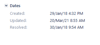
And yet it appears in the red circle on the control chart, along with many other issues, making the control chart much less useful as historic and current data are all mixed up.
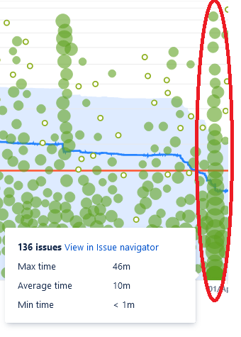
I guess the control chart places issues on the x-axis according to when the issue transitioned to the relevant status/column on the board and not resolutiondate, which obviously makes sense, otherwise you could not see process times for steps happening before resolution. However, this is now an annoying situation - is there anything I can do to correct it or do we need to suck it up? 


![Photo of Emre Toptancı [OBSS]](https://us.v-cdn.net/6038660/uploads/avatars/88/25/n8825d1e863017fd80882ab56e7550387.png)


