Unfortunately, we missed the part about not being able to roll back the new look and feel for the portal.
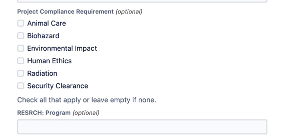
One issue is the placement of the Field Help below the actual fields. In the old portal, it was pulled out to the side and easier to see/scan. All other forms our customers use have any help messages directly below the field title and above the fields.
Furthermore, the field Help text and Titles look to be the same size and weight, which is confusing when they stack.
Can we
-have an option to move Field Help up above the fields so users receive the help ahead of their actions?
- improve the styling difference between help and titles?
Thank you
If you look at the screenshot you see the Field Help - "Check all that apply..." would be a better UX to have the help above the fields. You can also see how similar the Field Help text and the Title text is. Some simple styling could help here.