I'm using the standard diagram/chart macro from Confluence to display time series data in a line diagram. The data itself is queried from a database using the SQL macro.
When there are only few records in the resulting data table, the date labels are displayed nicely and readable on the x-axis (upper example "few values in x-axis").
But when there are my records (in my example almost 1000), the date labels are displayed overlapping each other, resulting in unreadable black bars (lower example "may values in x-axis").
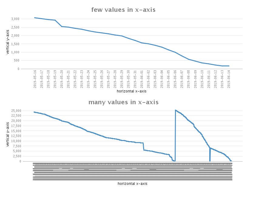
I've tried playing around with all the parameters you can configure there, but could not find a solution in a way, so that you can actually read these date labels. Of course not all 1000 of them, but at least the left-most and the right-most would be interesting and maybe a handful in the middle.
Any idea?


