Shipping on time in Agile is rarely about exact dates - it’s about probability, risk, and informed decisions.
That’s why we’re excited to announce the v1.0 release of Agile Monte Carlo Charts by Broken Build - a Jira-native way to forecast delivery using real historical data.
Instead of relying on deterministic plans, Monte Carlo forecasting helps teams understand what’s likely, what’s risky, and what’s realistically achievable.
🔑 Key charts and features
-
🎯 Probability-based delivery forecasting using real Jira data
-
📅 “When” Monte Carlo chart for delivery date forecasting
-
📦 “How Many” Monte Carlo chart for scope commitment
-
🧩 Portfolio-level forecasting across multiple Jira data sources
-
⚙️ Flexible calculation and workflow settings
-
📊 Health metrics and risk insights at a glance
-
🔬 Scenario modelling and what-if analysis
Below, we break down how each chart and capability supports confident delivery planning - from team execution to portfolio-level decisions.
What is Monte Carlo forecasting in Jira?
Monte Carlo forecasting runs thousands of simulations (typically 100,000) based on your team’s historical throughput.
Each simulation represents a possible delivery path - together, they form a probability distribution that shows when work is likely to be completed or how much scope can fit into a given timeframe.
This approach replaces guesswork with data-backed confidence levels.
♦️Two charts. Two planning questions.
1️⃣ When will we finish?
The “When” Monte Carlo chart visualizes the full distribution of possible completion dates for your remaining work.
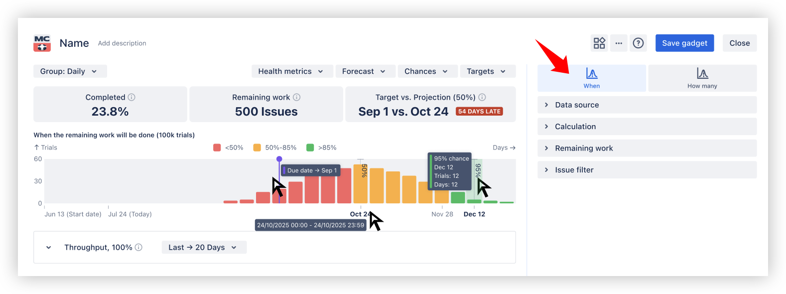
Use it to:
-
See earliest, median, and high-confidence delivery dates (P50 / P70 / P85 / P95)
-
Understand the probability of hitting a target date
-
Spot delivery risk early using RAG indicators
-
Compare Target vs Projection to see if delivery is on track or delayed
2️⃣ How much can we deliver?
The “How Many” Monte Carlo chart answers the inverse question: how much scope can realistically be completed within a fixed timeframe.
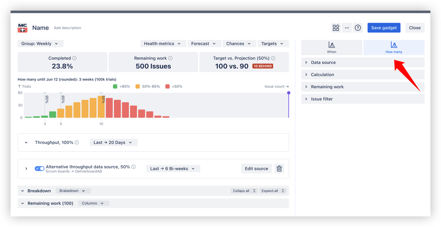
Use it to:
-
Commit to scope with explicit confidence levels
-
Understand trade-offs between ambition and risk
-
Validate whether your throughput is predictable enough for firm commitments
♦️ Built on your real delivery data
Monte Carlo Charts use historical throughput, not assumptions.
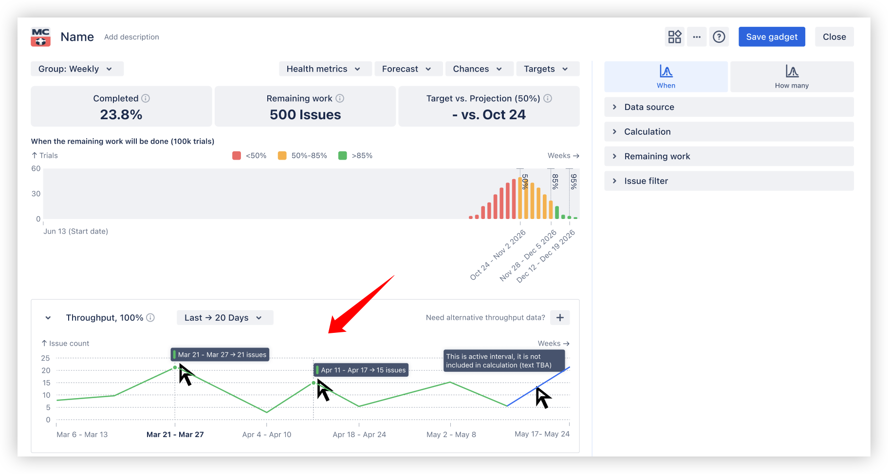
You can:
-
Review and validate throughput data directly below the chart
-
Adjust the historical range (e.g. last N sprints or intervals)
-
Exclude incomplete periods to keep forecasts reliable
-
Switch to an alternative throughput source when the main data set is unstable or insufficient
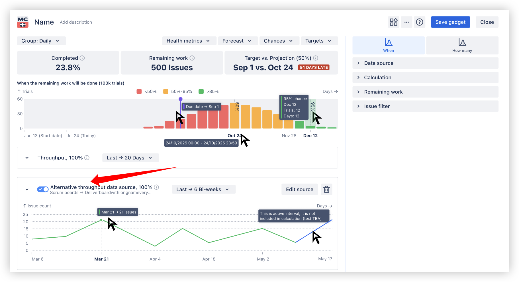
This makes forecasts transparent and explainable - not a black box.
♦️ Health metrics and delivery confidence
Each Monte Carlo chart includes a health summary that helps interpret results instantly:
-
Completed - percentage of scope already done
-
Remaining work - work still in progress
-
Target - planned milestone or date
-
Projection - forecasted outcome at the selected percentile
-
Target vs Projection - shows whether delivery is on track or at risk
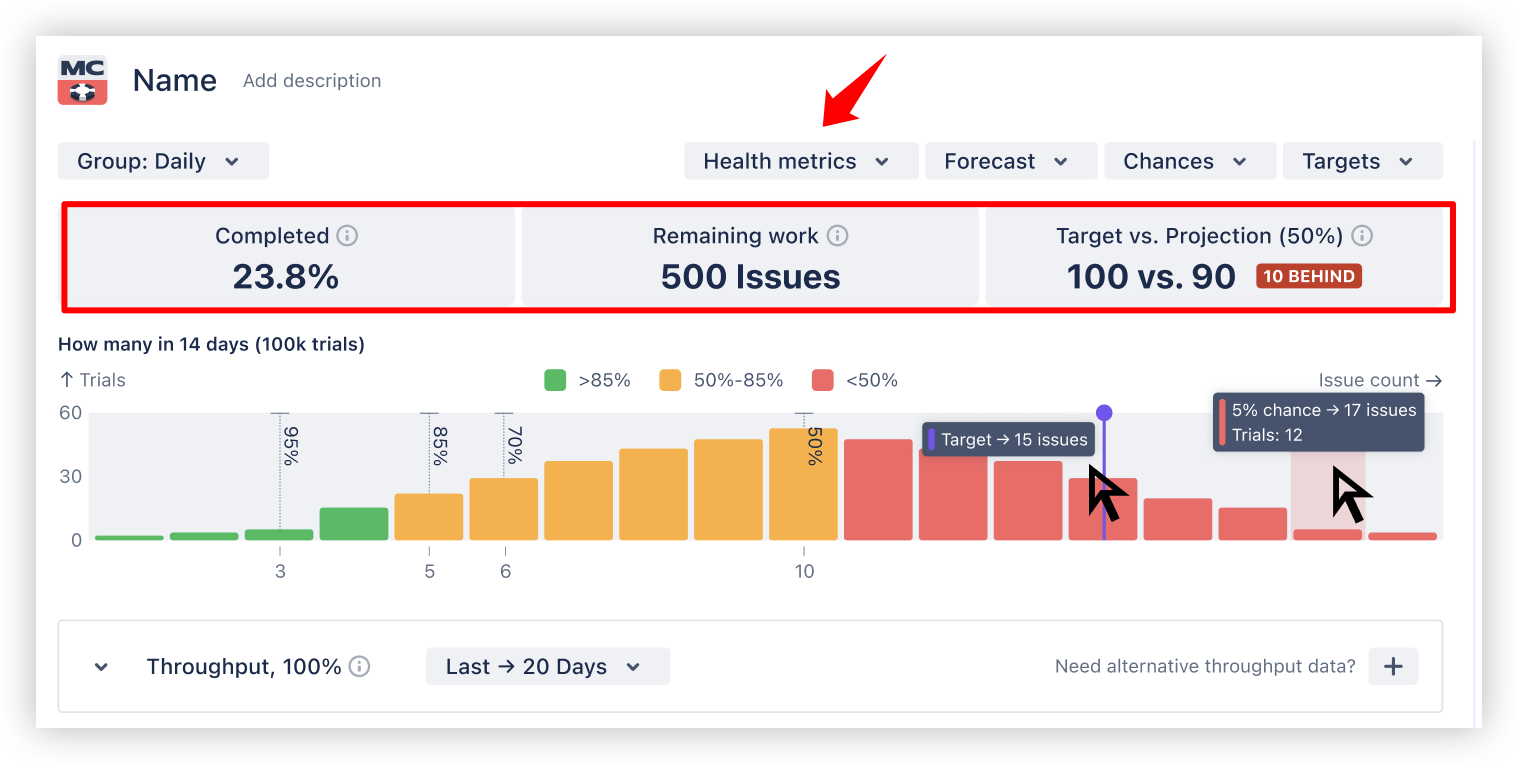
RAG indicators make delivery risk easy to communicate beyond the team.
♦️ From high-level forecast to concrete Jira work items
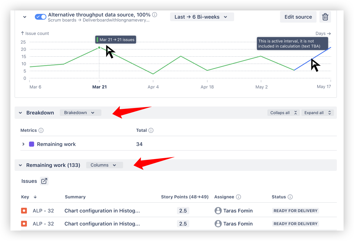
Monte Carlo forecasts don’t hide the data behind probabilities. You can always understand what exactly stands behind the numbers.
-
Filter remaining work by issue type, epics, releases, JQL, and other Jira dimensions to narrow the forecast scope
-
Break down remaining work by team, assignee, issue type, or release to uncover trends, risks, and anomalies
-
Drill down to the Remaining Work issue list to validate the exact Jira issues included in the forecast
This makes Monte Carlo forecasting transparent, explainable, and actionable — not a black box.
♦️ Flexible scope and data source configuration
Agile Monte Carlo Charts support enterprise-grade forecasting across Jira structures:
-
Scrum or Kanban boards
-
One or multiple teams
-
Projects, releases, epics, initiatives
-
Issue hierarchies and links
-
Custom JQL filters
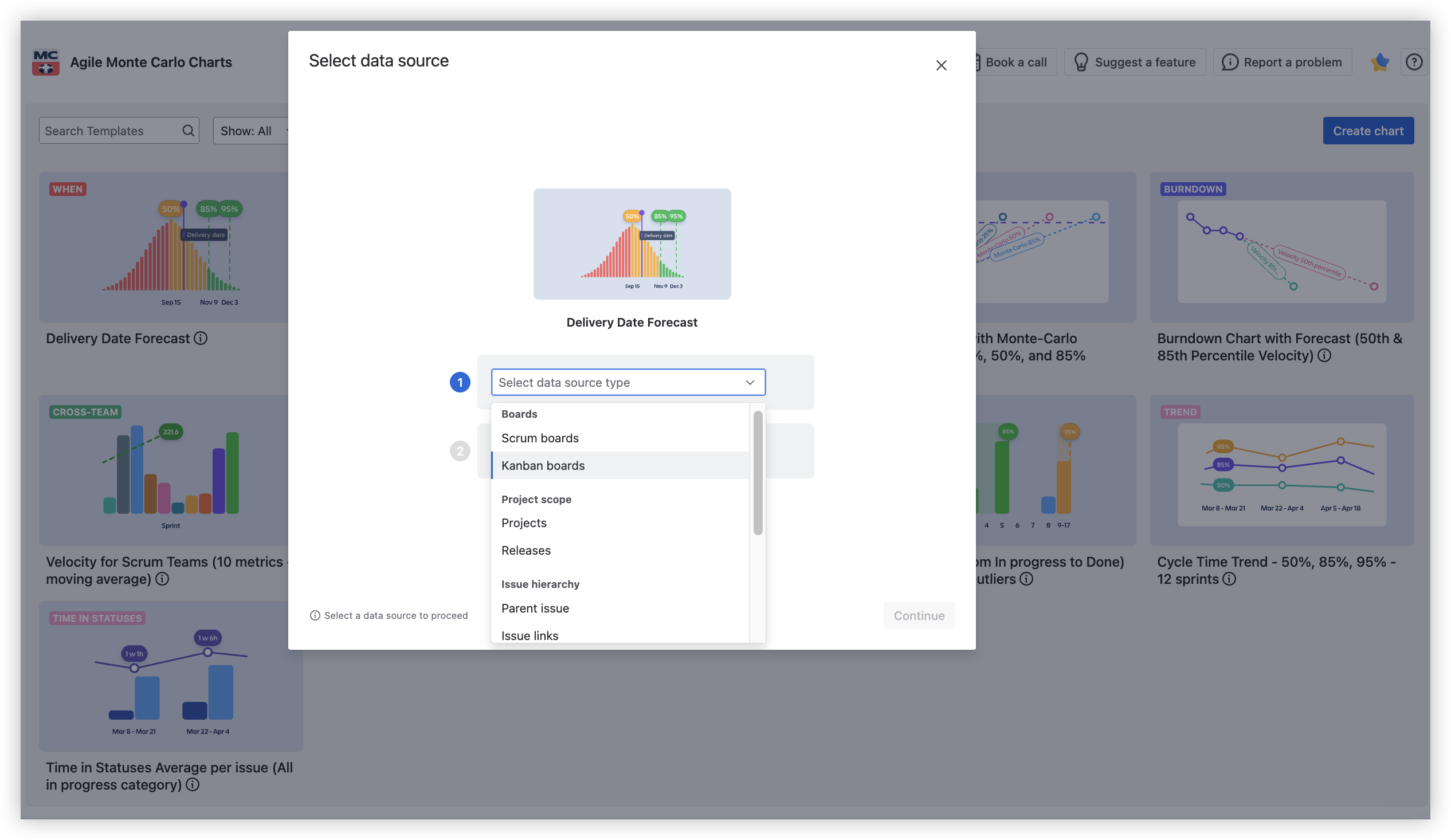
This allows you to run:
– all within a single chart.
♦️ Scenario modelling and what-if analysis
Monte Carlo is not just a reporting tool - it’s a planning instrument.
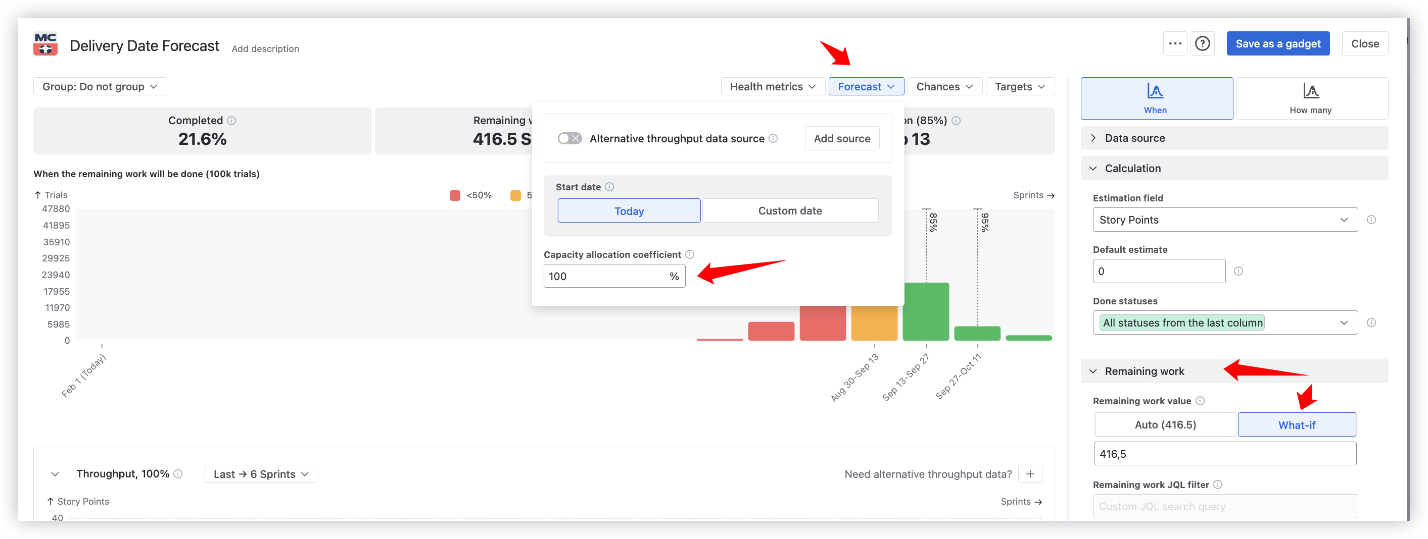
You can:
-
Model backlog growth or reduction
-
Simulate part-time capacity using allocation coefficients
-
Run scenarios across multiple scopes to compare risk profiles
This enables informed trade-offs between date, scope, and risk - especially at the portfolio level.
💡Why Monte Carlo forecasting?
Agile teams rarely fail because they lack plans.
They struggle because plans are often deterministic, while delivery is not.
Monte Carlo forecasting addresses this gap by:
-
Running thousands of simulations based on historical throughput
-
Showing a range of possible outcomes, not a single date
-
Making delivery risk explicit and measurable
Instead of committing to “best-case” scenarios, teams can now commit with clear confidence levels using Agile Monte Carlo Charts.
🔒 Built on trust
SOC 2 Type 2 Certified – Independent audit verification of our security controls for Security, Availability, and Confidentiality.
Additional security:
-
☁️ Cloud Fortified (Atlassian's rigorous security requirements)
-
🧩 Runs on Atlassian Forge (secure cloud infrastructure)
-
🔒 Bug Bounty Program (proactive vulnerability management)
🔗 Visit our Trust Center
🎯 Get started with Agile Monte Carlo Charts
Agile Monte Carlo Charts is now available on the Atlassian Marketplace.
Install it in minutes and start making probability-based delivery decisions using your real Jira data.
Ready to plan with confidence?
-
📥 Install Agile Monte Carlo Charts from the Atlassian Marketplace
-
🆓 Start your 30-day free trial to explore probabilistic forecasting in action
-
💬 Contact Broken Build support for setup help, best-practice guidance, or advanced use cases
Support options:
✨ From teams to executives - forecast delivery with confidence
Agile Monte Carlo Charts help teams and leaders make probability-based delivery decisions using real Jira data - from sprint planning to portfolio-level commitments.
Built for:
-
Executives & Portfolio leaders - assess delivery risk, confidence levels, and timelines across initiatives
-
Delivery & Program Managers - forecast releases, align scope with realistic dates, manage expectations
-
Agile & Scrum Coaches - explain uncertainty, risks, and flow dynamics with clear visual evidence
-
Agile Consultants - support data-driven recommendations and what-if scenarios for clients
From day-to-day delivery decisions to enterprise-level forecasting, Monte Carlo Charts scale with your context.
🧩 Complete your Agile analytics toolkit
Agile Monte Carlo Charts is part of the growing Broken Build Agile Analytics ecosystem on the Atlassian Marketplace.
Individual apps:
All-in-One Suite:
-
Agile Reports & Gadgets (Bundle) – a unified analytics suite for Jira, including Velocity, Cycle Time, and Burnup/Burndown charts
🚀 Agile Monte Carlo Charts and Agile Cumulative Flow Charts will be added to the bundle soon.
Each Broken Build app integrates seamlessly with Jira dashboards, helping teams plan smarter, manage risk, and deliver with confidence.
Cheers,
The Broken Build Team
