Is there any way to fix the position of the branches being displayed? Something similar to this bitbucket image or this git flow image.
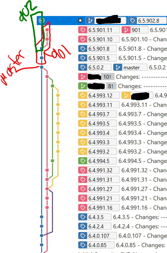
The current rendering of the branches will zig-zag them, making it difficult to follow branch paths and determine which branch a commit is on. I have provided an example in the picture below. As is shown in the picture, SourceTree makes it:
- Appear that the master branch continues up to the top, 3 more commits
- That 901 branches off of master at 6.5.901.8, instead of at 6.5.0.2.
- Does not really show that the 902 branch is in fact a branch, and branches off of 6.5.901.8
Yes, if one follows the tags and branch information to the right of the lines. But if there was a way to display the branches like the two picture above, it would make it more immediately clear and intuitive.