I've been using Jira for several years, including before the move from the top navigation to the current sidebar.
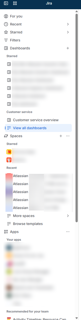
While I like the flexibility of the sidebar, I've noticed that it becomes difficult to navigate once multiple sections are expanded. I also see the same confusion from our customers.
I think the main issue is the lack of visual hierarchy. When sections like Spaces, Dashboards, or Filters are expanded, the main navigation items blend together with their contents, making it harder to quickly scan the sidebar.
My suggestion
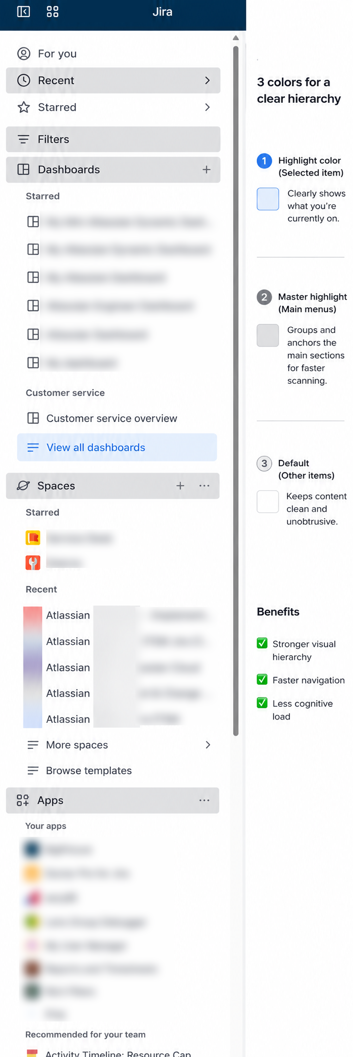
Introduce a three-level color hierarchy:
- 🔵 Highlight – the currently selected item (existing behavior).
- ⚫ Master highlight – a subtle darker gray background for top-level navigation items (Filters, Dashboards, Spaces, Apps, etc.).
- ⚪ Default – regular items remain unchanged.
This small visual change would make it much easier to distinguish where each section starts and ends, especially in long, expanded sidebars.
I've attached a quick mockup to illustrate the idea.
Would love to hear what others think!
here is example idea (current and idea)
Regards everyone,
Benjamin


