Beyond personal preference for the new UI colours, some of them just do not work from a contrast point of view. Examples:
- the 'completed' green in the sprint headers in the backlog. It's barely visible on top of grey.

It's also a different colour from the completed status:

#B3DF72 vs #EFFFD6 for the light green above.
- black text on dark blue for 'in progress' status.
 (#669DF1)
It's much lower contrast than all other buttons for some reason. Just compare it to the Create button:
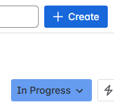
This 'in progress' button also has a different shade in the backlog layout:
 #8FB8F6


