At present, when you group by a boolean (checkbox) field, you get a super confusing interface:
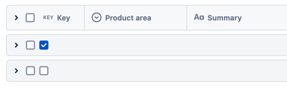
Is this something that can receive some love? Even if it is was just as simple as changing it to "Field name ✅" and "Field name ❌", that would at least make it clearer which field is being used and also eliminate the awkward double checkbox.

