Hi,
I'm looking for some help when creating a table chart within Atlassian Analytics.
I've created some custom SQL and I'm showing the results on the dashboard in a table format.
The output contains more than 20 rows of data and only 3 columns.
How do I change how many maximum can be visible within the screen?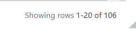
Currently it is set to 20 but I would like more to be visible.
Can I hide the headers of the columns?


