Hello, I am loving the new card addition under the Description section that now allows for different formatting options. However, since this addition, whenever I need to add a new line in, it places a large gap in between the text above which makes our lovely cards look untidy and unorganised. Is there a way I can reduce this space that I have missed?
Originally looks like this:

Then like this with the work "test" added
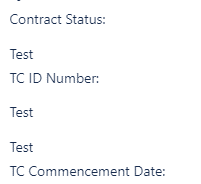
It would also be great if the formatting options available here, such as Horizontal line and underline could also be added at some stage.
Thank you
Stacey


